The University of Toronto Magazine aims to unite alumni, donors and friends in support of the university’s mission to educate global citizens and discover new knowledge. The magazine needed a new visual partner to help them build a bond with their readers, making them proud to be associated with their alma mater.
The already award-winning University of Toronto Magazine tells the stories of the university and it’s impact on Canada and the world. It is distributed to 335,000 alumni, faculty, staff, donors and friends of the university and is the only U of T publication that reaches all of their alumni.
When we first met editor, Scott Anderson, neither the magazine or the website had been updated in nearly a decade. He was keen to apply a new contemporary look to the magazine and incorporate more visual storytelling, while maintaining the universities reputation for superlative research and teaching.
This isn’t a newsstand publication—alumni are automatically subscribed when they graduate and they genuinely love receiving their copy in the mail. Seriously, countless readership surveys showed it.
“It makes me feel very proud of being a U of T alumni. It means volumes to my family and is a piece of social status in our communities”
—quote from a 2017 readership survey conducted by the university
Scott and his team had done their homework: hosting focus groups, gathering online data from their readers and requesting critiques from industry experts. Their findings found that their audience responded best to content that was documentary in style, lacking in dramatization and the kind of intelligent storytelling that makes readers reflect or think a little deeper.
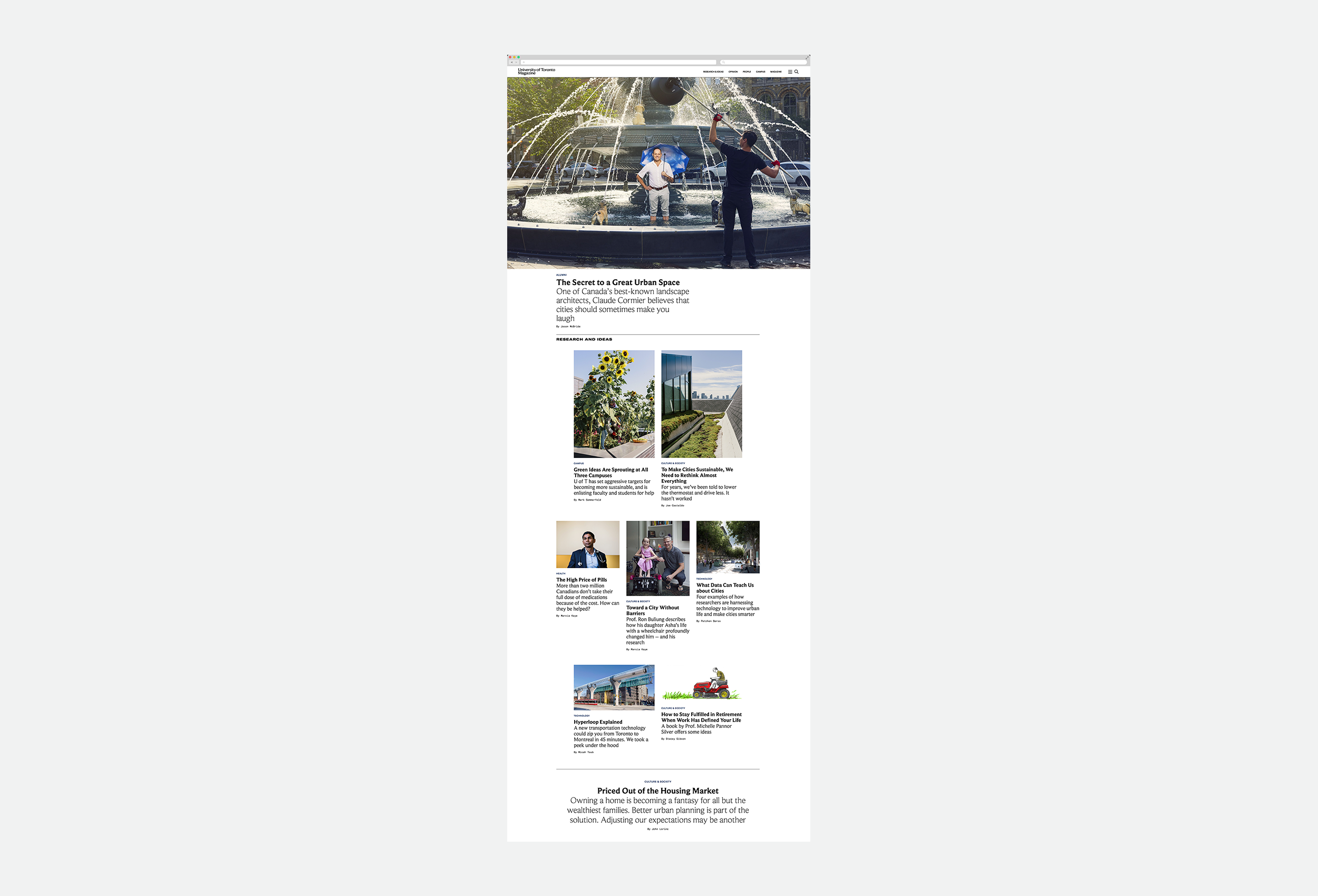
Our collective goal was to engage readers, both emotionally and intellectually by giving them a backstage pass to the brilliant minds learning, teaching and working at the institution. Their community is talking about problems that matter, and working to find some incredible solutions. This became the editorial strategy: to tackle big, messy topics as in-depth and slowly as we can.
As we began the design process, we took cues from the undeniable prestige and history of the institution, aiming to create something that could nod backwards to their history, but look ahead into the digital futures they’re inventing.
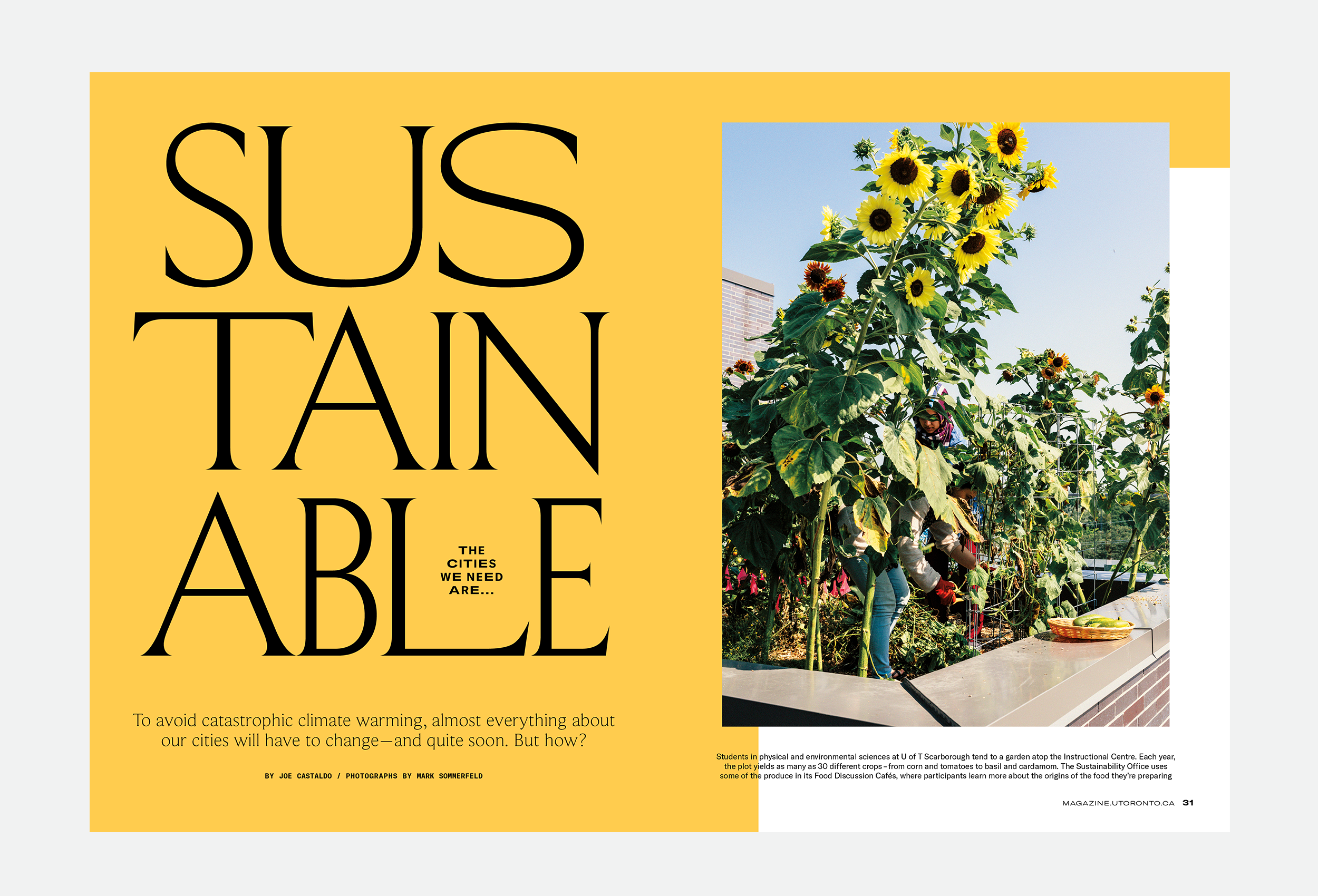
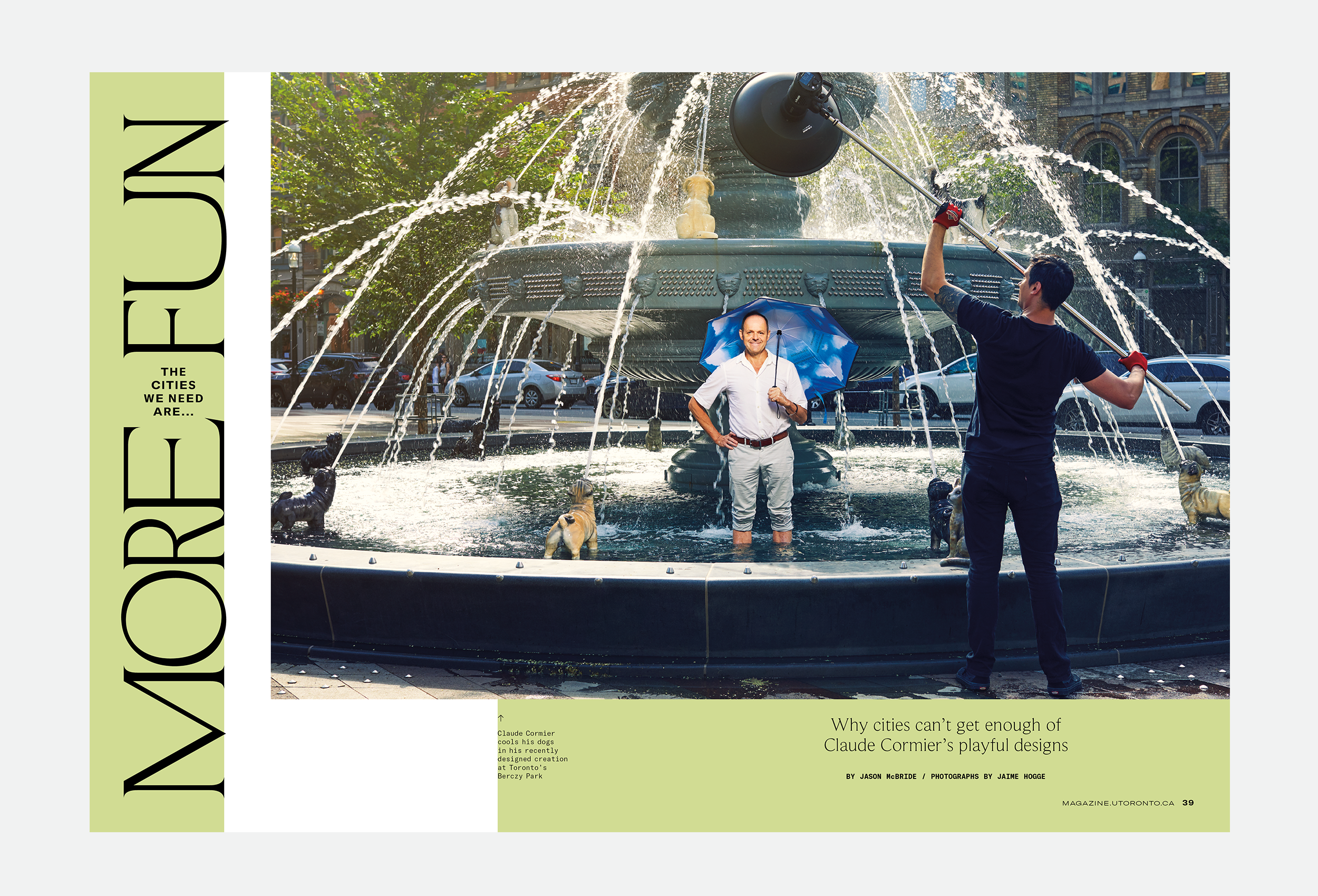
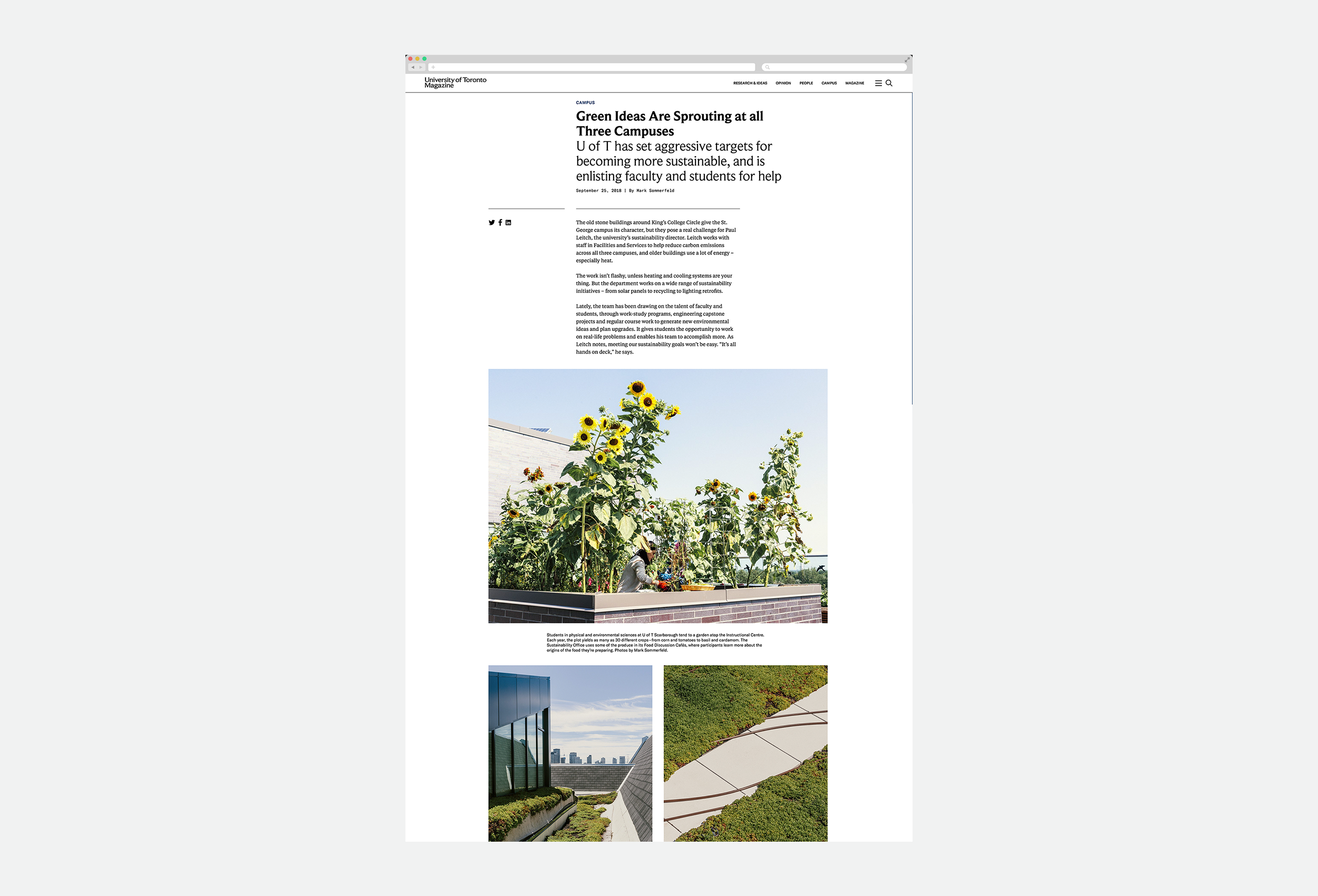
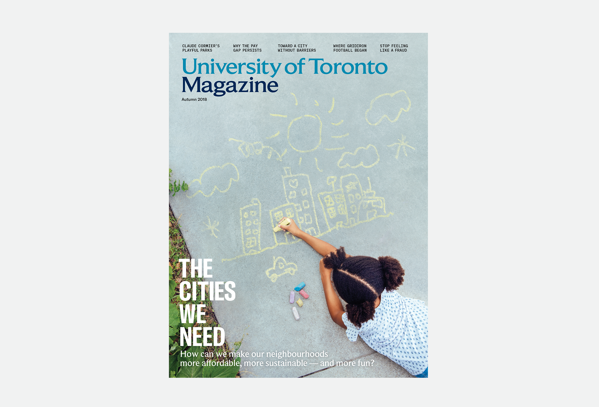
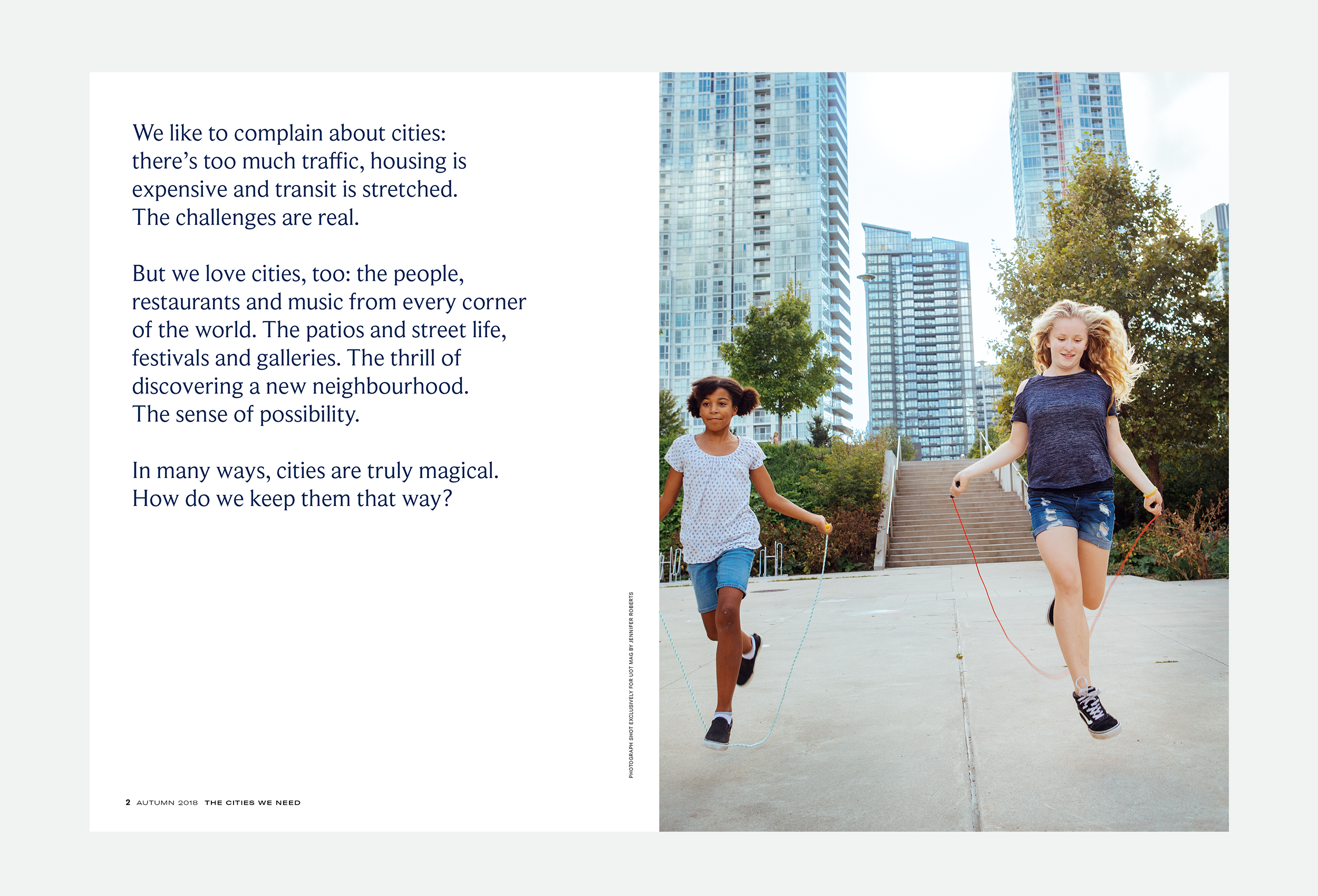
In print, this manifested as a slow, intimate framework rooted in historical field guides and journals. Sophisticated in its restraint but grand in its execution — sprawling stories, large photography, vast amounts of white space.
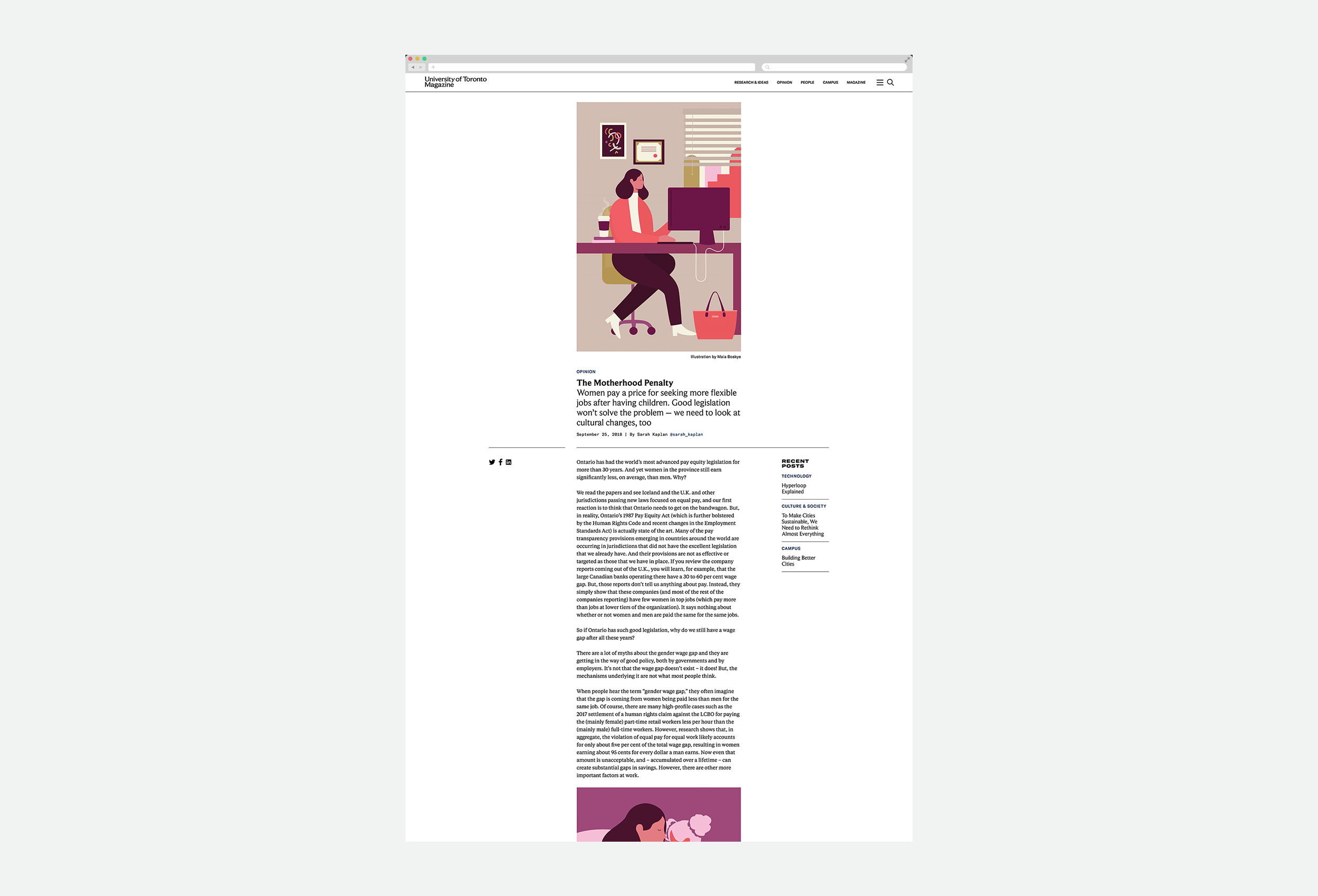
Building on the tradition of high-quality commissioning the magazine had already established we enlisted the likes of: Jaime Hogge, Mark Sommerfeld, Maia Boakye, Angela Lewis, Jennifer Roberts, David Sparshott, Franziska Barczyk, Brianna Roye, Raymond Biesinger and Chris Philpott to contribute.
For display, we’re using Nick Shinn’s wonderfully odd serif face, Beaufort, which comes in three widths and Grilli Type’s GT America, which also comes in a variety of widths. The adaptability these typefaces gave us and the old-meets-new-world nature of the pairing just felt right.
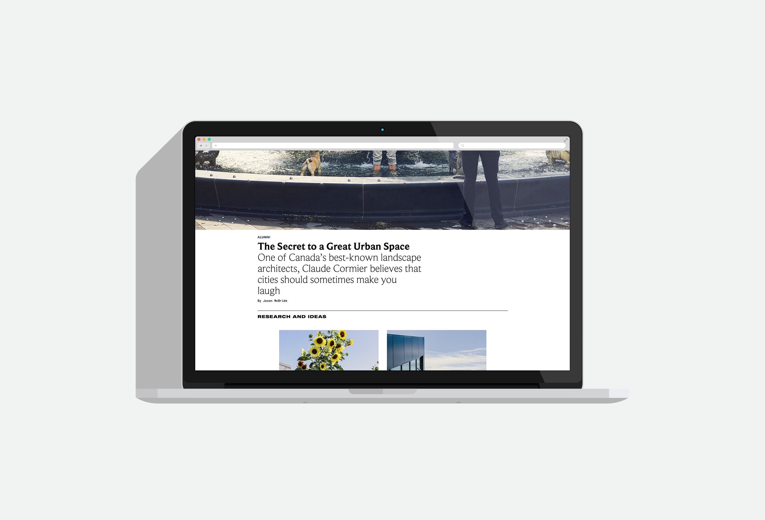
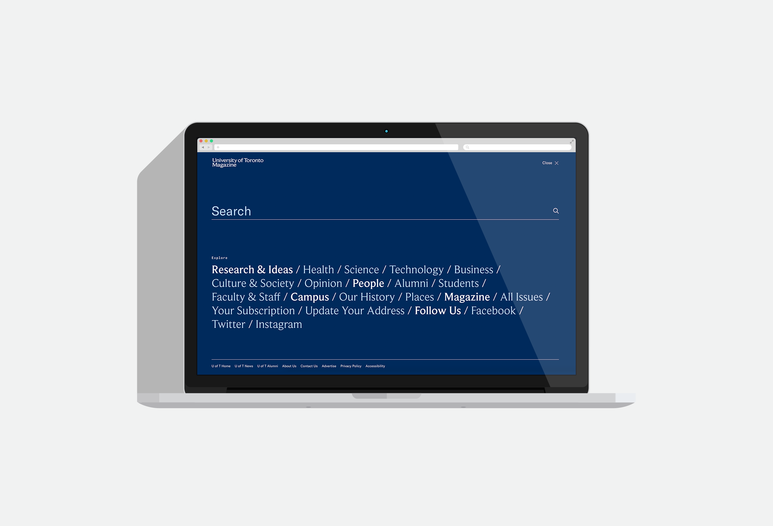
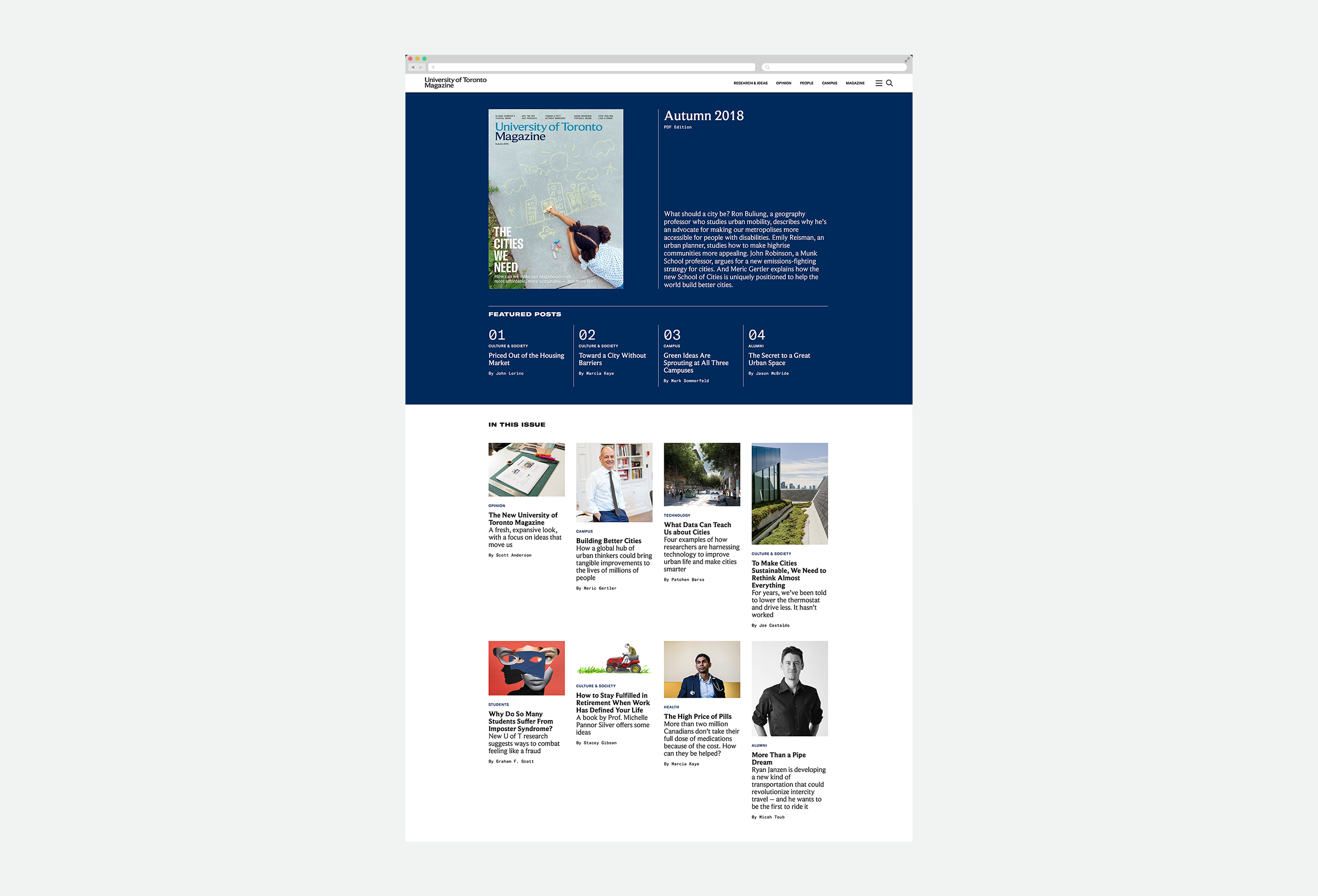
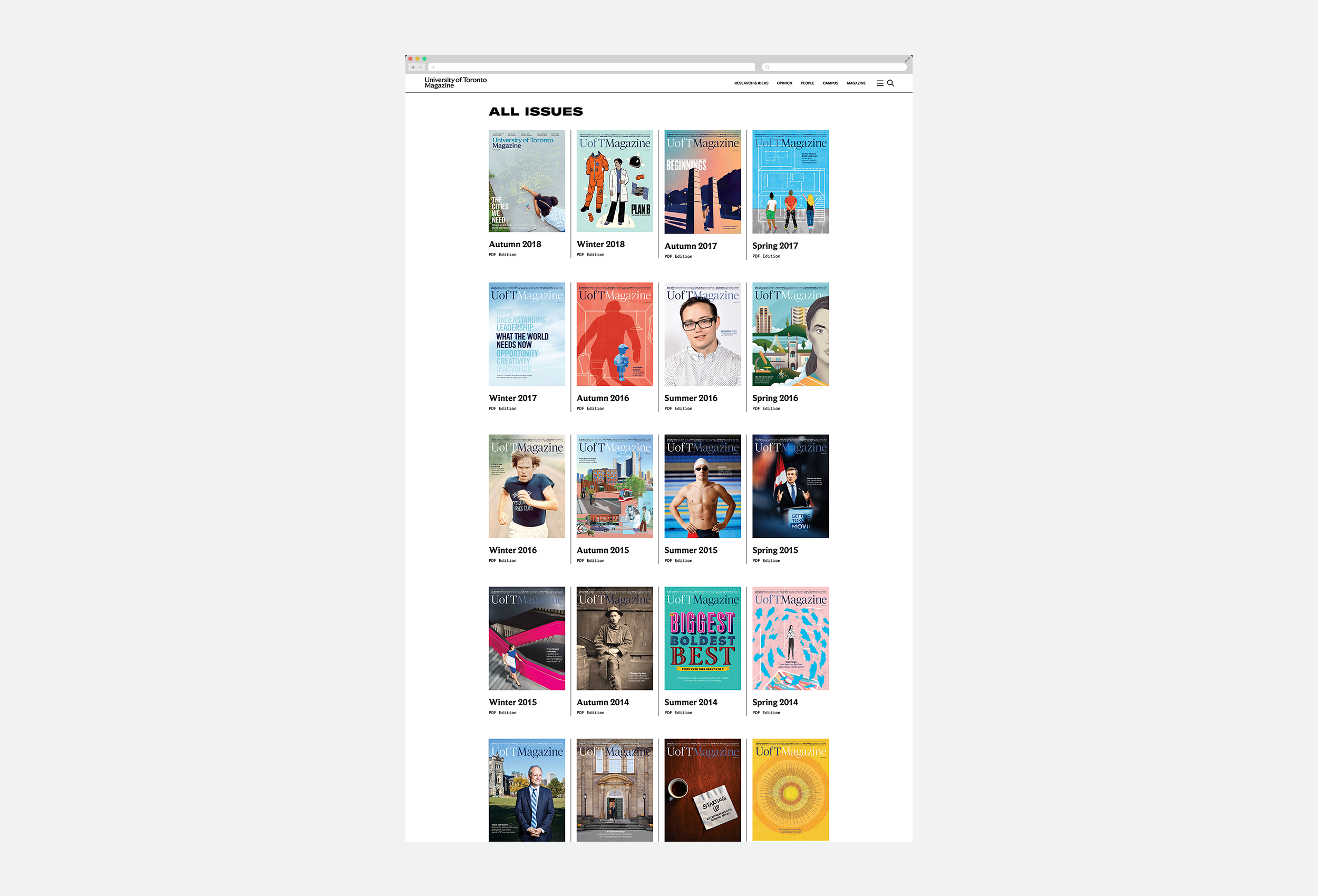
Online, updating the content was important, but updating the technology was too. We built a responsive system that flexes and adapts to different moments, giving the editors maximum flexibility in how they tell their stories.
By decoupled the publishing schedule from the printed product, the team can now produce stories more frequently online and have the tools to tell them just as beautifully as they can in print.
We’re looking forward to continuing to develop the new, reimagined University of Toronto Magazine.