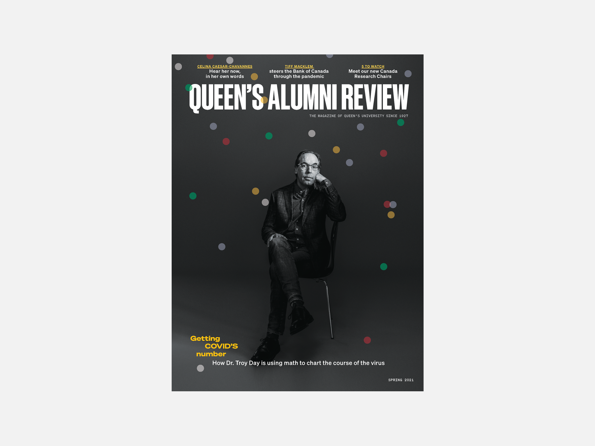
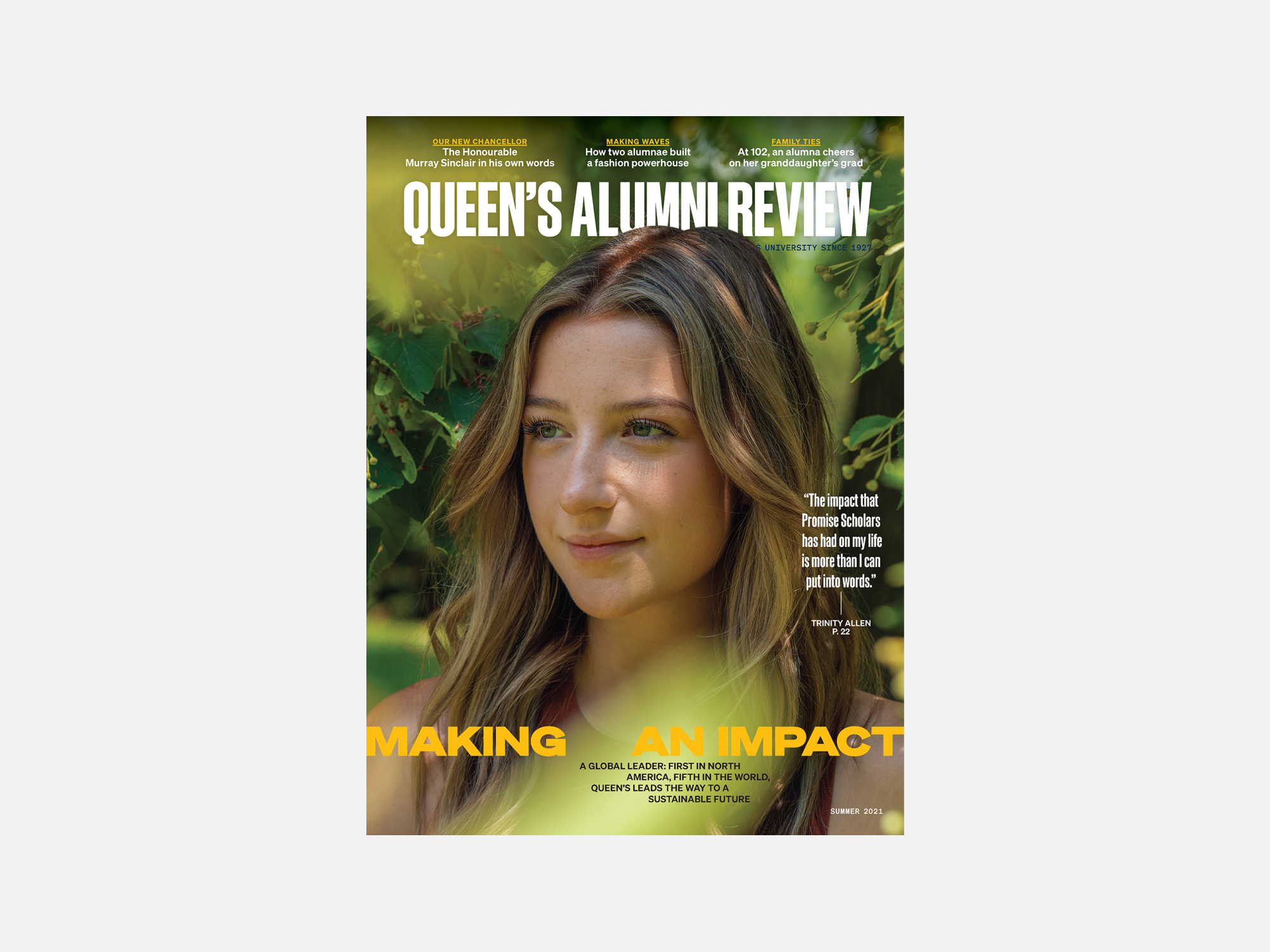
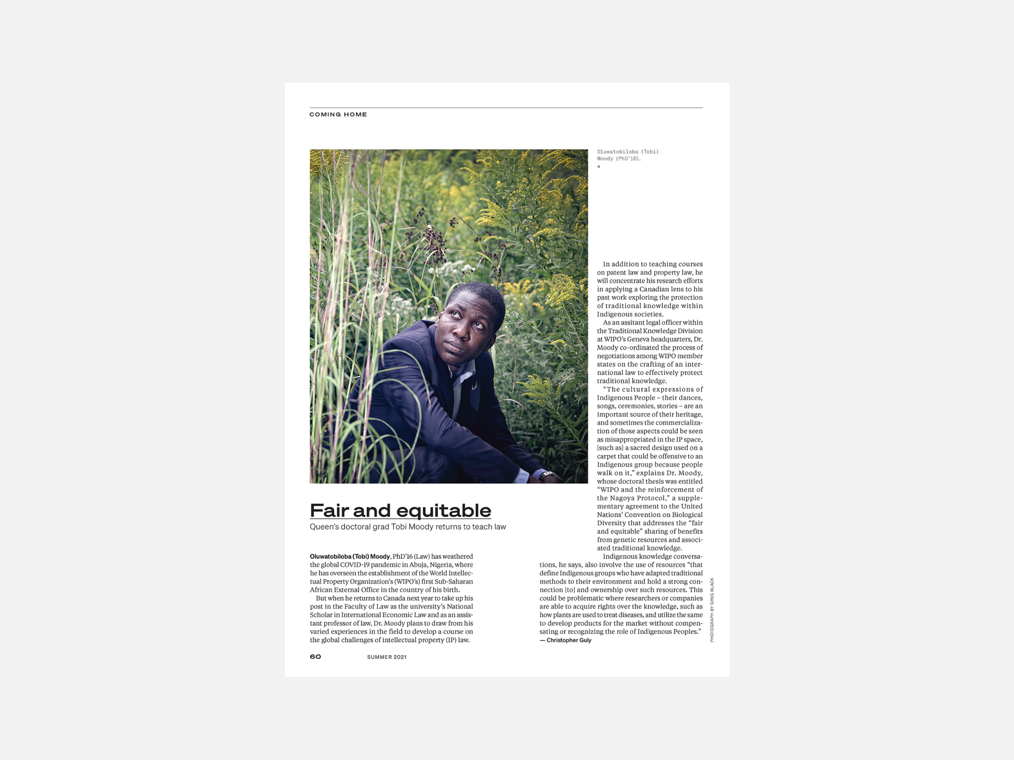
Established in 1927, the Queen’s Alumni Review (QAR) aims to engage its readership by telling the university’s stories: of bold ideas, innovative teaching, cutting-edge research, alumni achievement and more. Our goal was to build a magazine that better represents the diversity of the Queen’s community and speaks both to where the university has come from and where it’s going.
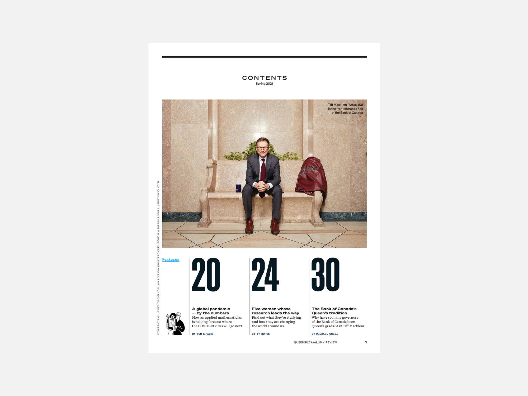
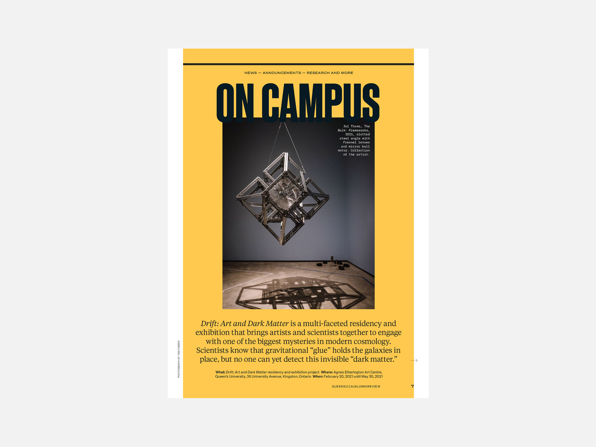
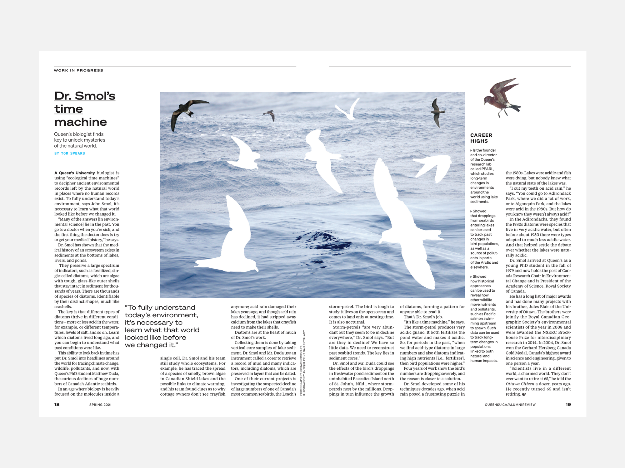
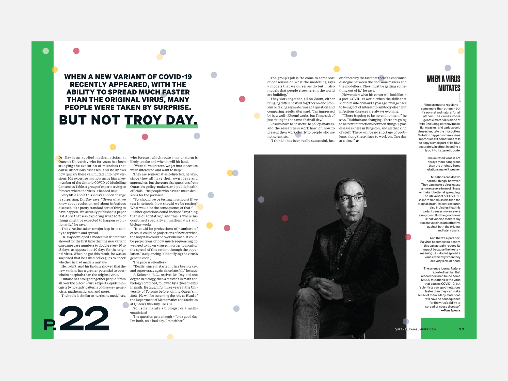
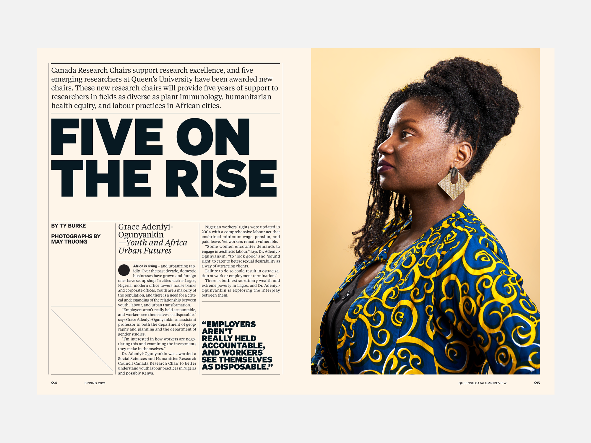
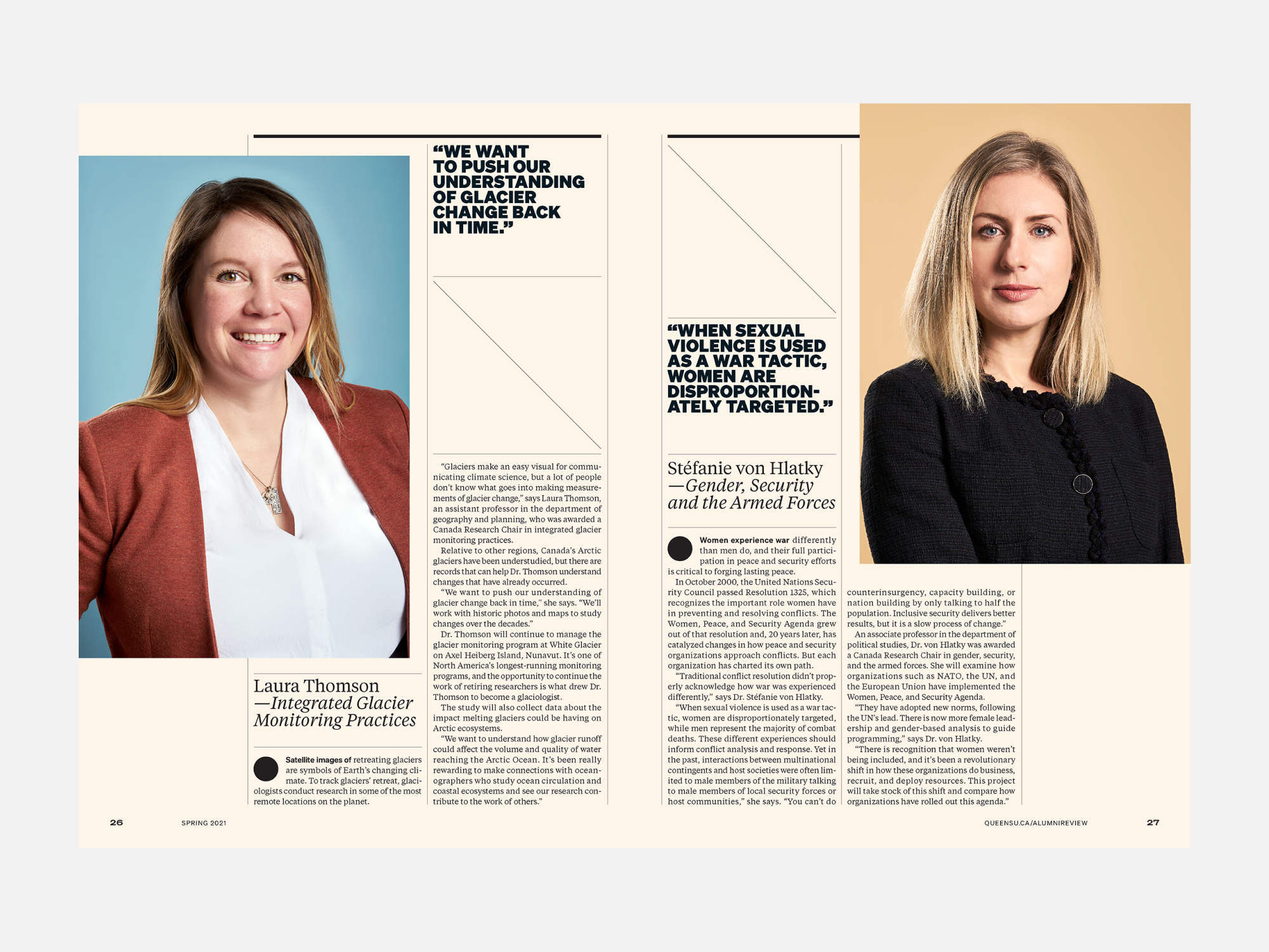
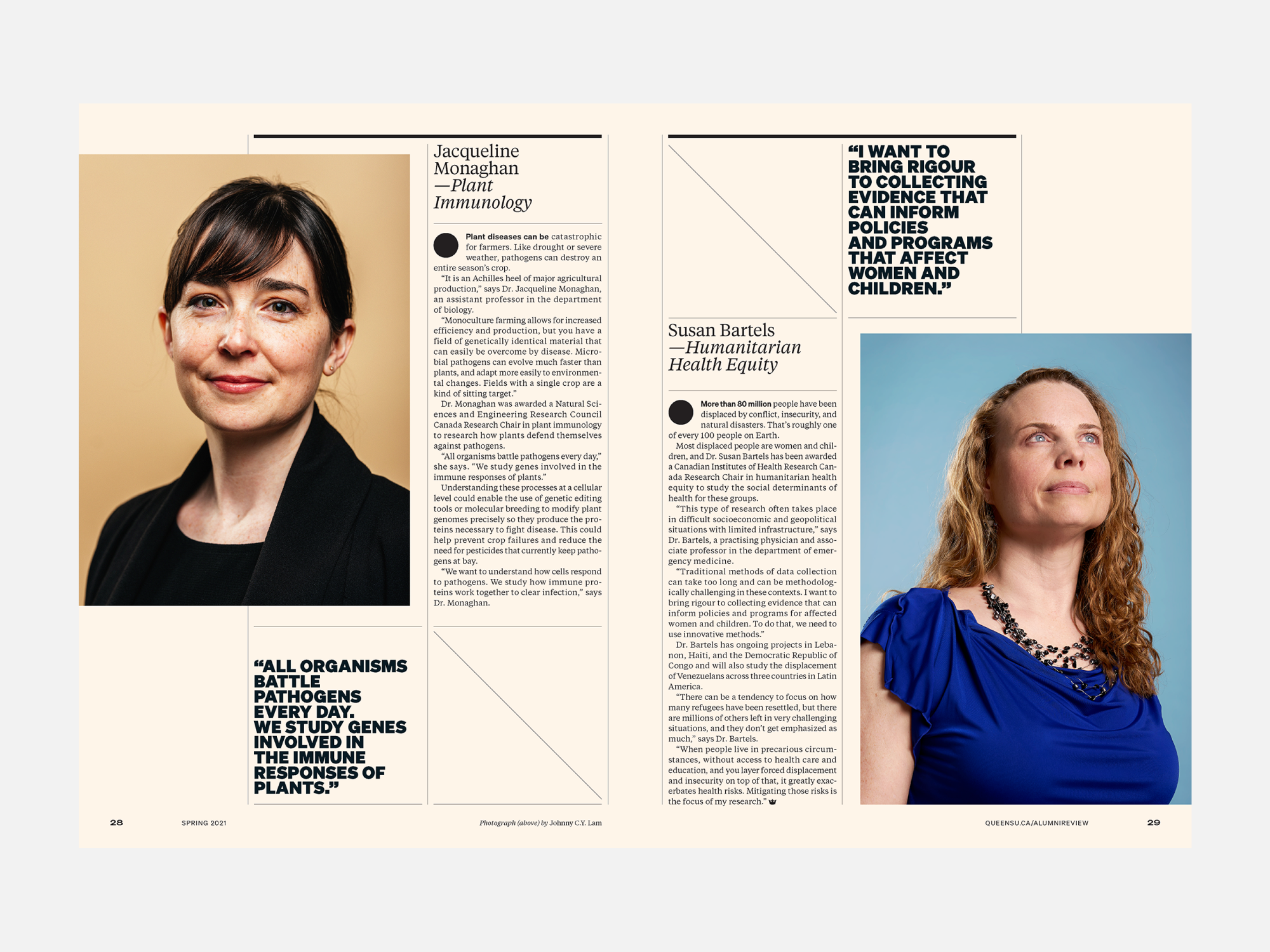
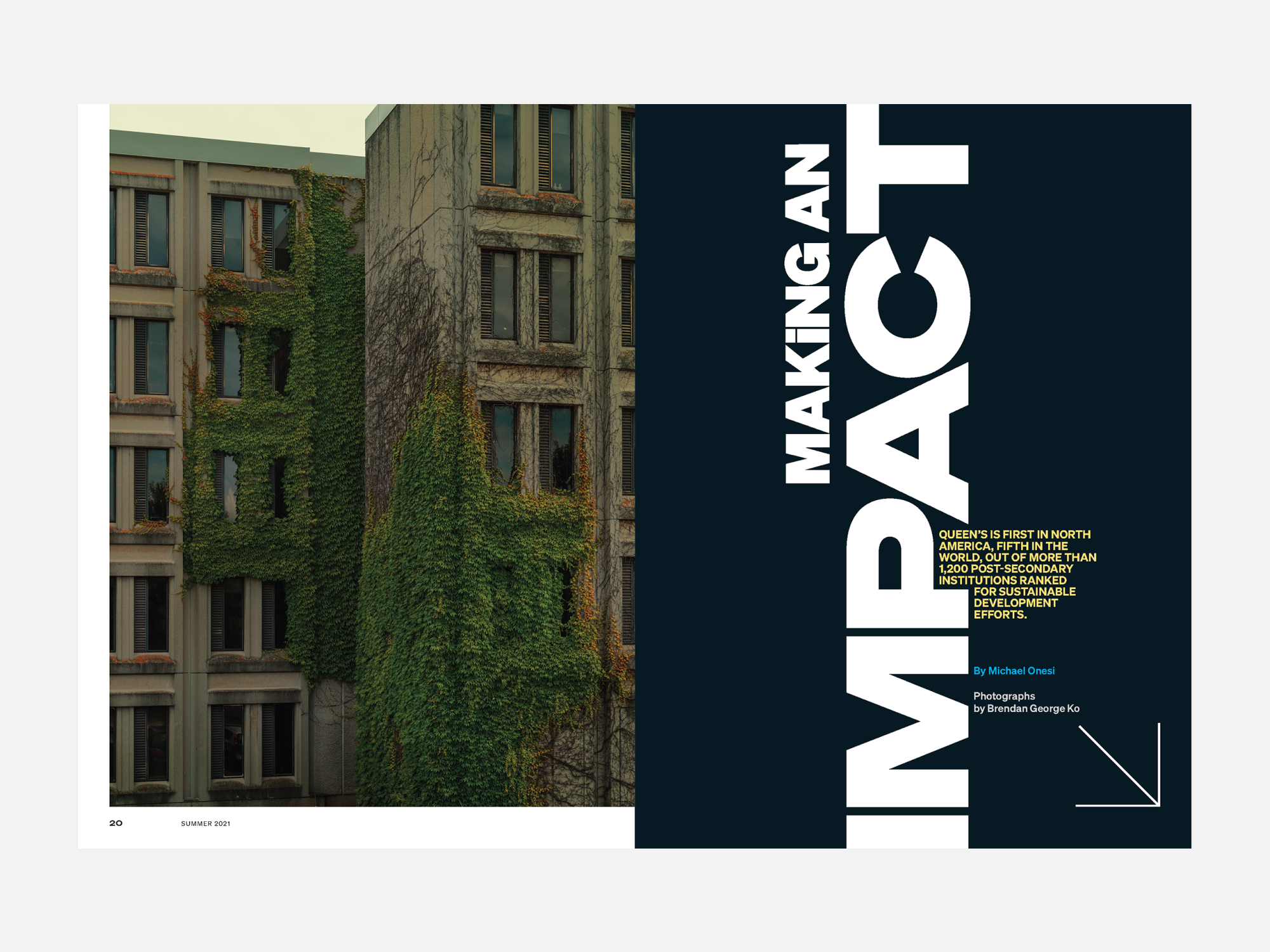
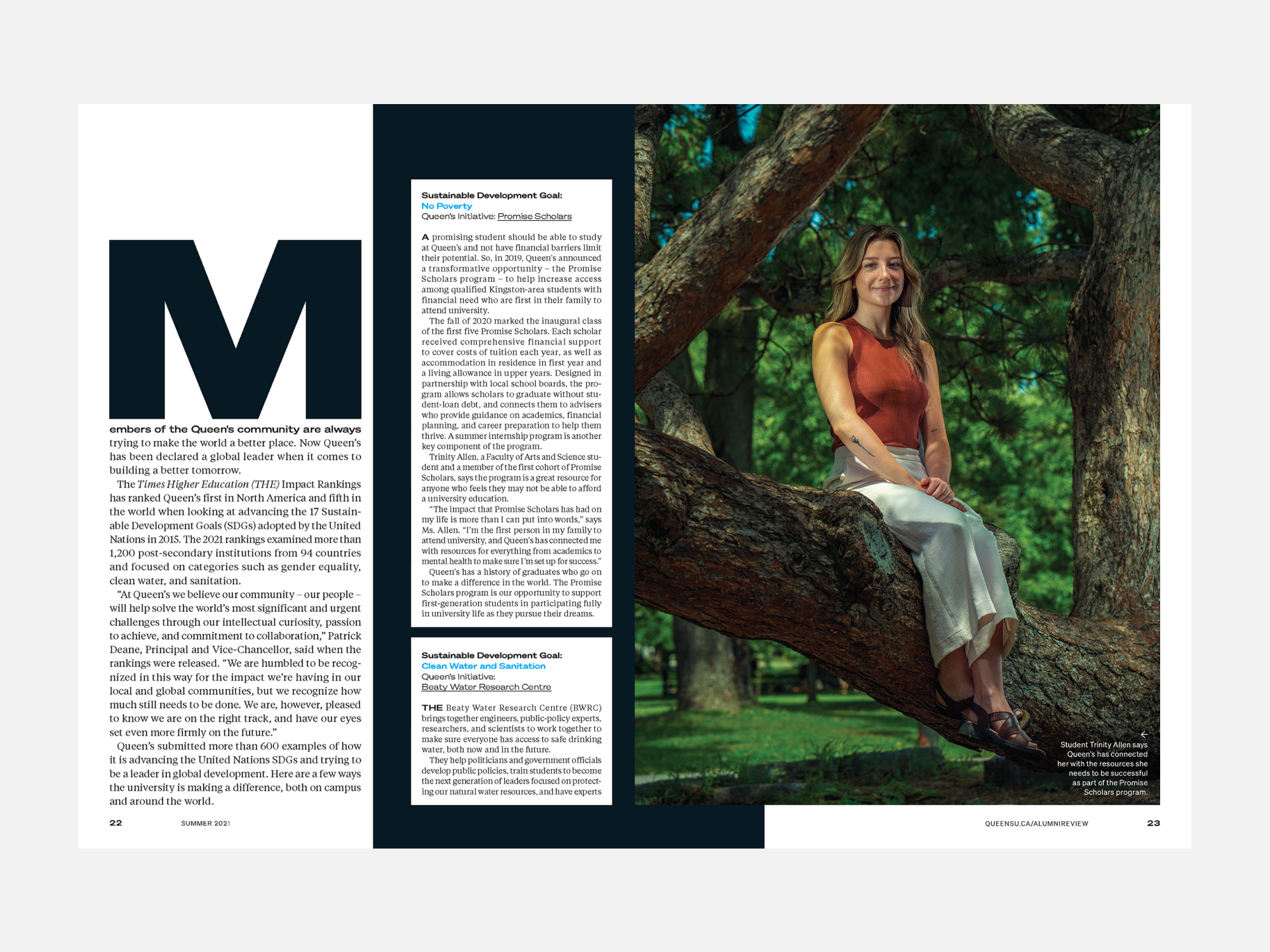
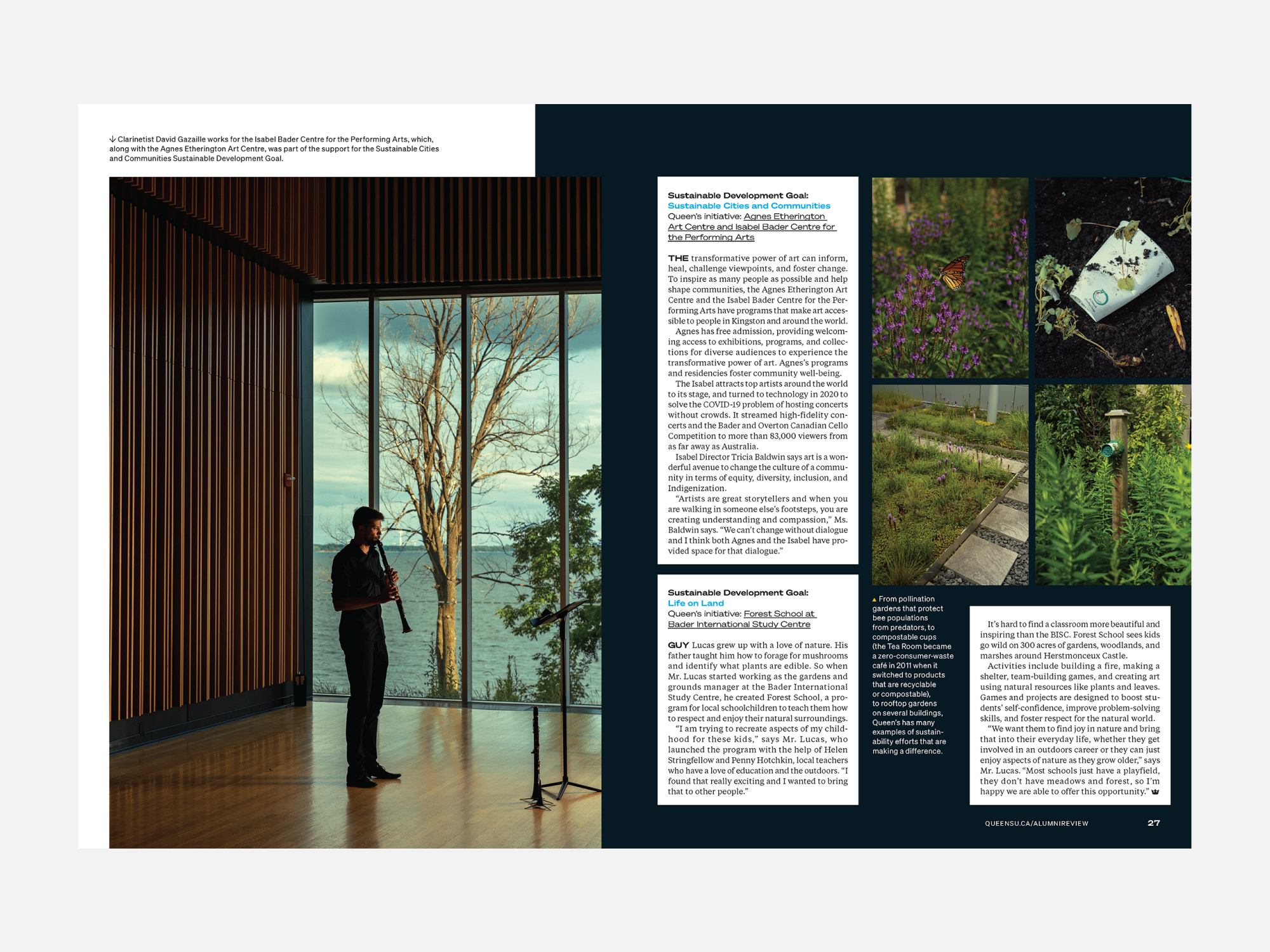
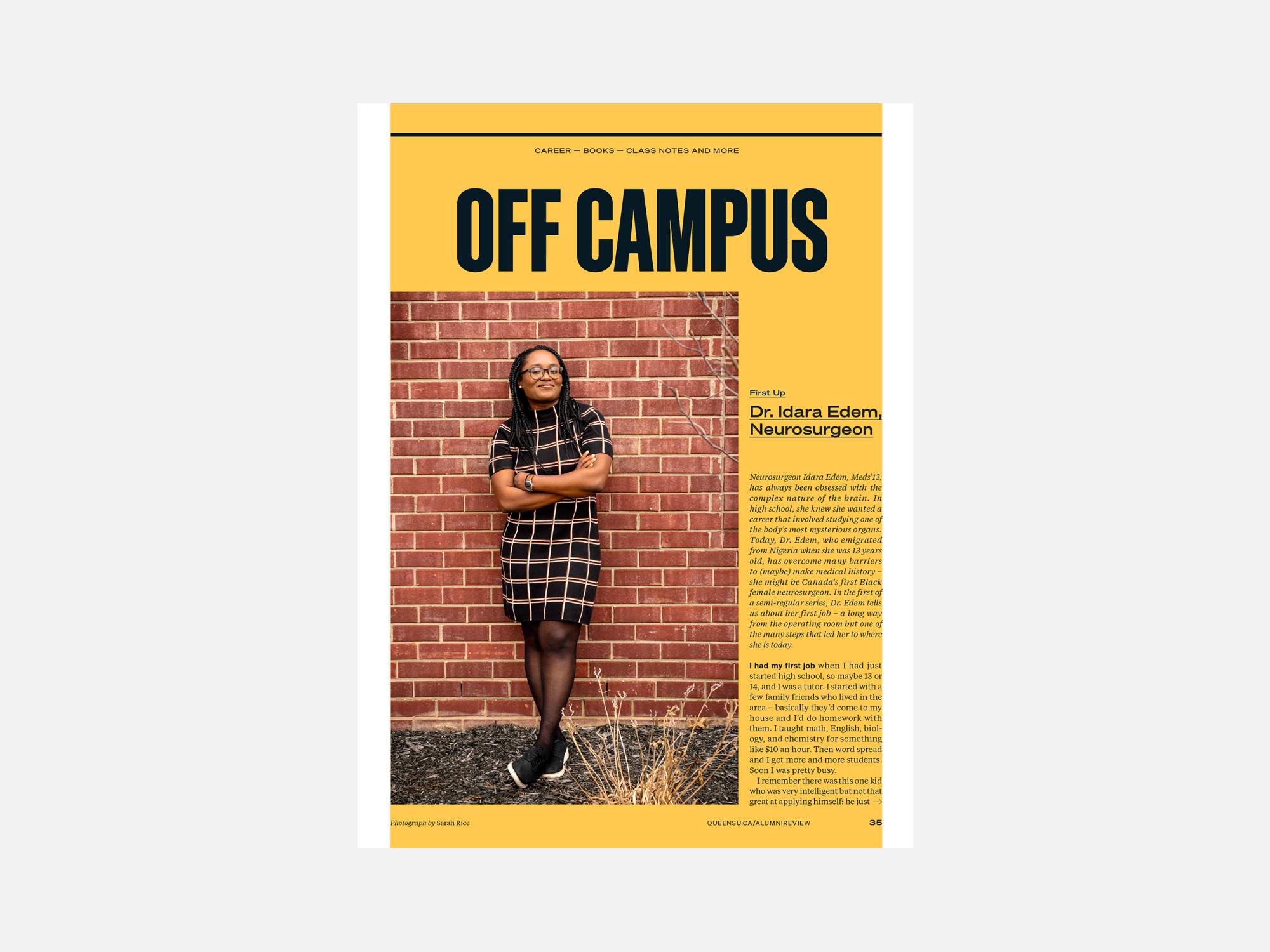
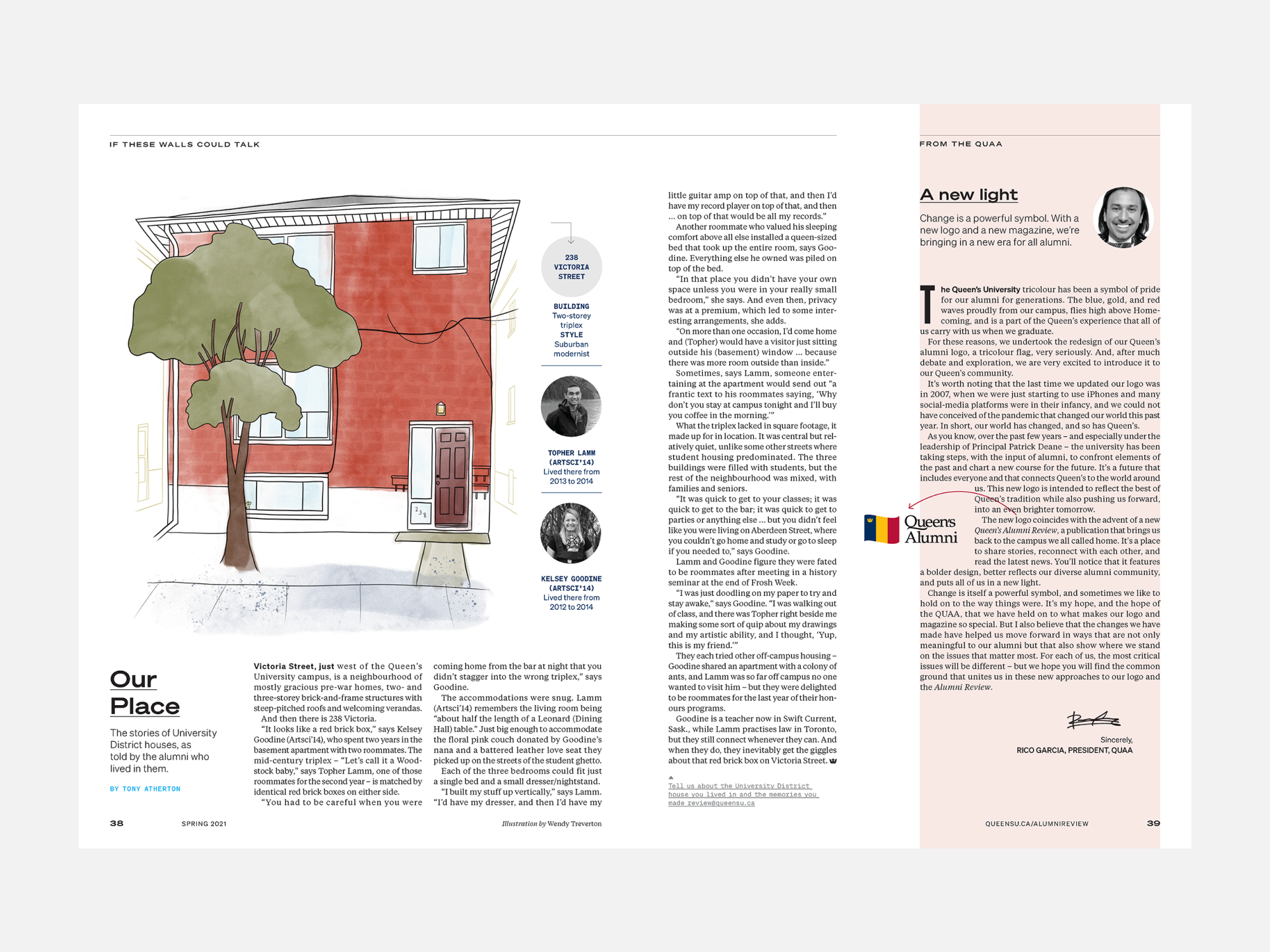
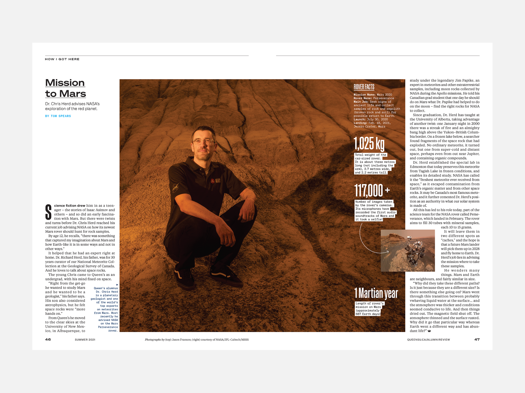
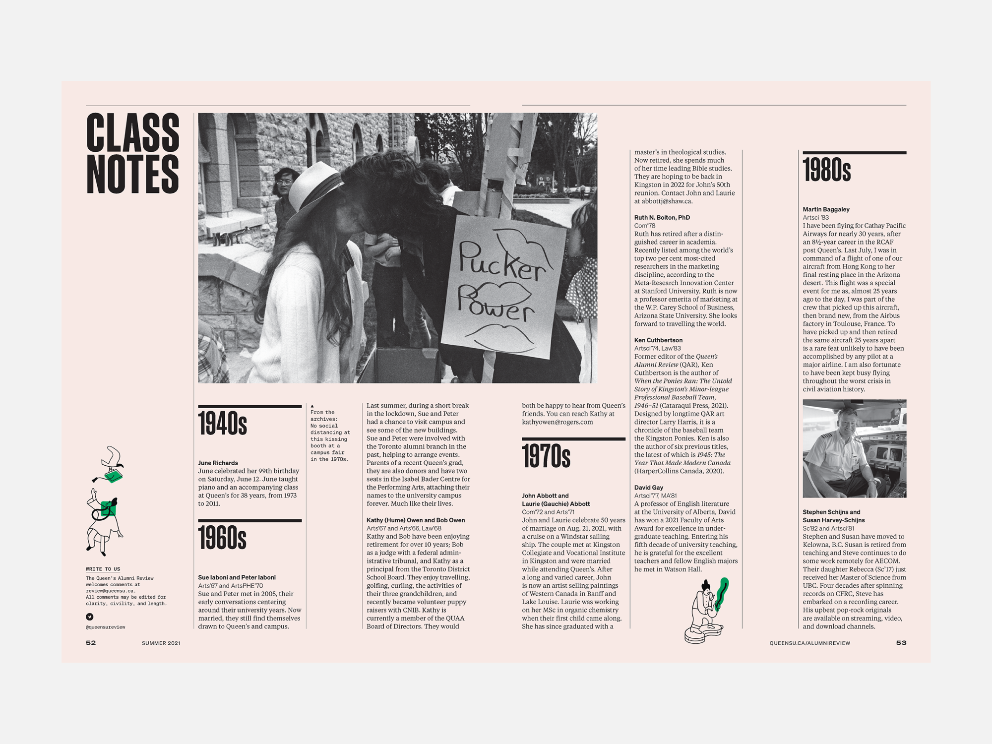
We brought in more visually-led content and a greater variety in story formats and applied a contemporary look with a bold approach intended to be as innovative as the stories the magazine tells. Using textures within its large photography and small detailed type, the design leans heavily on a black-and-white colour palette and some editorial packaging to allow the content to shine through, engaging readers both emotionally and intellectually.
The magazine won an SPD Merit Award for Redesign of an Entire Issue, B2B Silver for Best Art Direction of a Complete Issue and CASE Silver for Circle of Excellence, Magazines / Publishing Improvement.
“Working with Studio Wyse was an exercise in creativity on all levels — every photo, every story, every font was up for discussion and debate. Those conversations were not always easy, but they resulted in a bold, new direction for the magazine that not only celebrates the best of Queen’s today but that also welcomes the alumni of tomorrow.”
–Editorial team, Queen’s Alumni Review
“The whole thing felt smart, sophisticated, and reflective of a unified vision. A remarkable transformation, from a tired design to a fresh and bold one.”
-CASE judges


