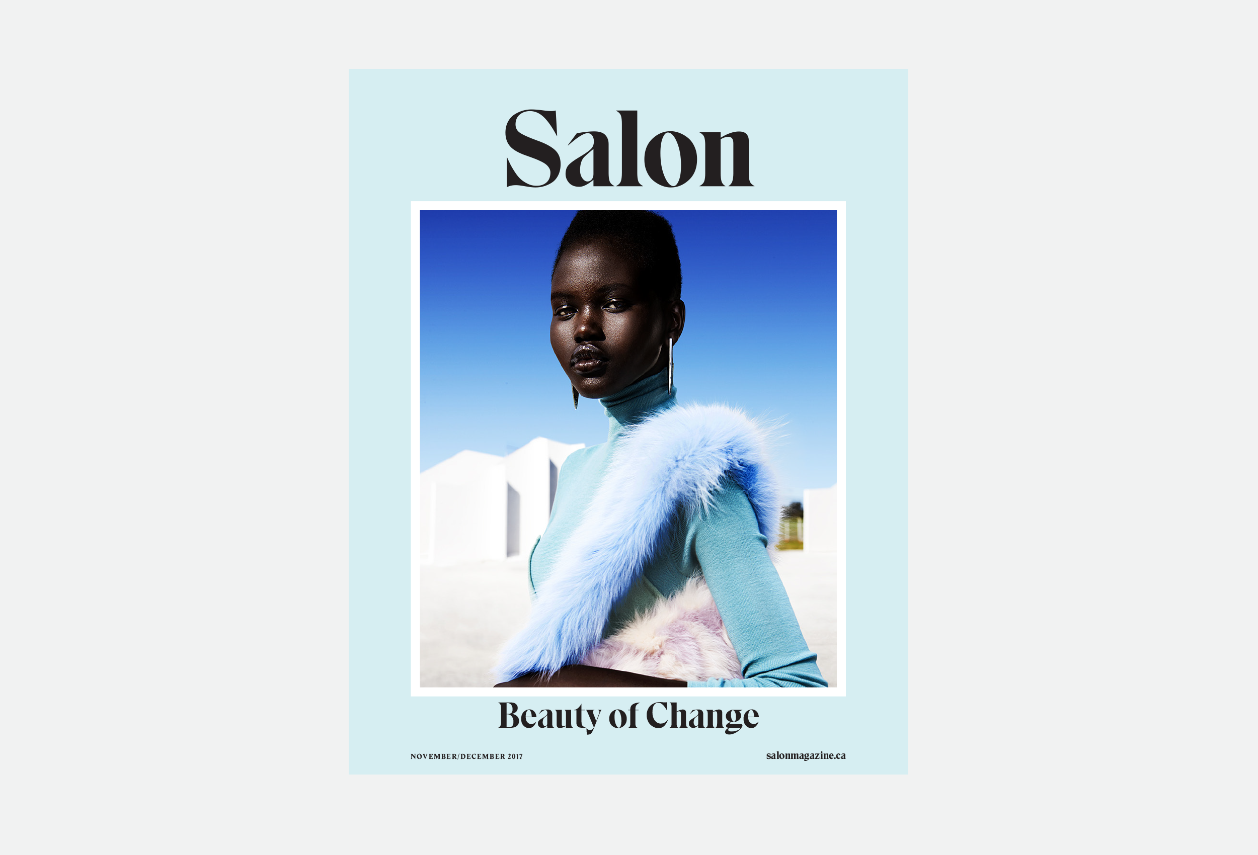
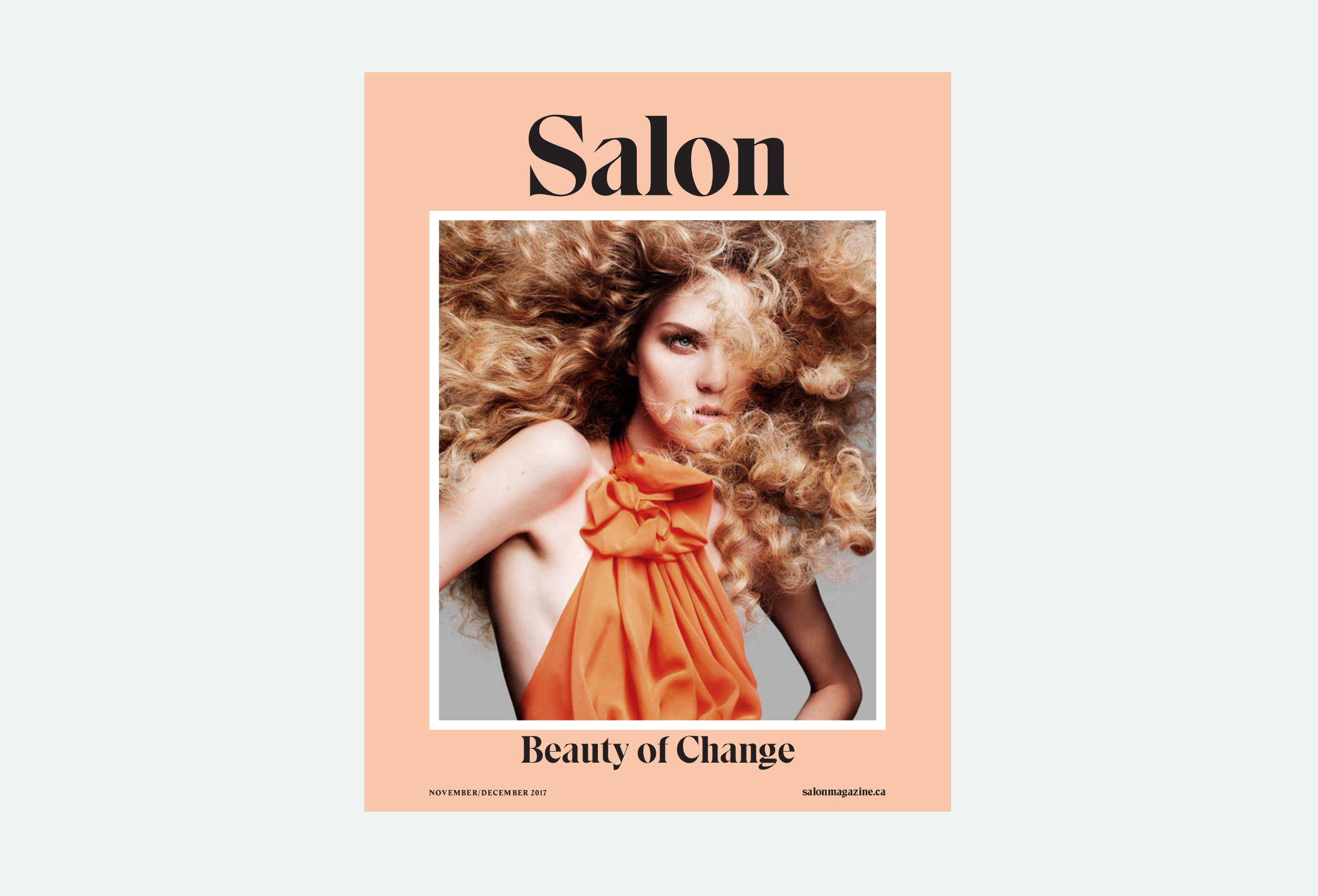
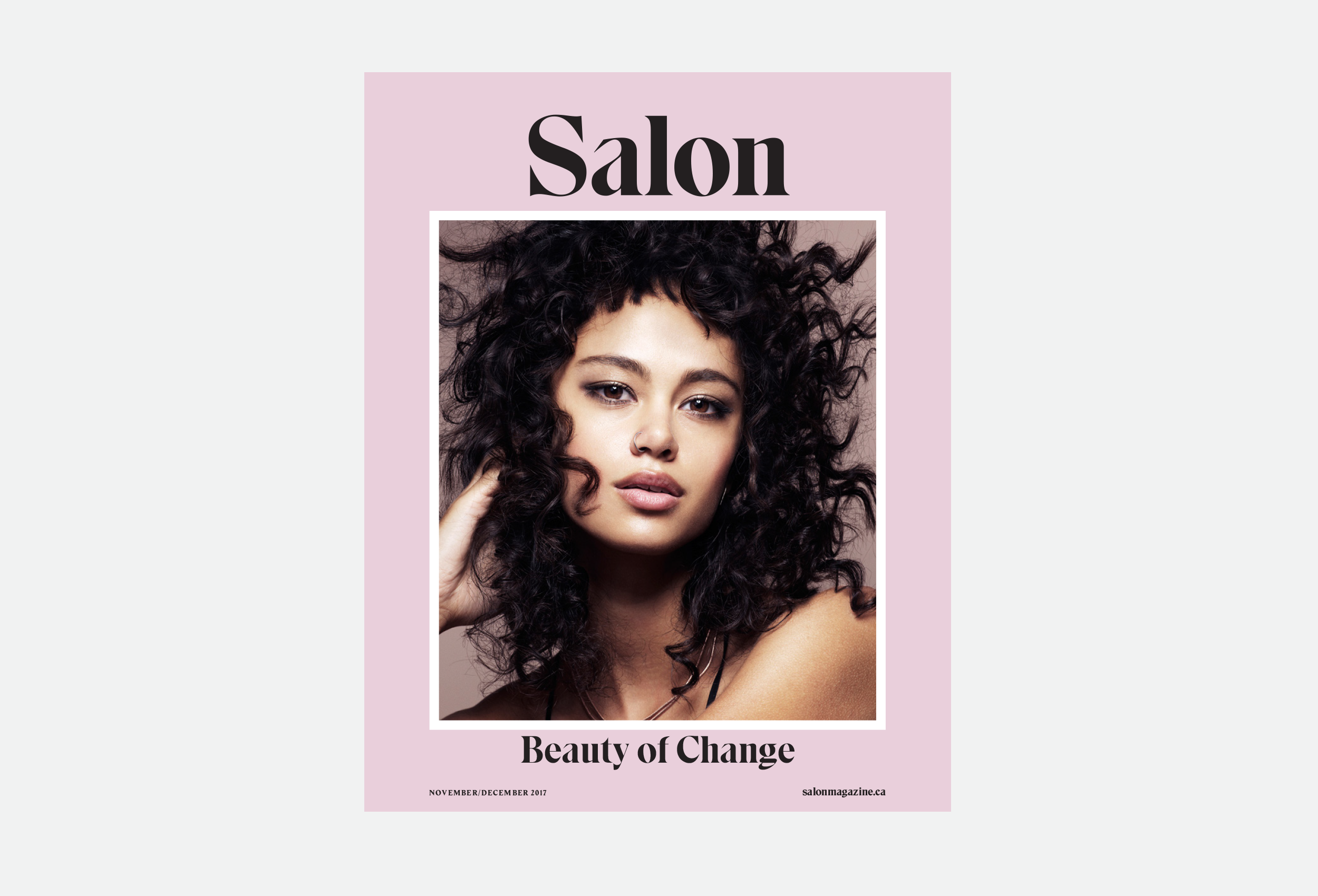
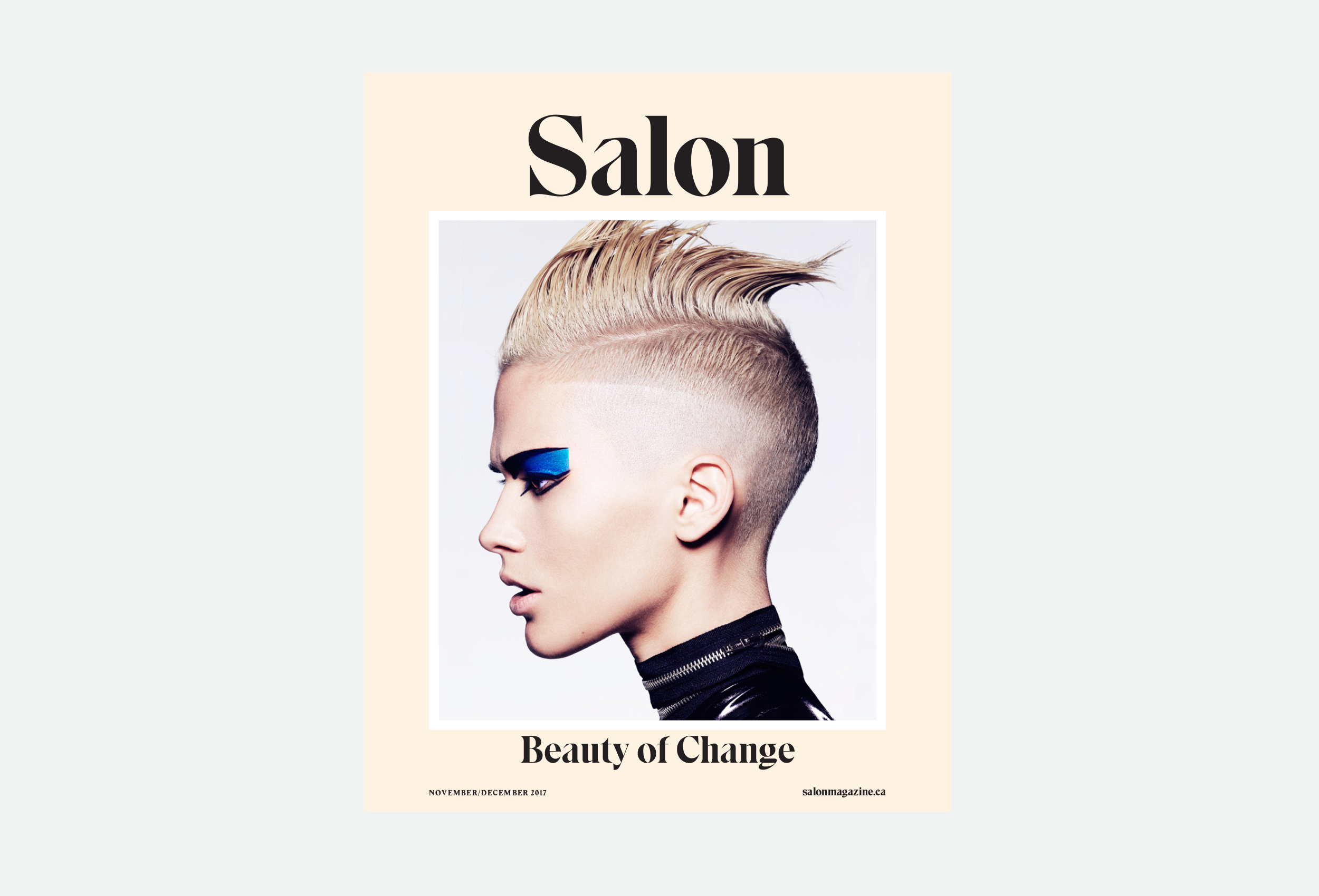
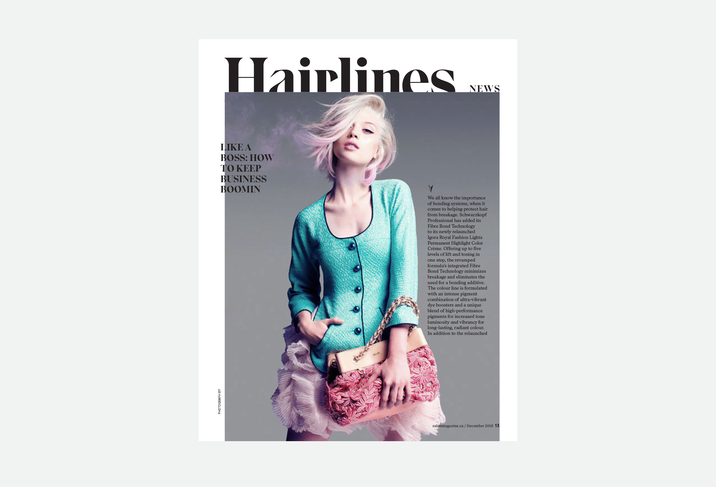
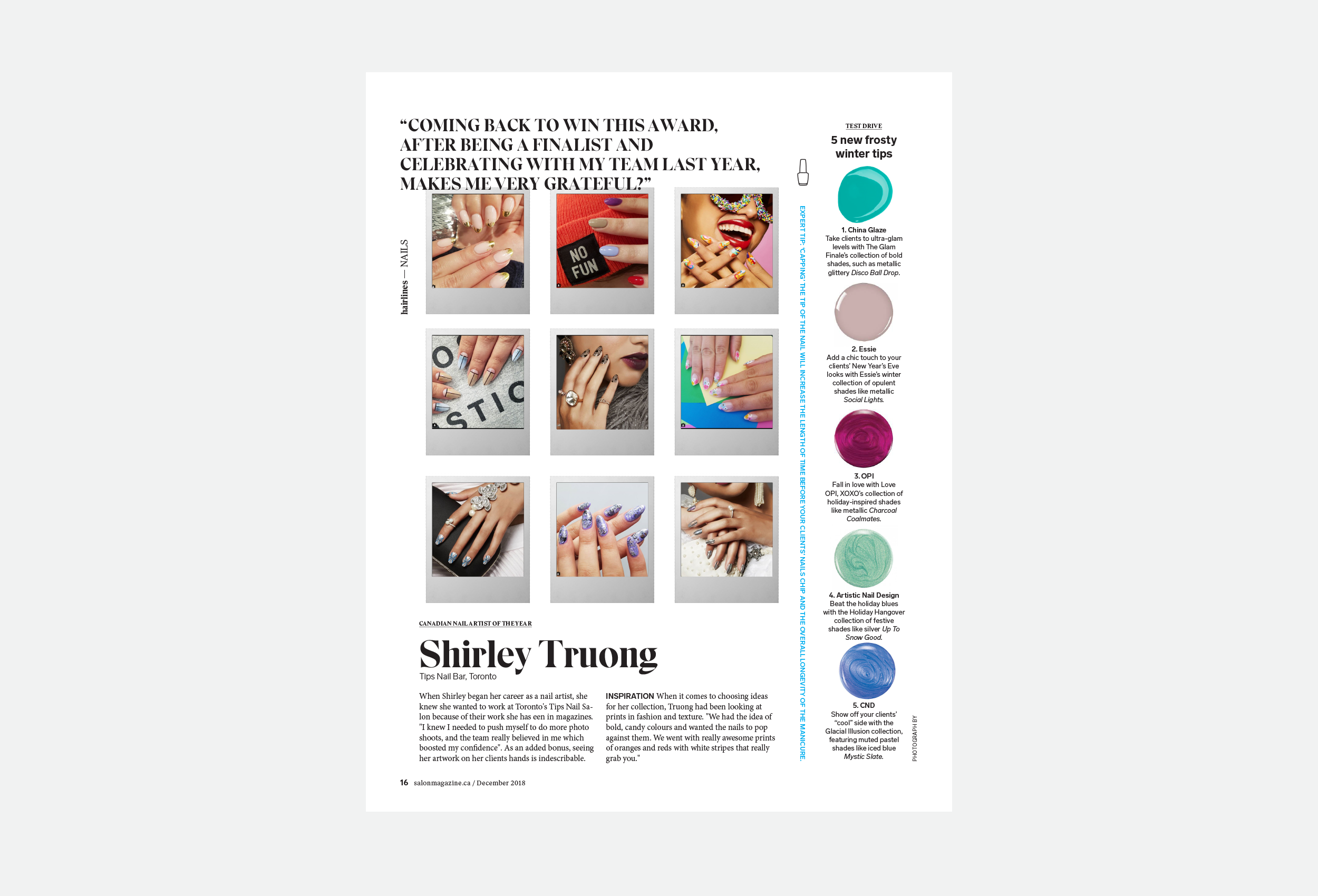
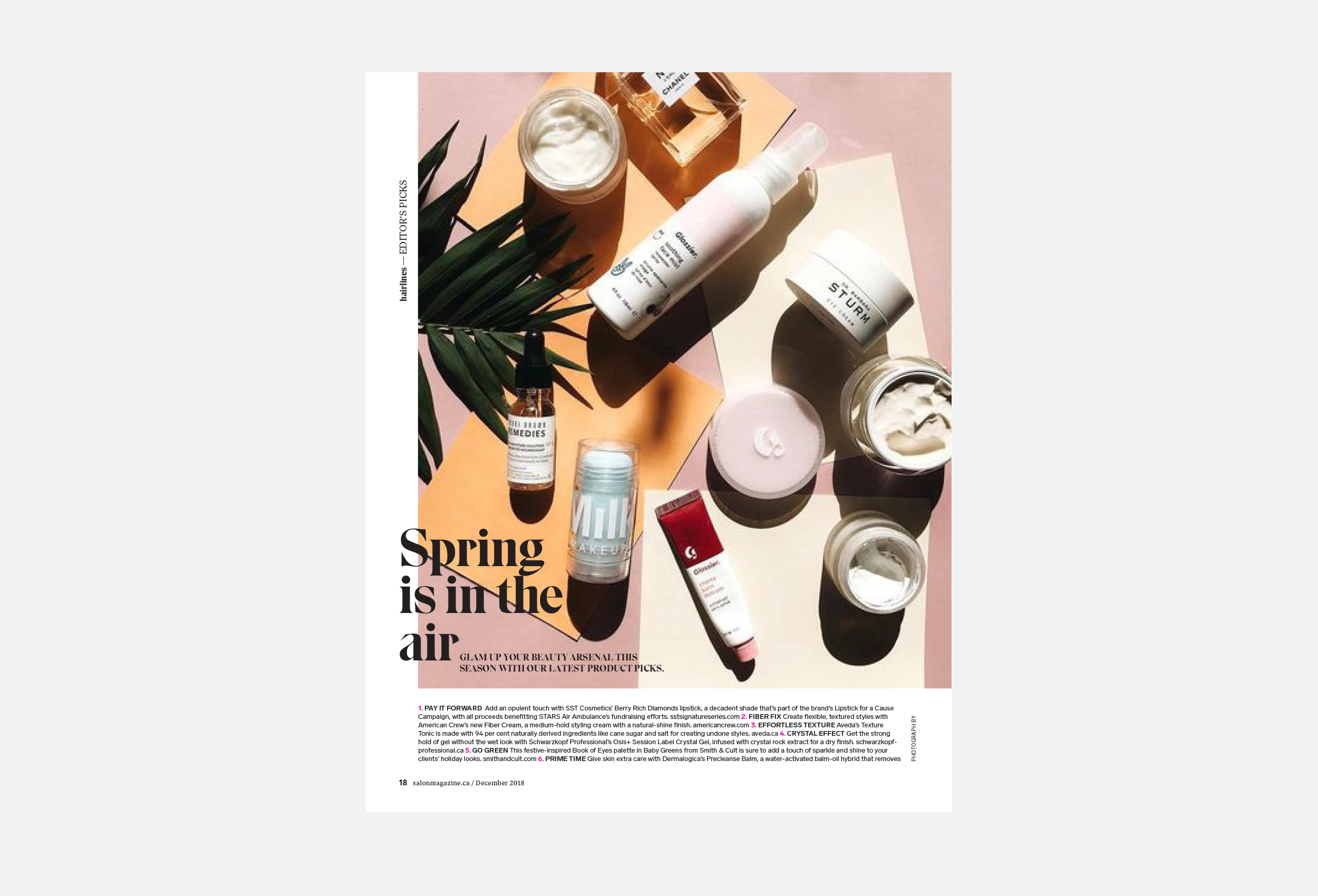
Our friends at BLVD Agency have been working with Salon Communications Inc. on a number of brand growth initiatives this year. They asked us to collaborate on the redesign of Salon Magazine, the most trusted source for salon owners and stylists on the latest trends.
The task was to define, design and template key sections of the publication to be executed by Salon's internal team. The goals were:
- Reposition the magazine visually to be cleaner, fresher, and more sophisticated
- Improve production efficiency by systemizing sections and providing a design toolbox (grid system, hard working typefaces, modular design)
- Build a cover strategy that will work both on and offline
- Re-envision the nameplate
As a primary display typeface, we used Eksell, by Letters from Sweden. It has these sharp, triangular serifs and extreme contrast between the thick and thin strokes. It's an odd letter set, with some really strange characters but a perfect choice for a publication dedicated to tracking often polarizing hair and beauty trends. Eksell is supported by Ivar Text and Lab Grotesque, also by Letters from Sweden.
The goal for the cover was to make a brand statement that was elevated, bolder, and trendy. We worked towards a template that could become immediately recognizable as a Salon cover with or without the nameplate, with or without cover lines. A cover template that can easily adapt over time adapt with an image that encapsulates exactly what's happening in the industry at the very moment the issue is published. The cover mechanisms—textured typography, a coloured background, a framed image—can all be repeated inside and in their marketing collateral, acting as extensions of the brand.
Salon's internal design team was supplied with consistent navigation, section openers, and key page templates, all built on a basic 12-column grid for it's versatility. They were given a toolkit of type styles, templates, colour and icon options, which they will continue to build on as the magazine, and the brand, evolve.
