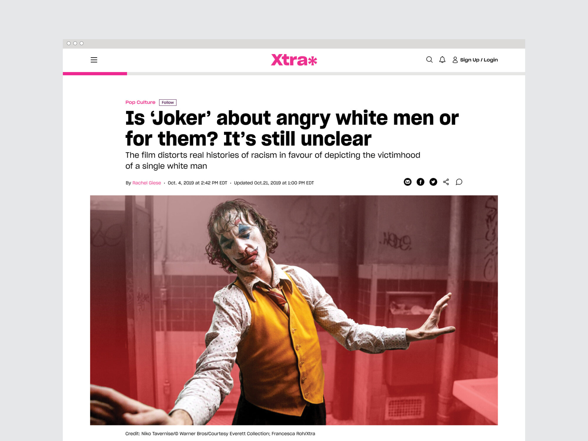
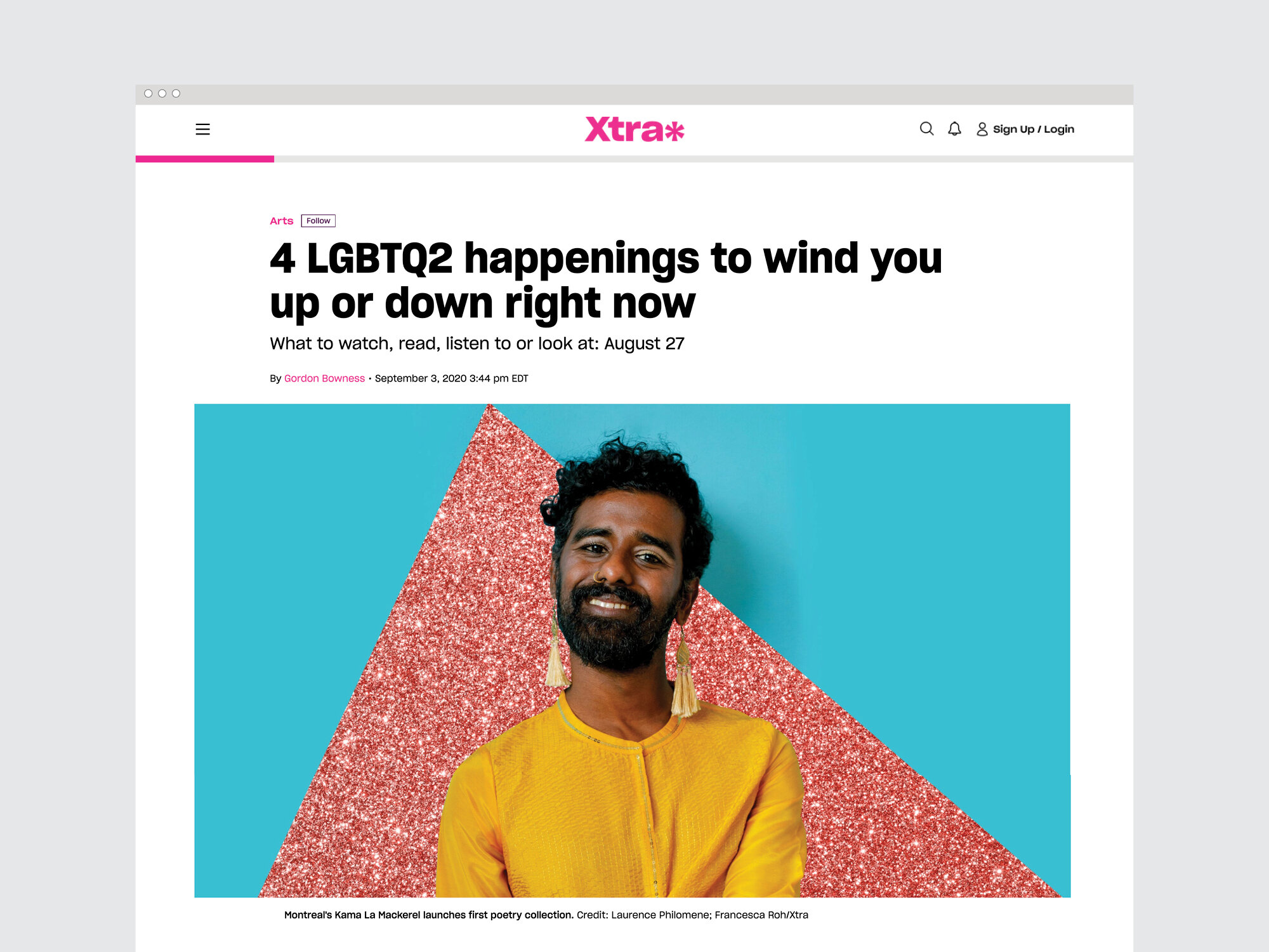
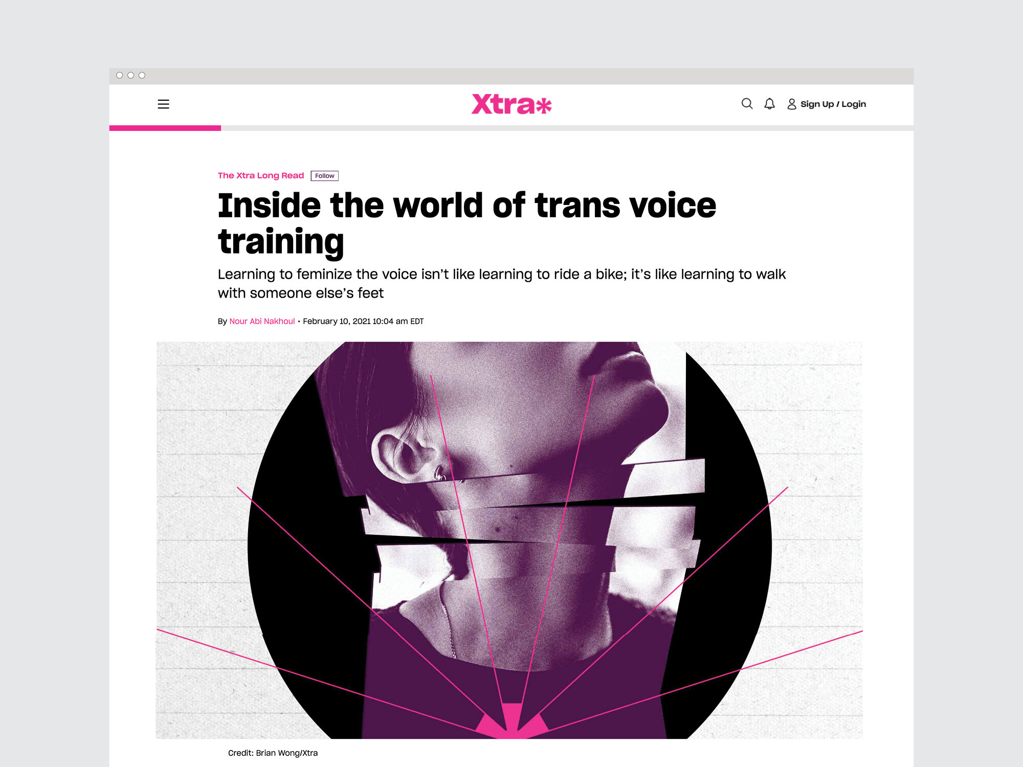
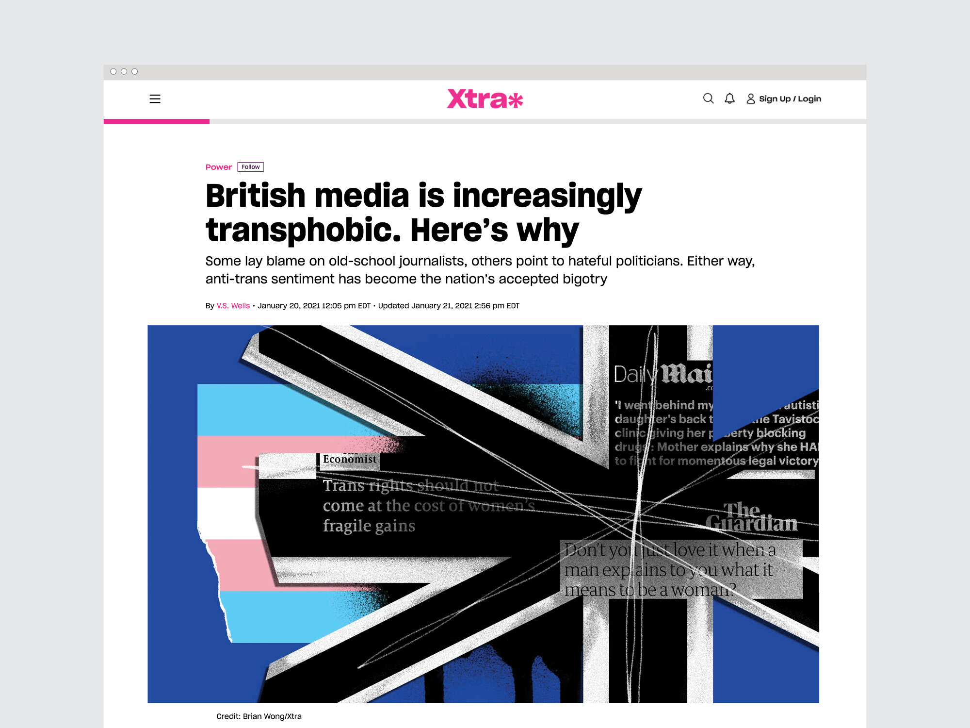
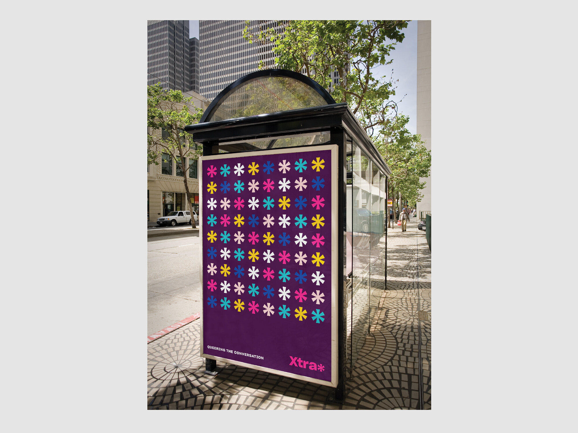
Xtra is an online magazine and community platform covering LGBTQ2S culture, politics and health that launched in 1984 as a local, free lesbian and gay newspaper in Toronto. Inspired by its activist past and back issues of its printed history, we developed a look that was loud & proud and reflective of the communities it represents.
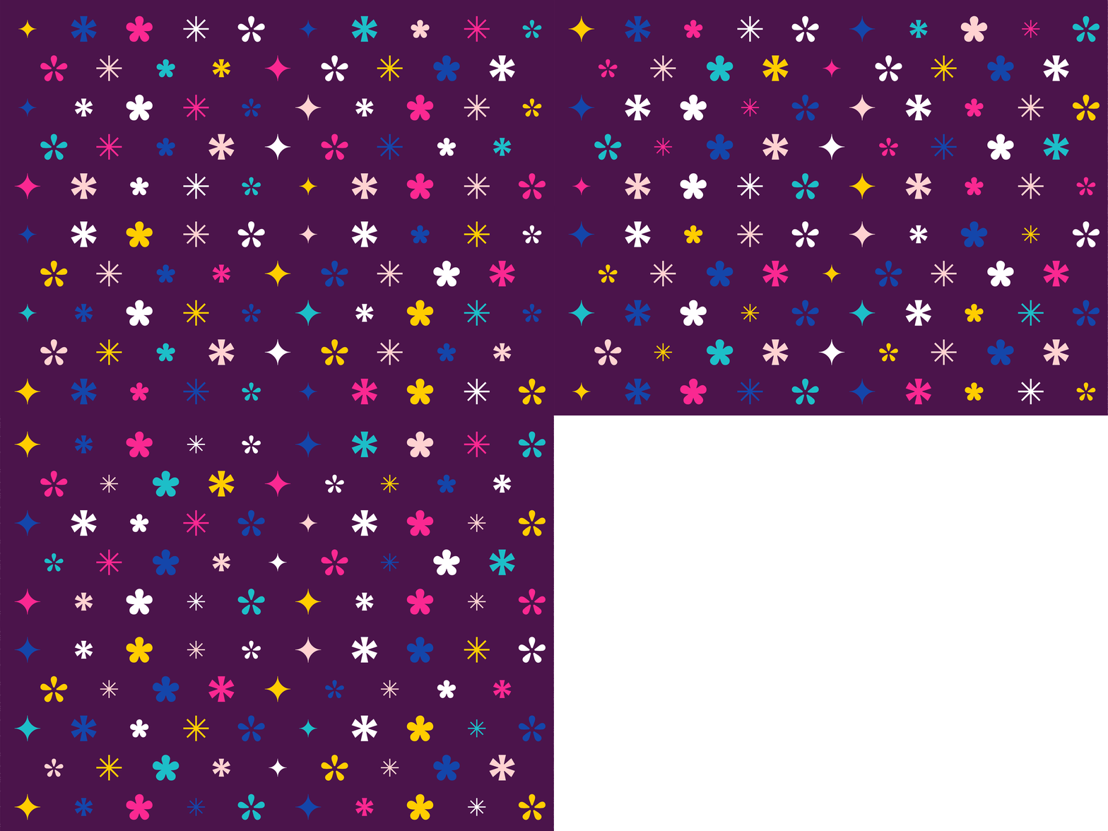
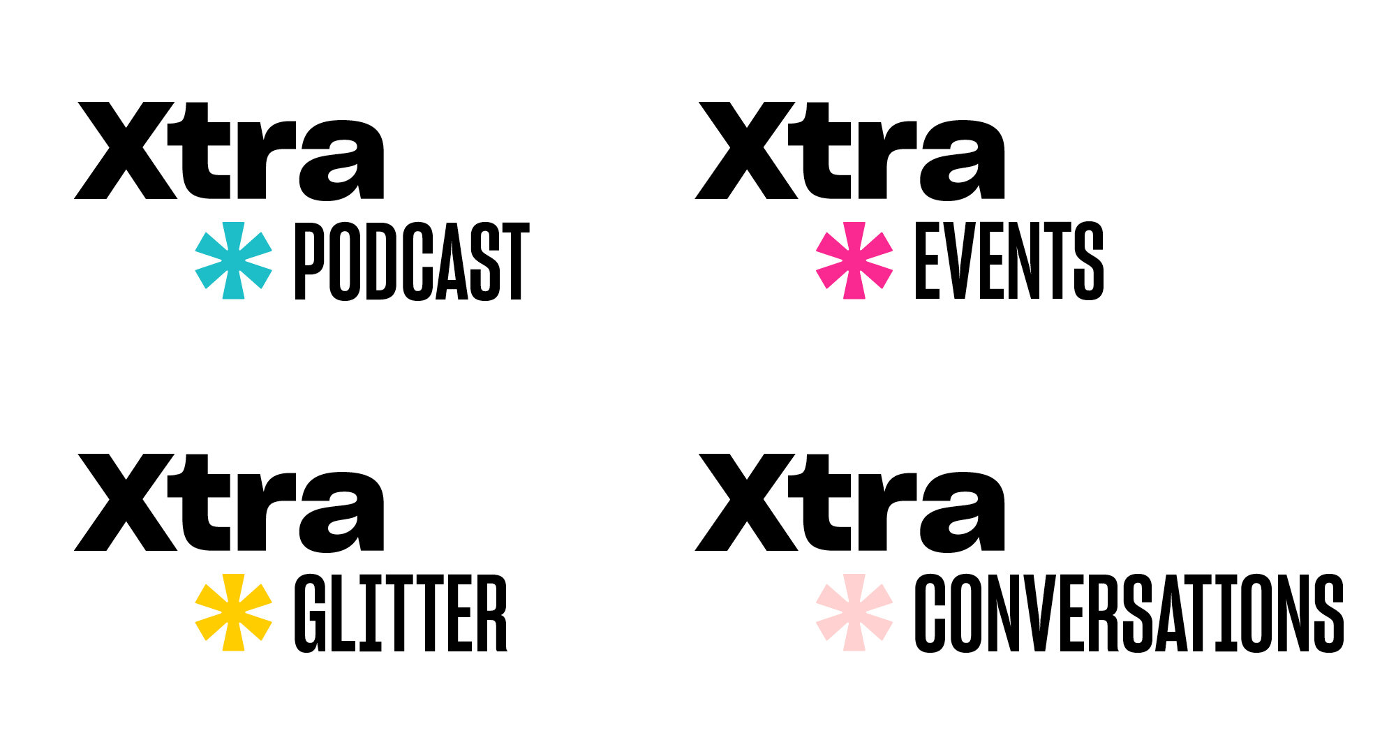
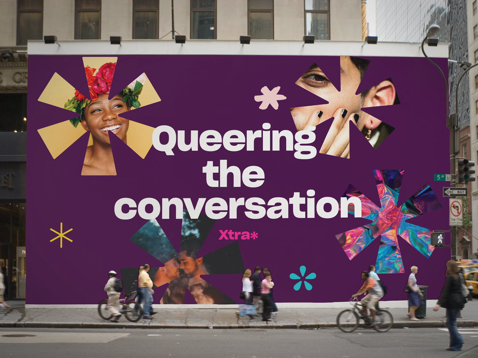
The website and brand redesign is fresh and modern with lots of playful elements. At the core of Xtra’s new look is the asterisk — a symbol normally used to indicate an omission or a footnote. By reclaiming the power of the asterisk, Xtra says, “We will not be left out or pushed to the bottom of the page — our stories matter.”
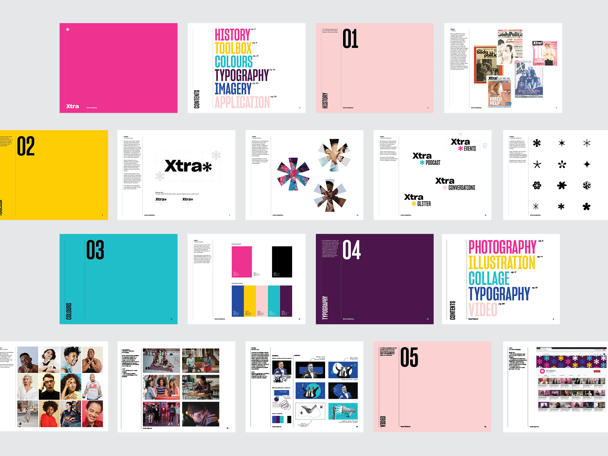
As part of the editorial strategy moving forward, we developed an extensive visual playbook that provides an overview of how to use the new look. The book illustrates different story types with direction for artwork that pairs with content to strike the right tone, from loud and playful at times to serious and reserved.
Studio Wyse took us down dozens of wonderful rabbit holes in their research—including a fascinating discussion about whether fonts have genders—and dug deeply into our activist, DIY past for design inspiration. They made mood boards of the covers of back issues of The Body Politic and Xtra, pictures of our old hot pink newspaper boxes, 1980s AIDS activism posters and 1990s queer zines. They introduced us to the work of some fabulous LGBTQ2S+ photographers and illustrators, with an emphasis on the work of racialized artists, to support our vision of showcasing more images of members of our communities throughout our site. The resulting look is modern, elegant and easy to navigate, but with lots of playful elements and surprises.
rachel giese, editorial director, xtra magazine
