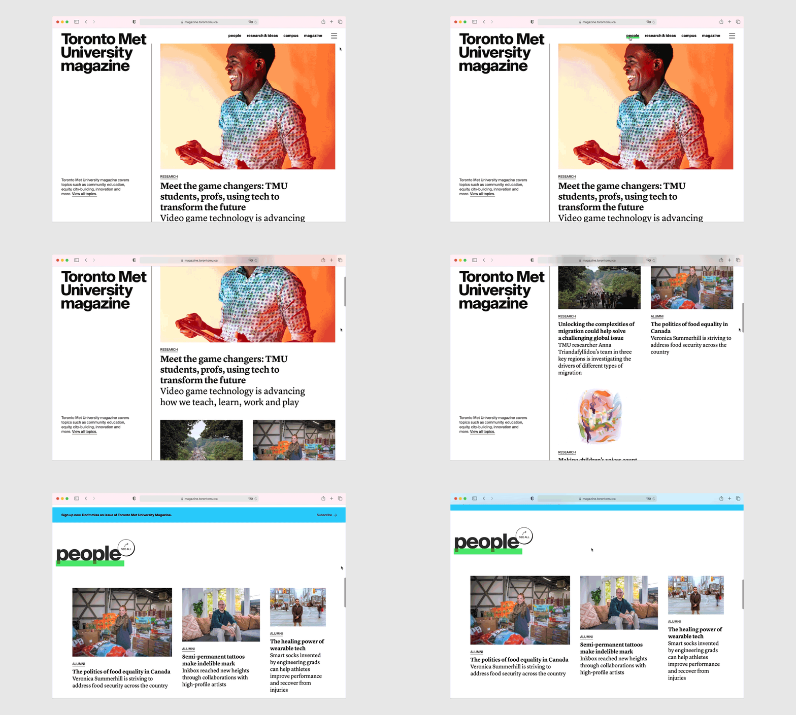
Toronto Metropolitan University magazine has a new website! It keeps alumni informed and engaged while sharing stories about the impact the university and its alumni have locally, nationally and globally. We were tasked with designing a site that's bold, contemporary and compelling, while reflecting the university as relevant, diverse and courageous. We kept the overall design clean and organized, and added fun touches of colour and interactivity to engage users.
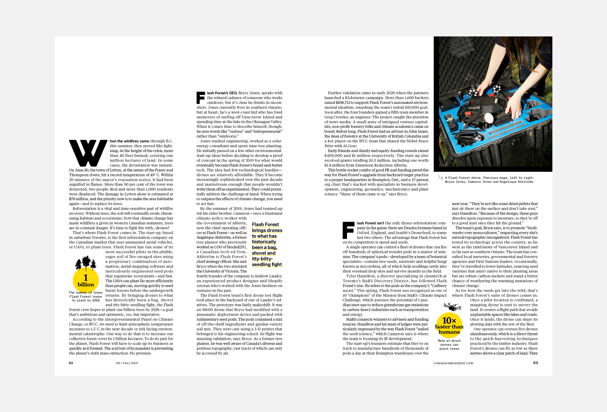
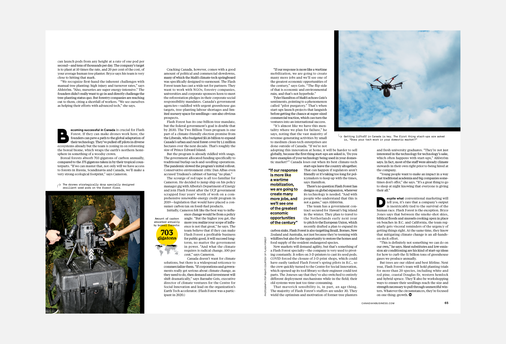
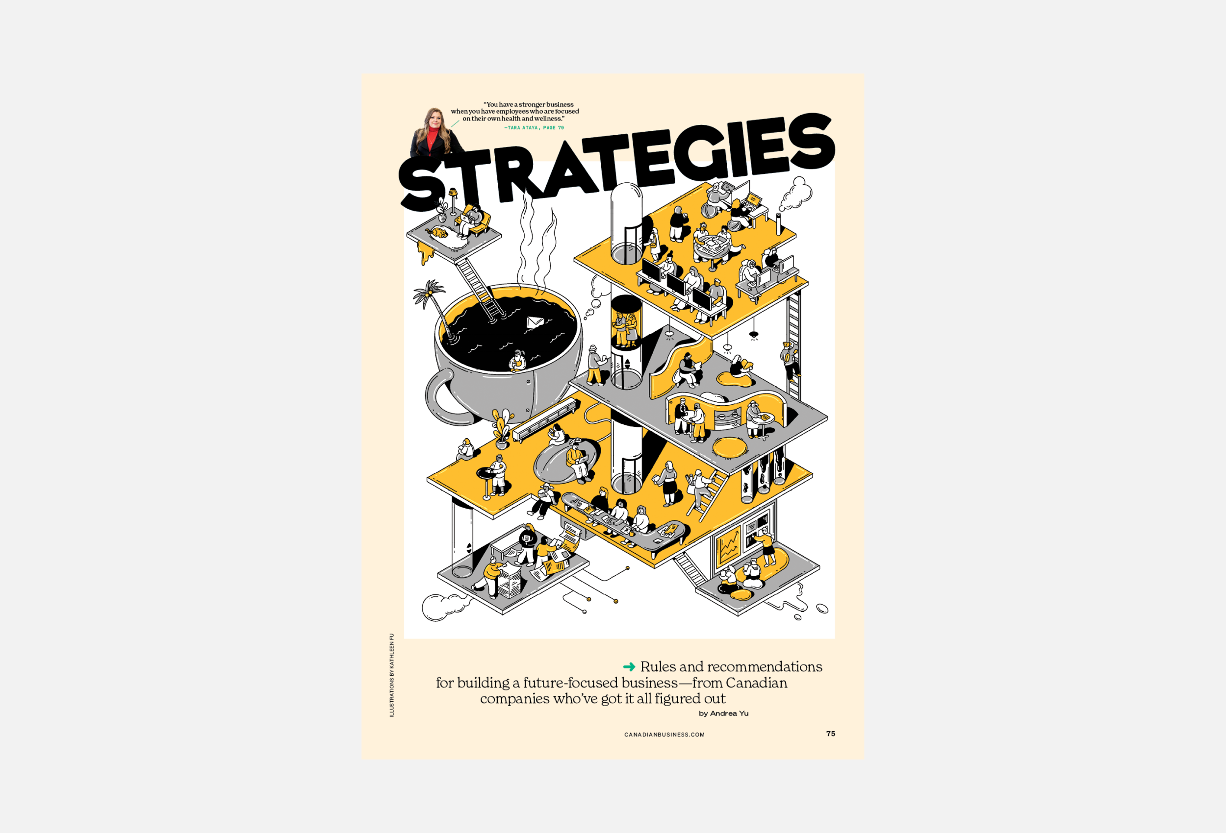
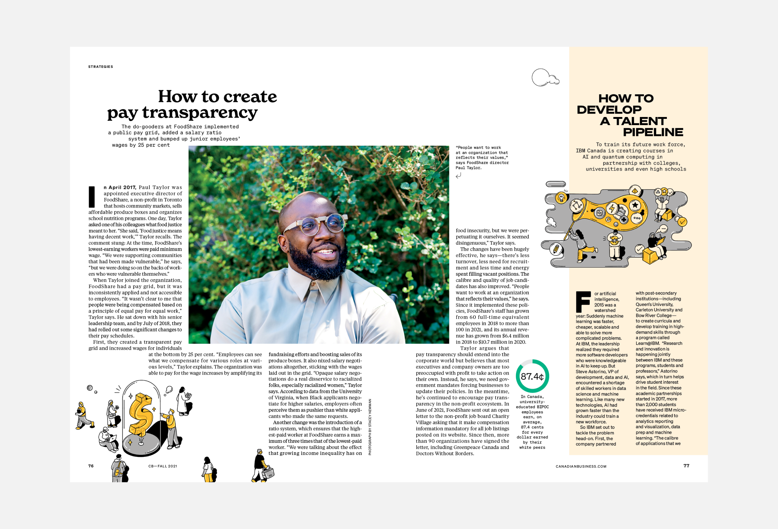
Canadian Business Redesign
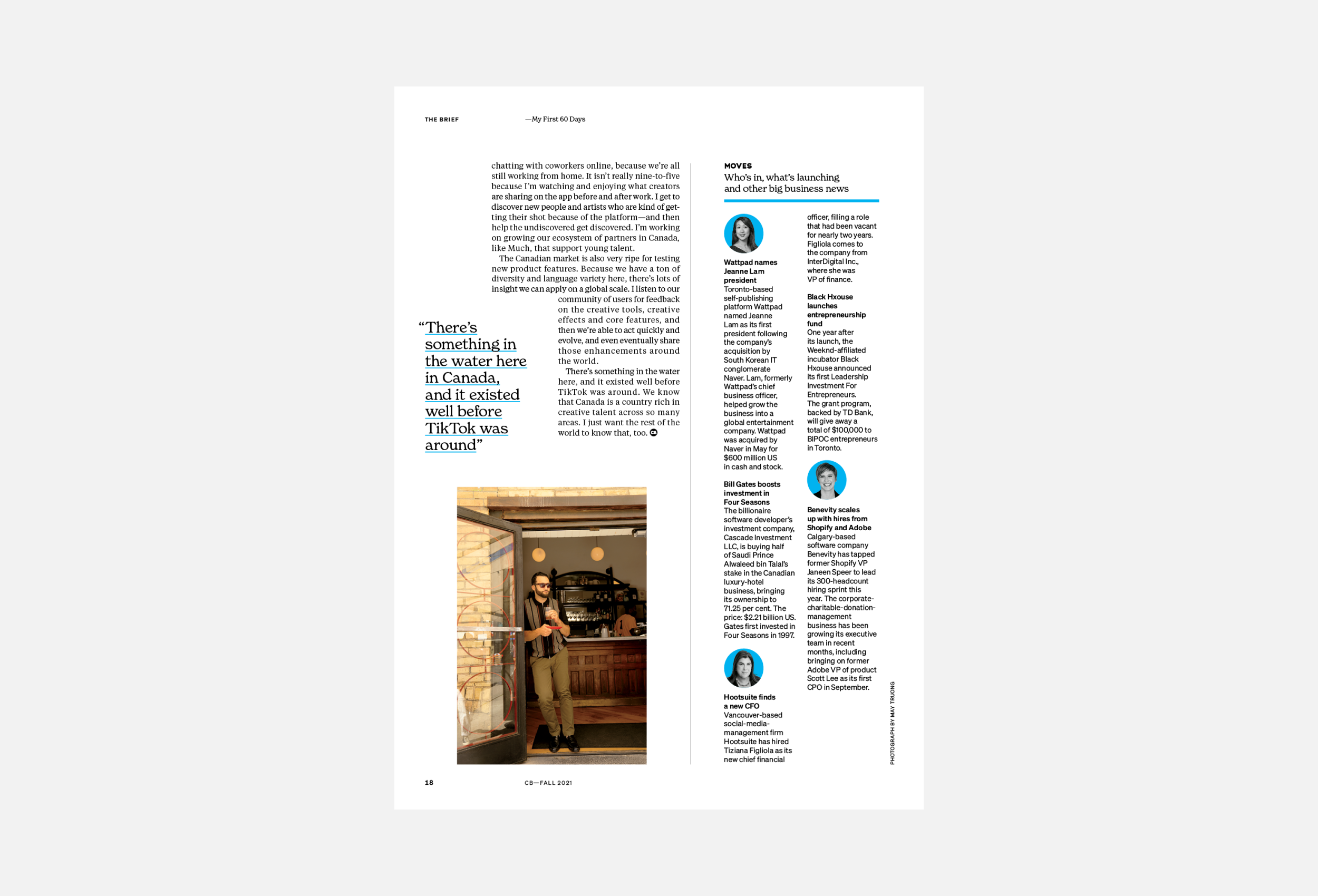
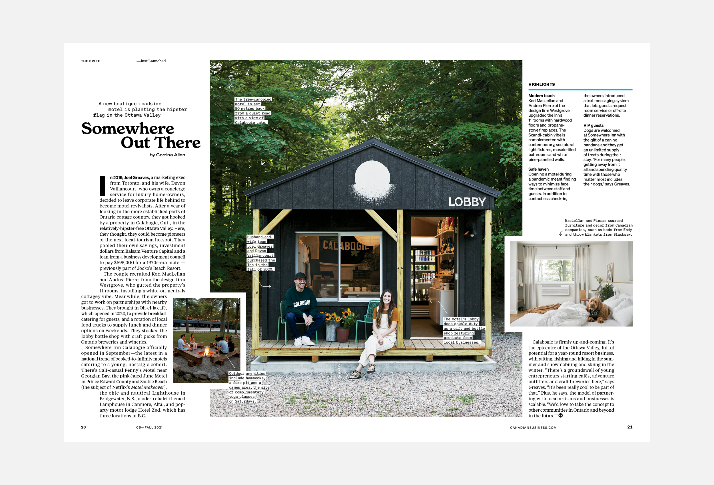
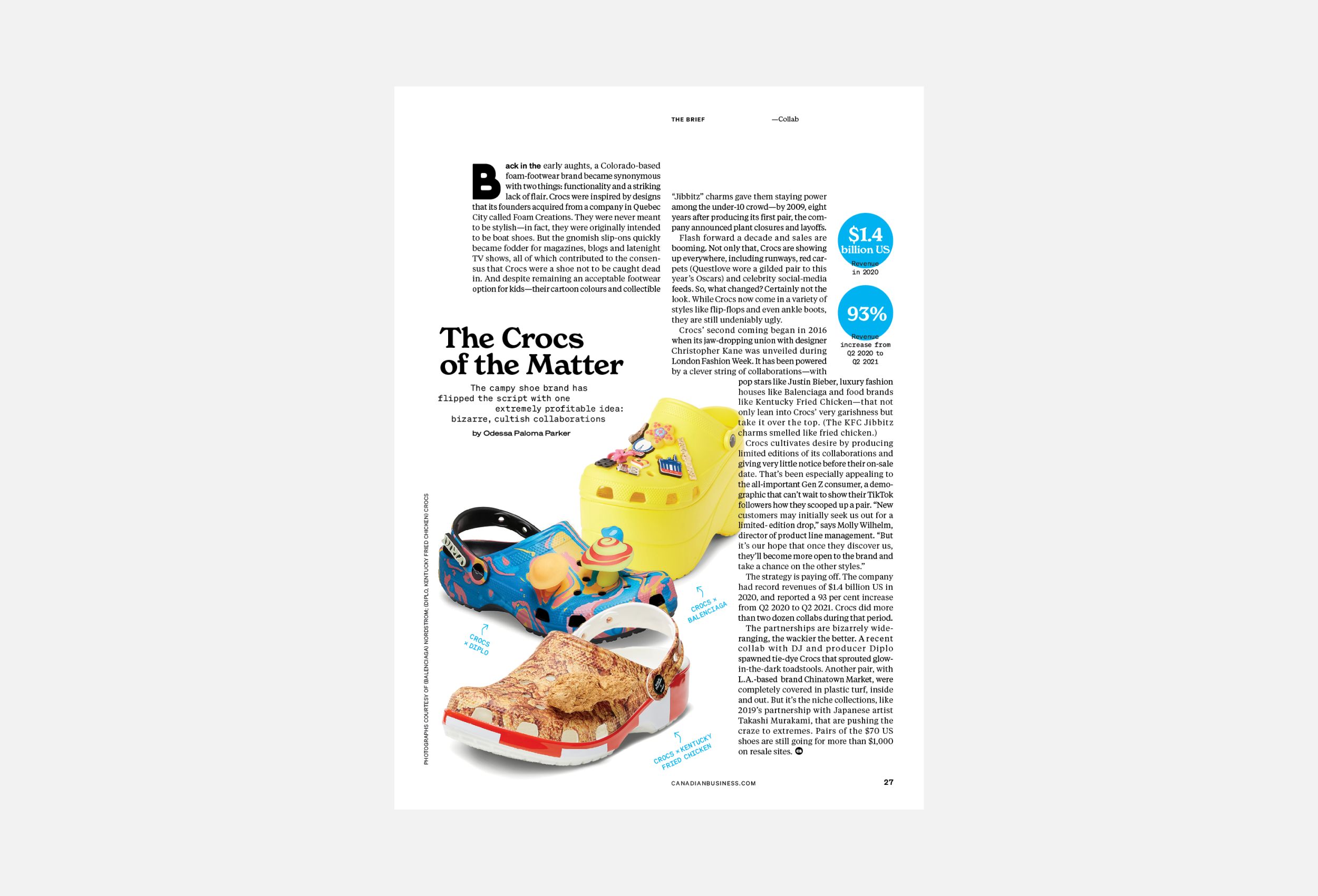
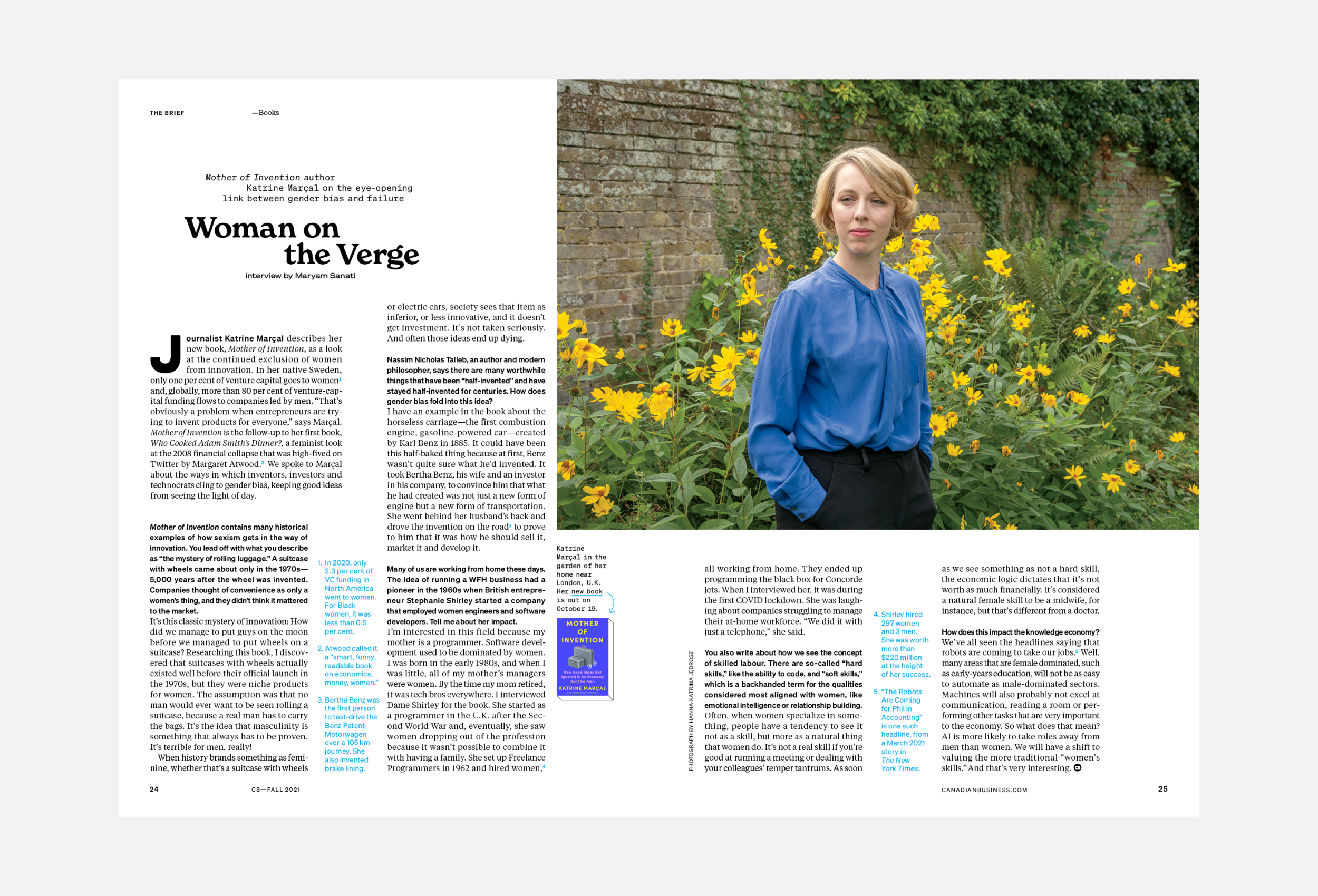
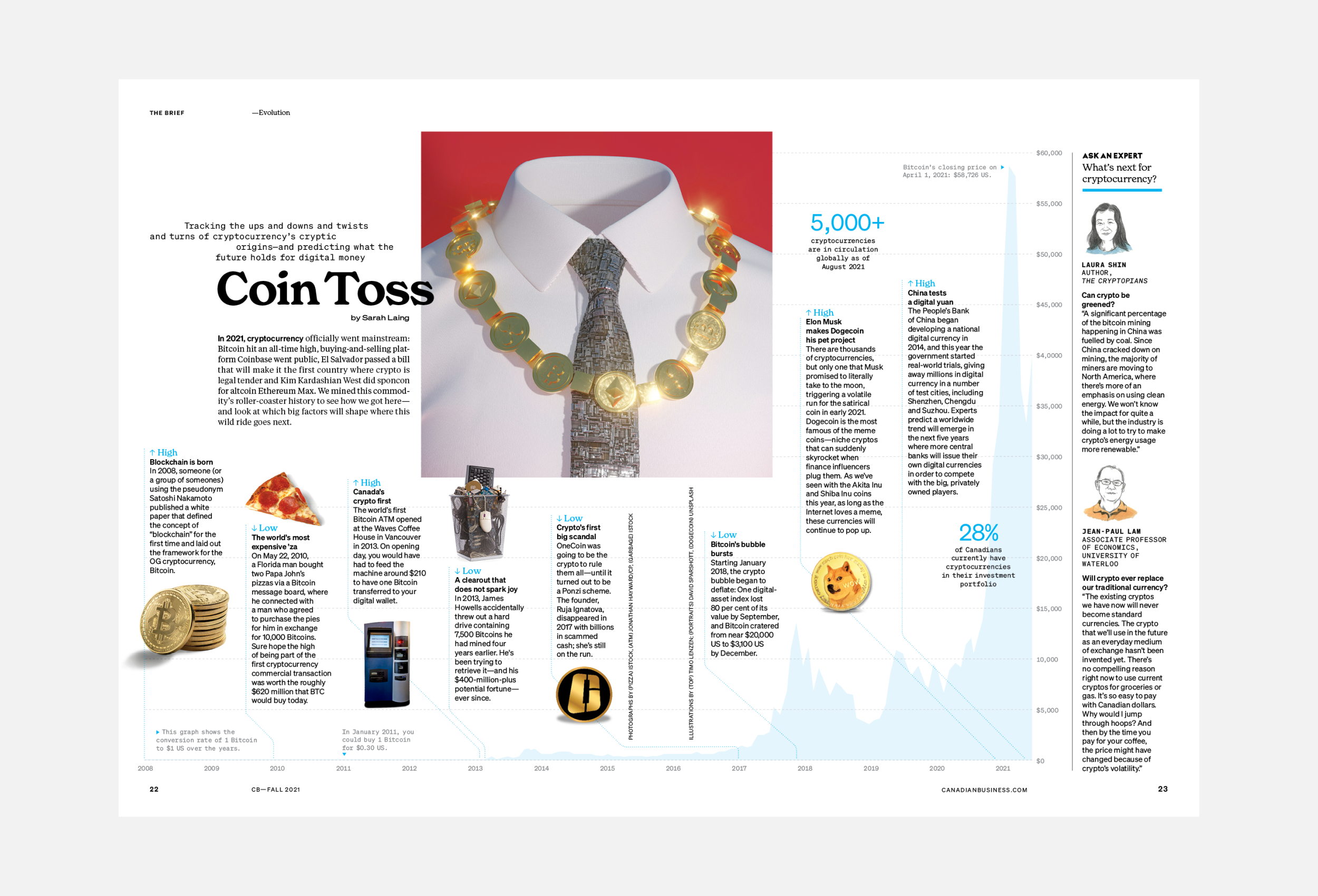
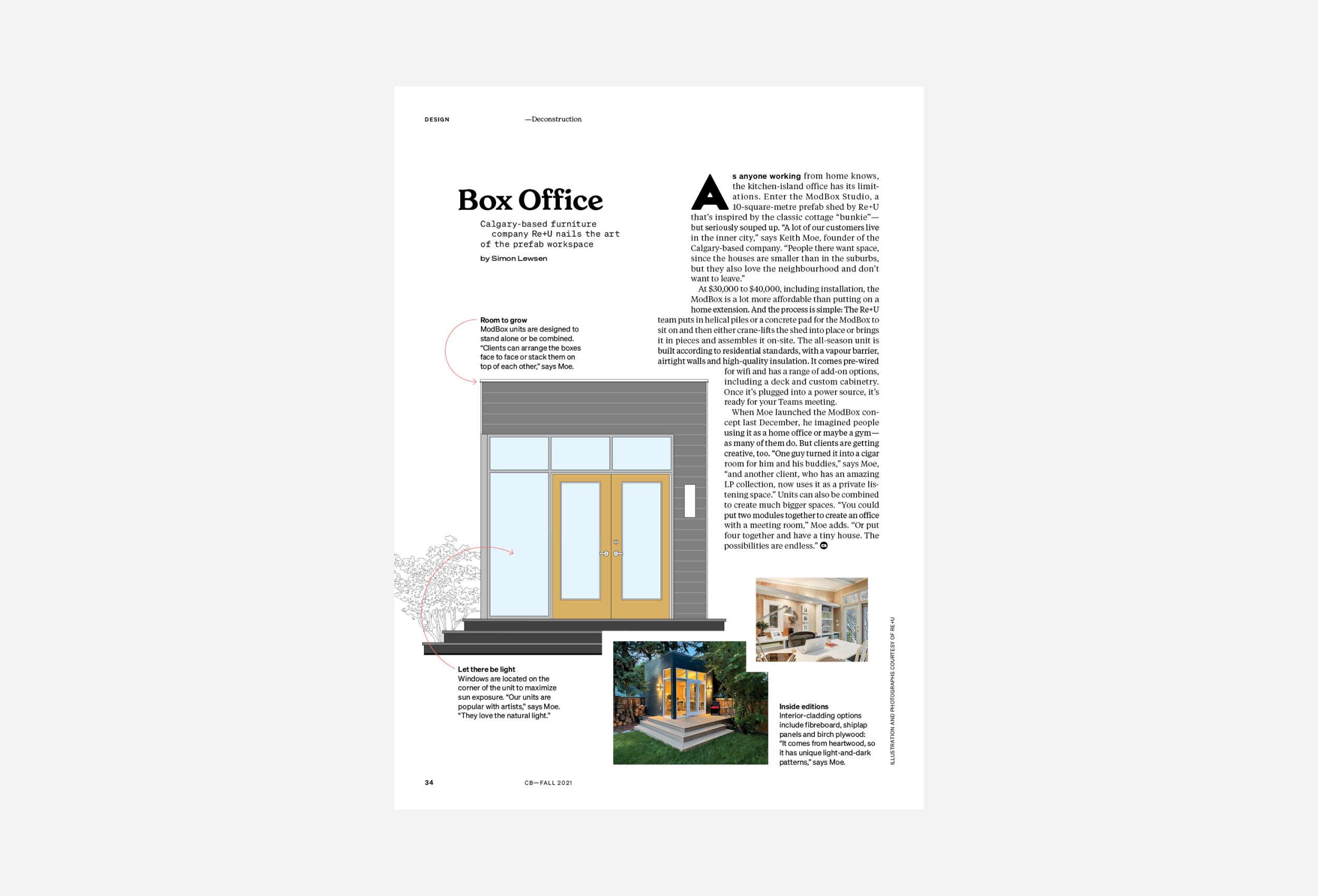
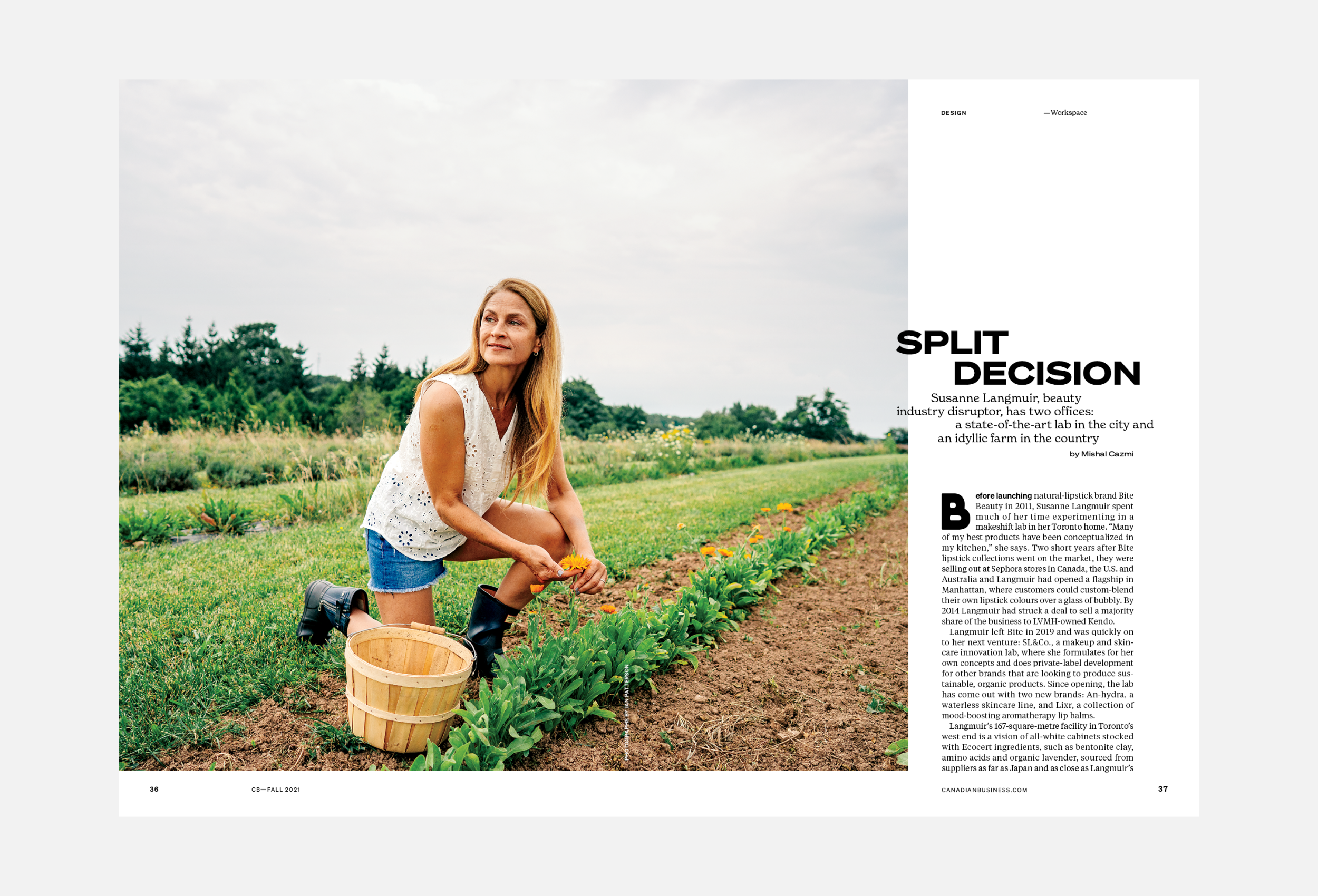
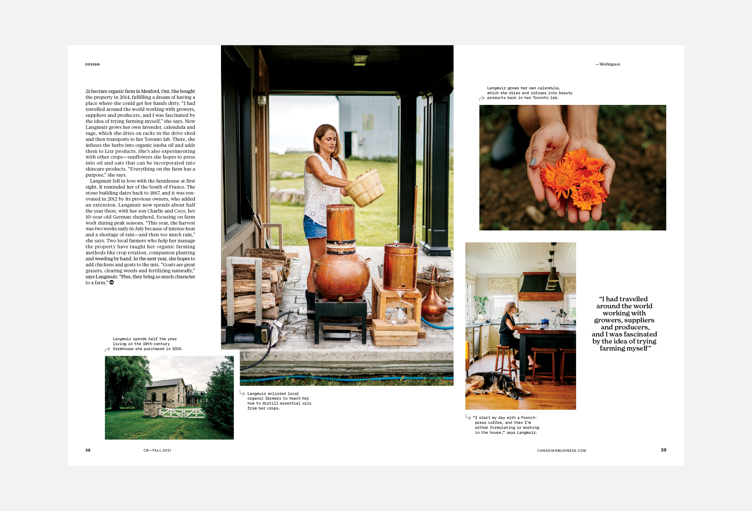
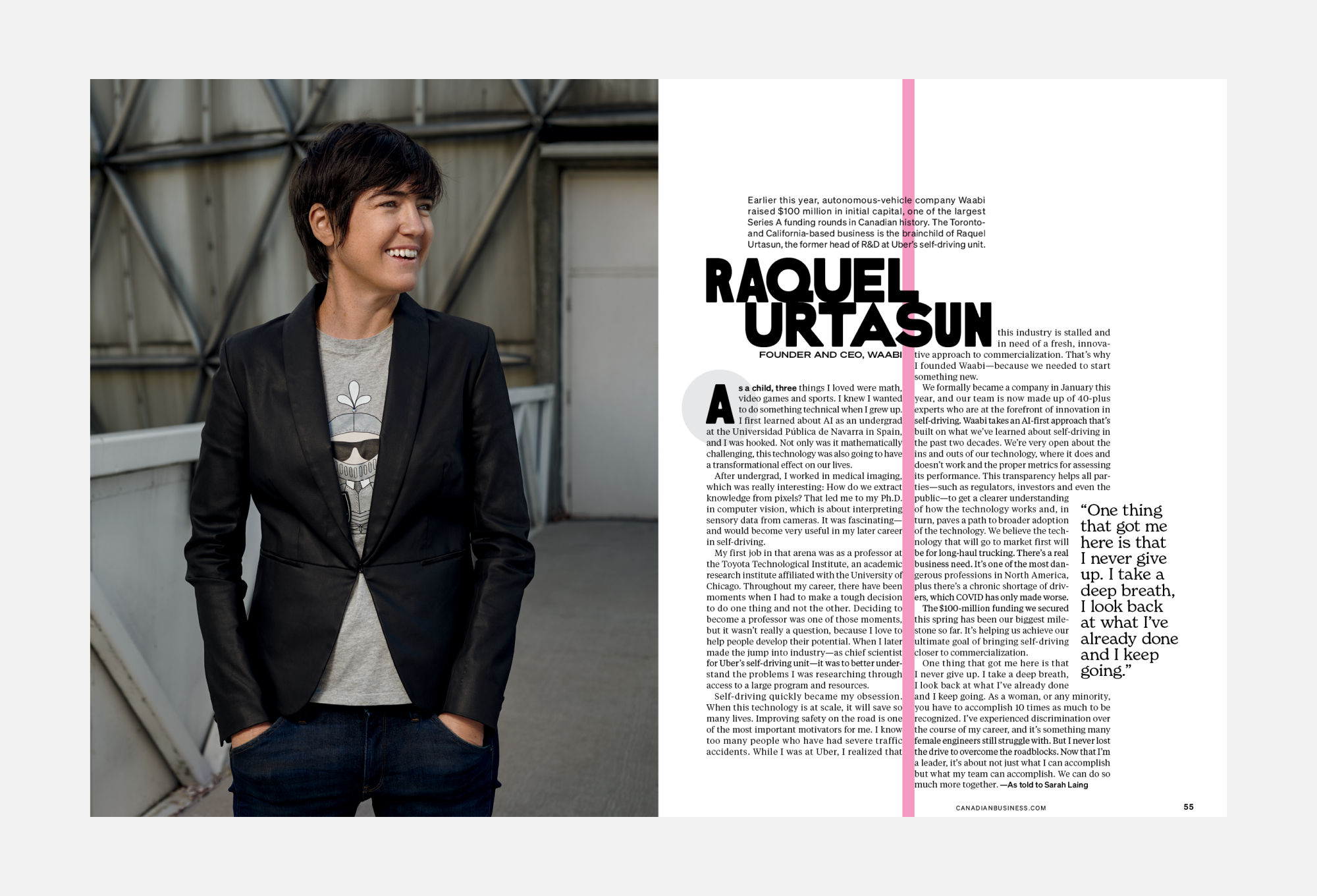
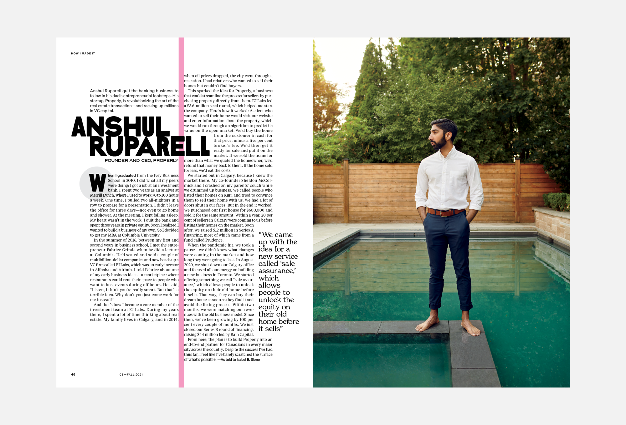
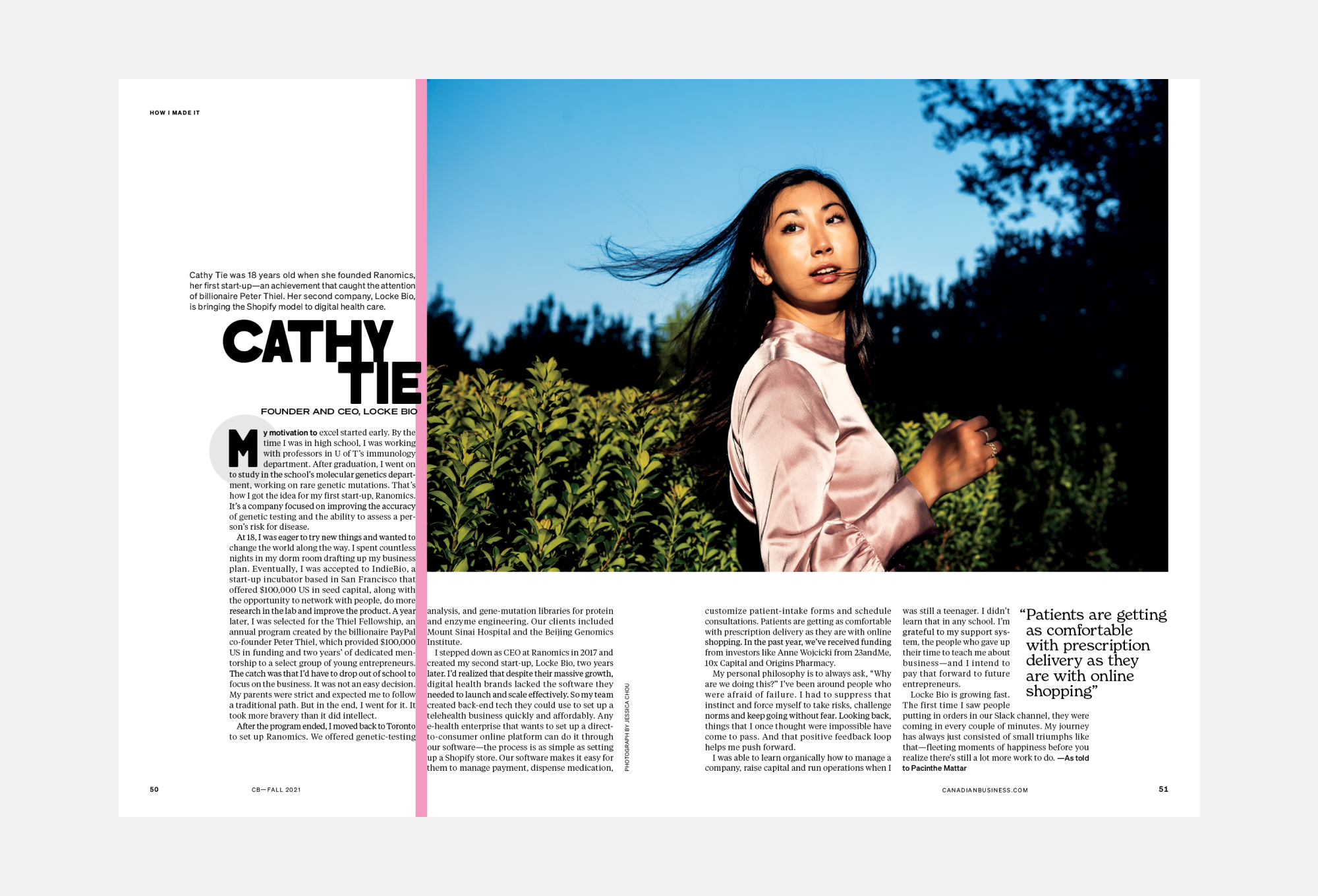
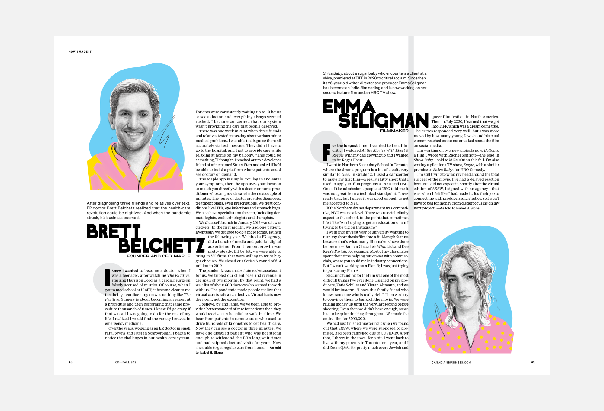
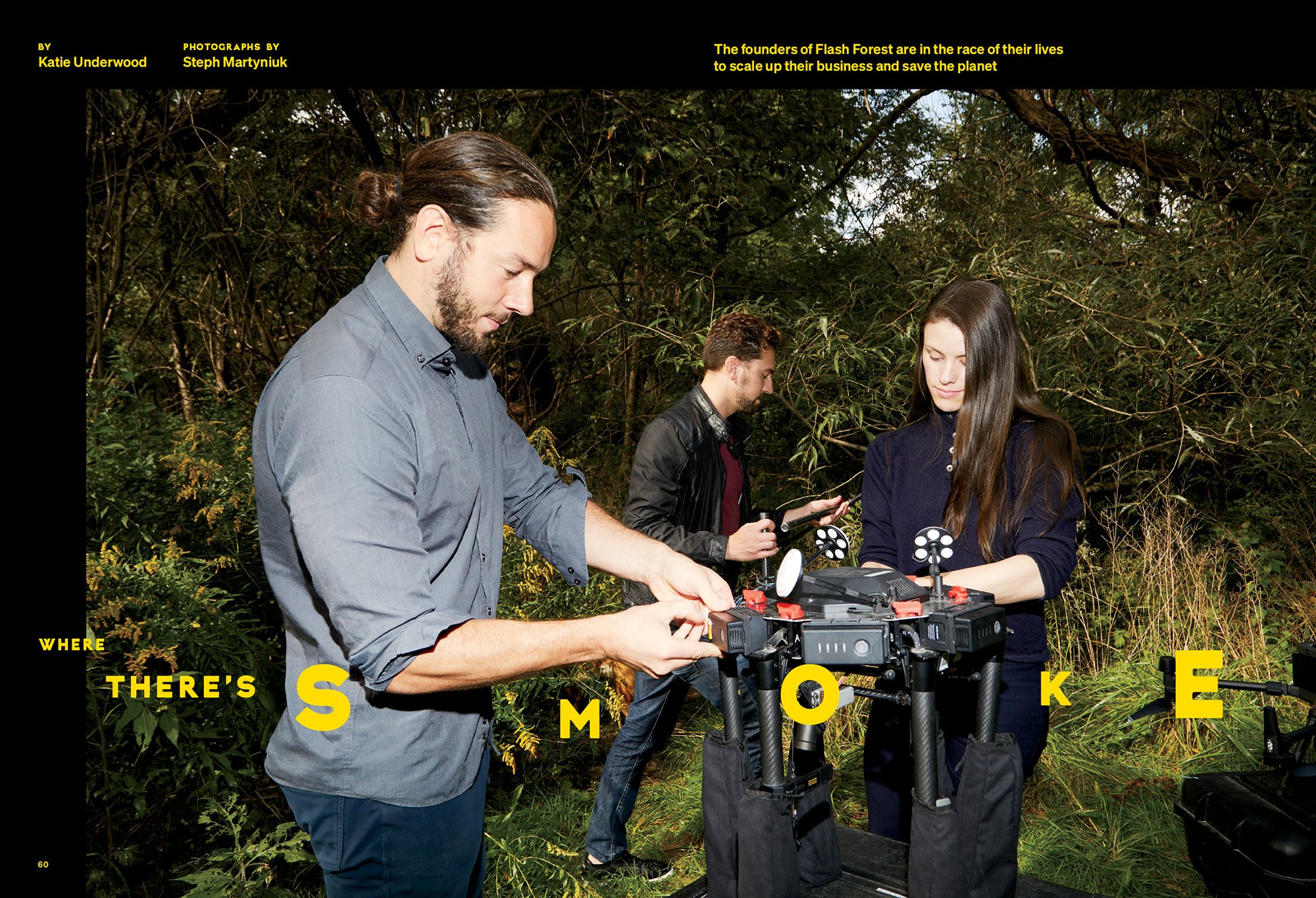
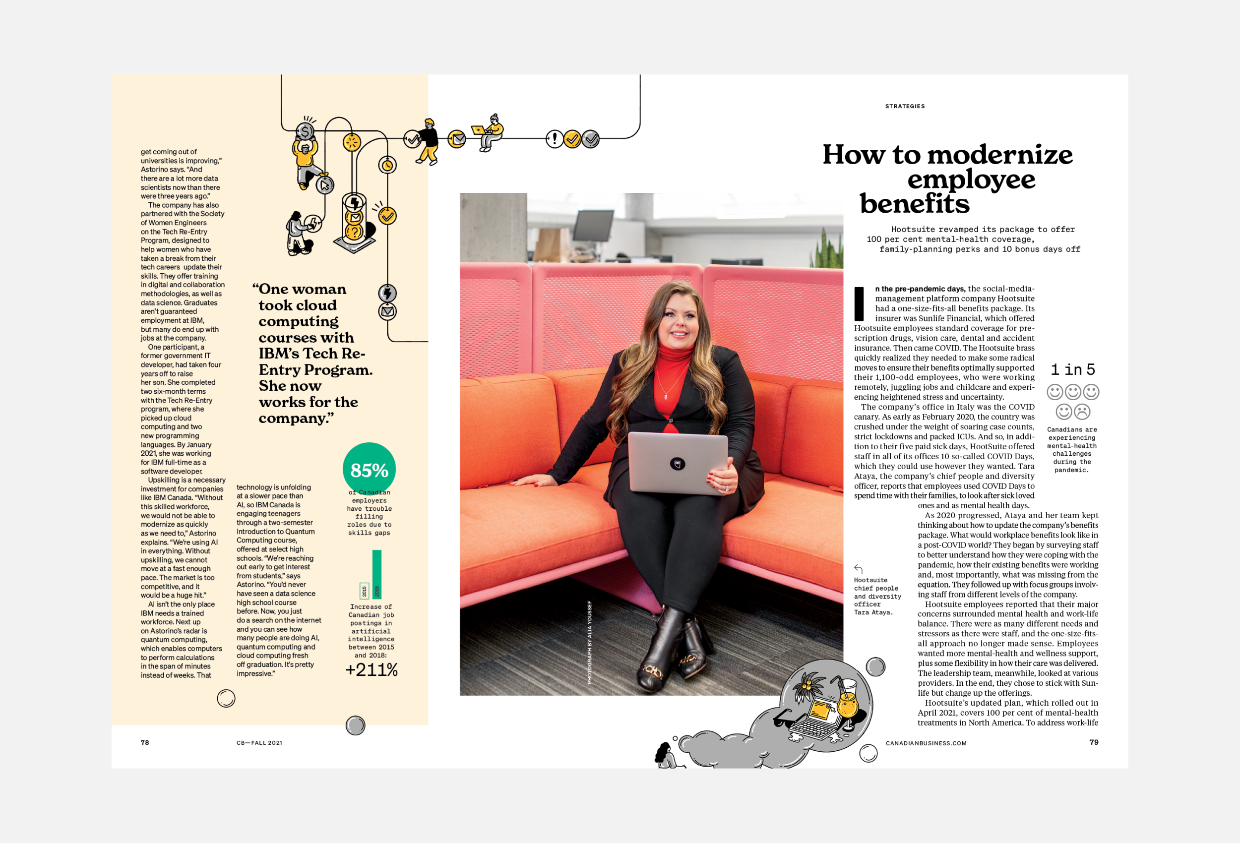
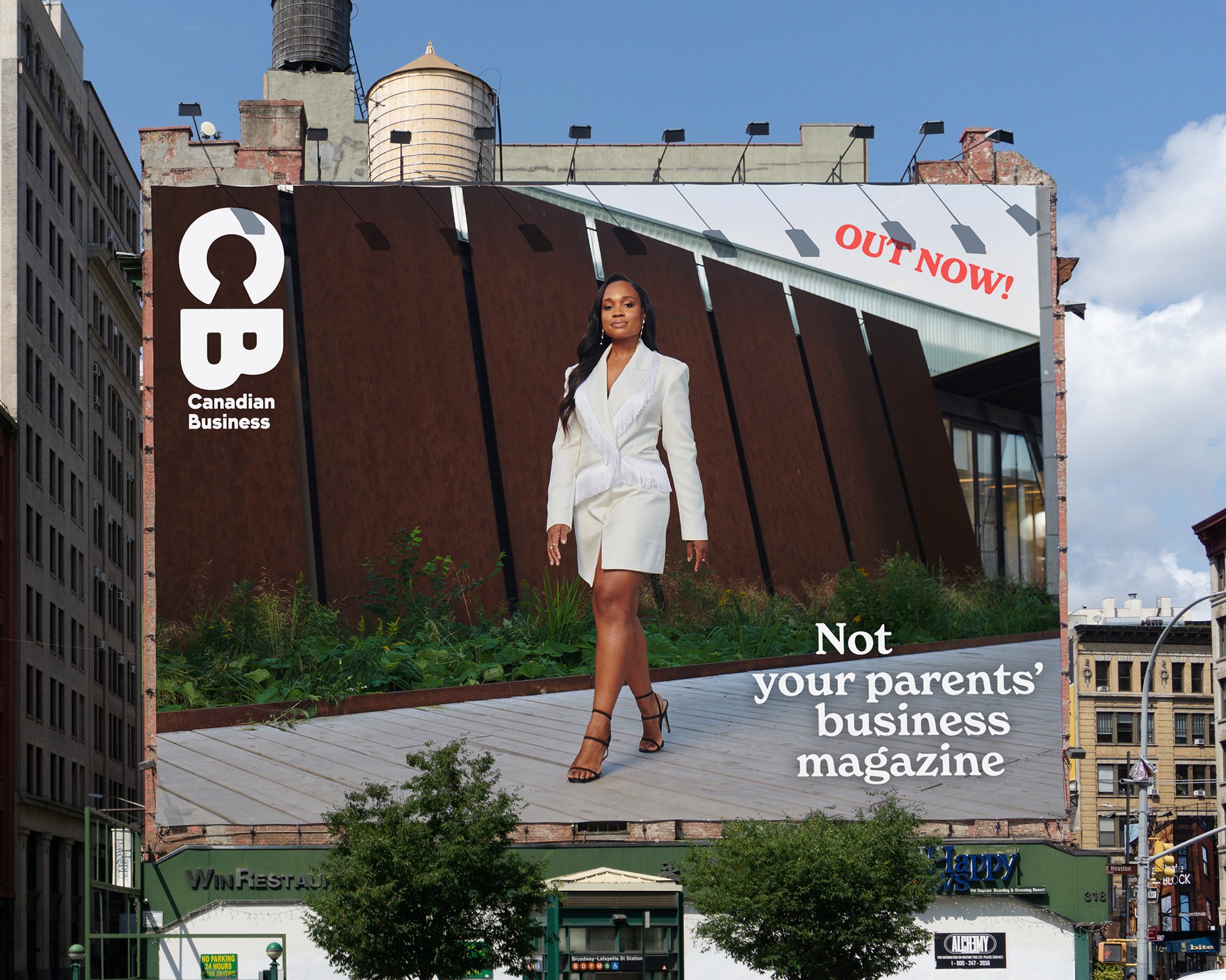
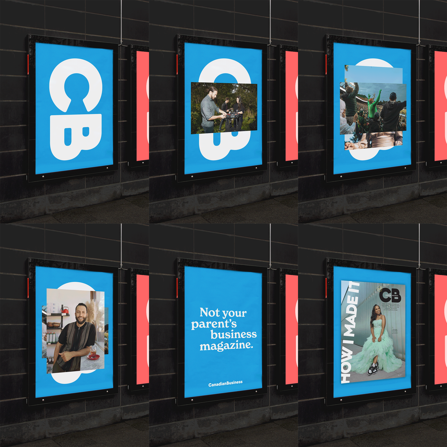
Founded in 1928, CB is a valued destination for business journalism, profiling and connecting innovators who are changing Canada for the better. We were tasked with rethinking every aspect of the magazine to reflect a more modern approach to business—one that is more diverse, less stuffy and a lot more fun.
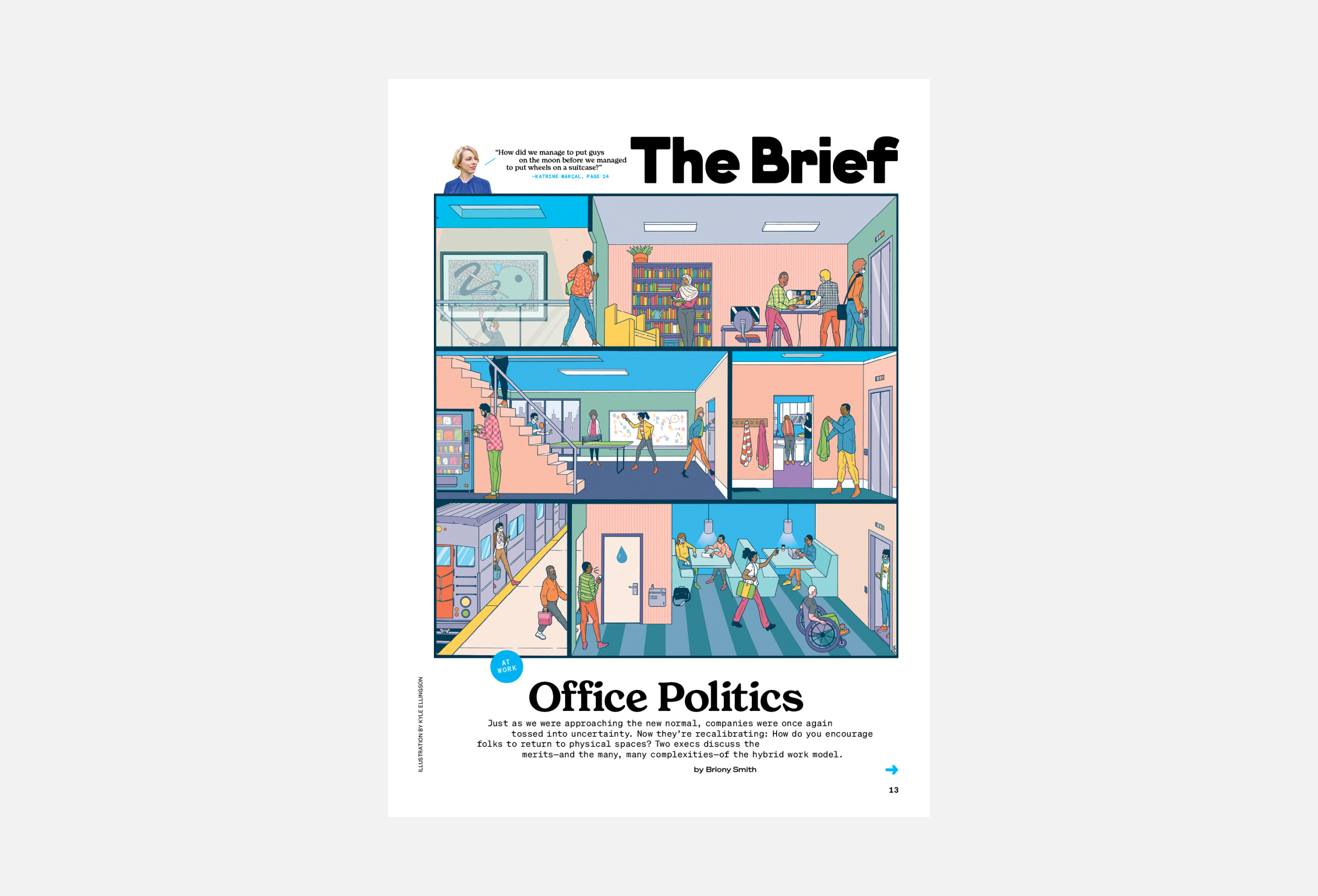
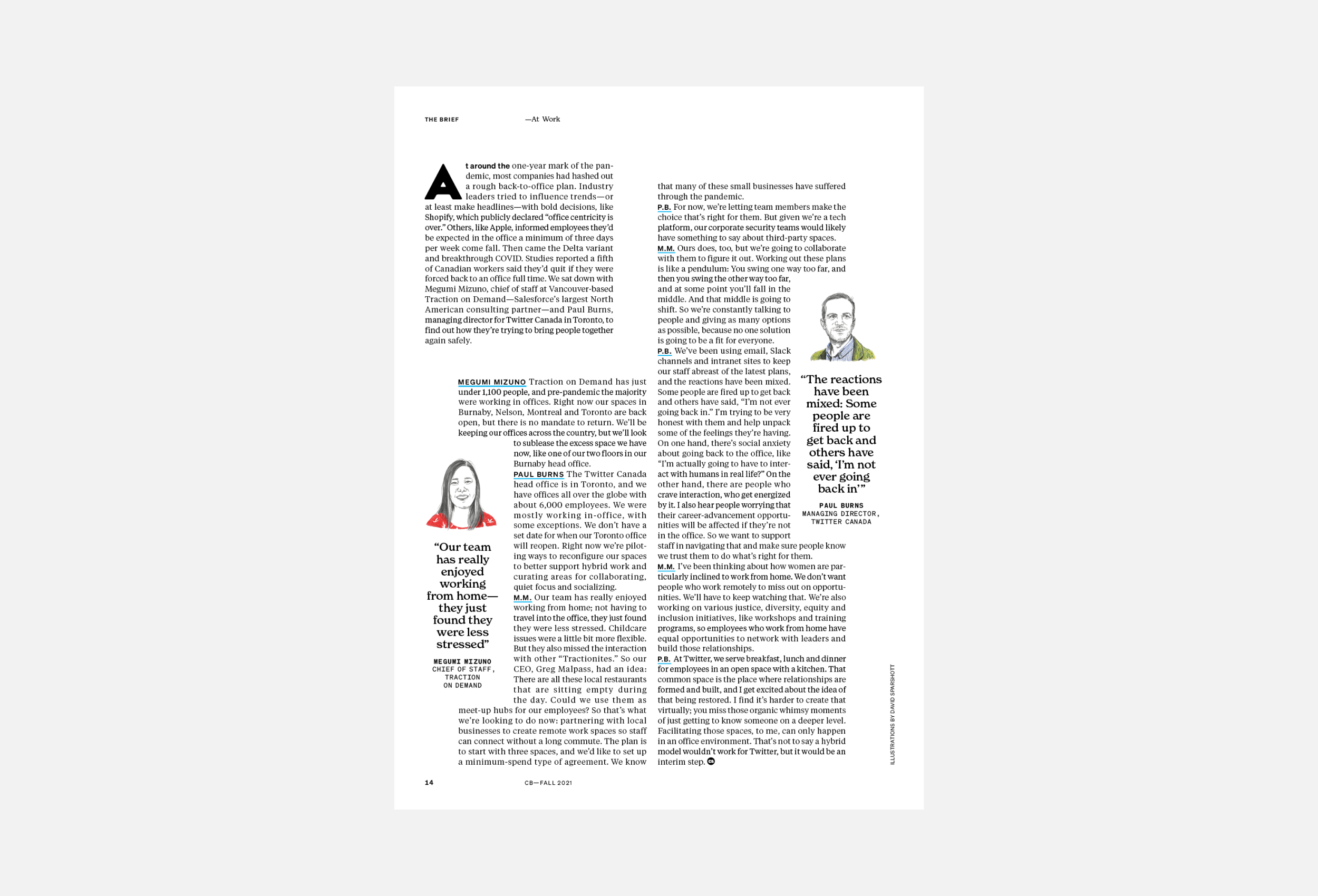
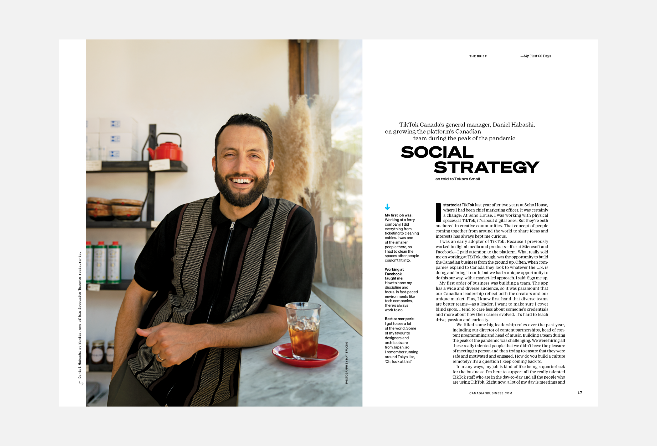
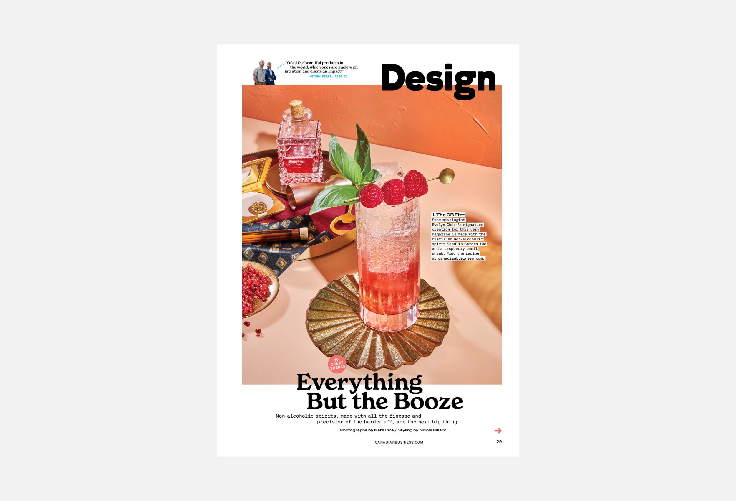
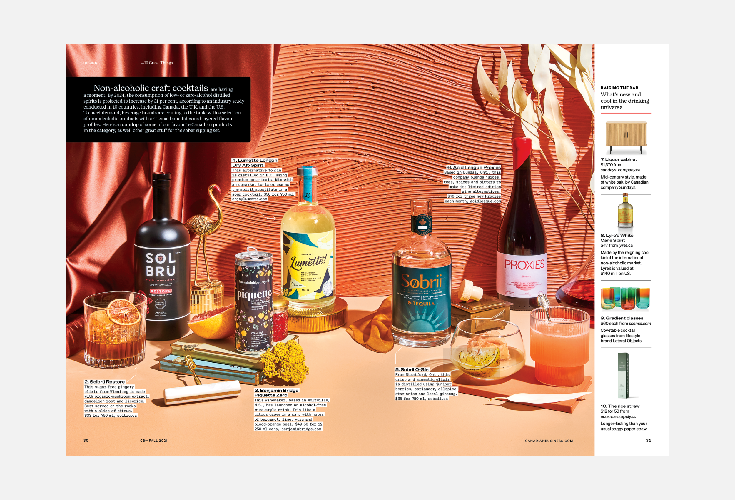
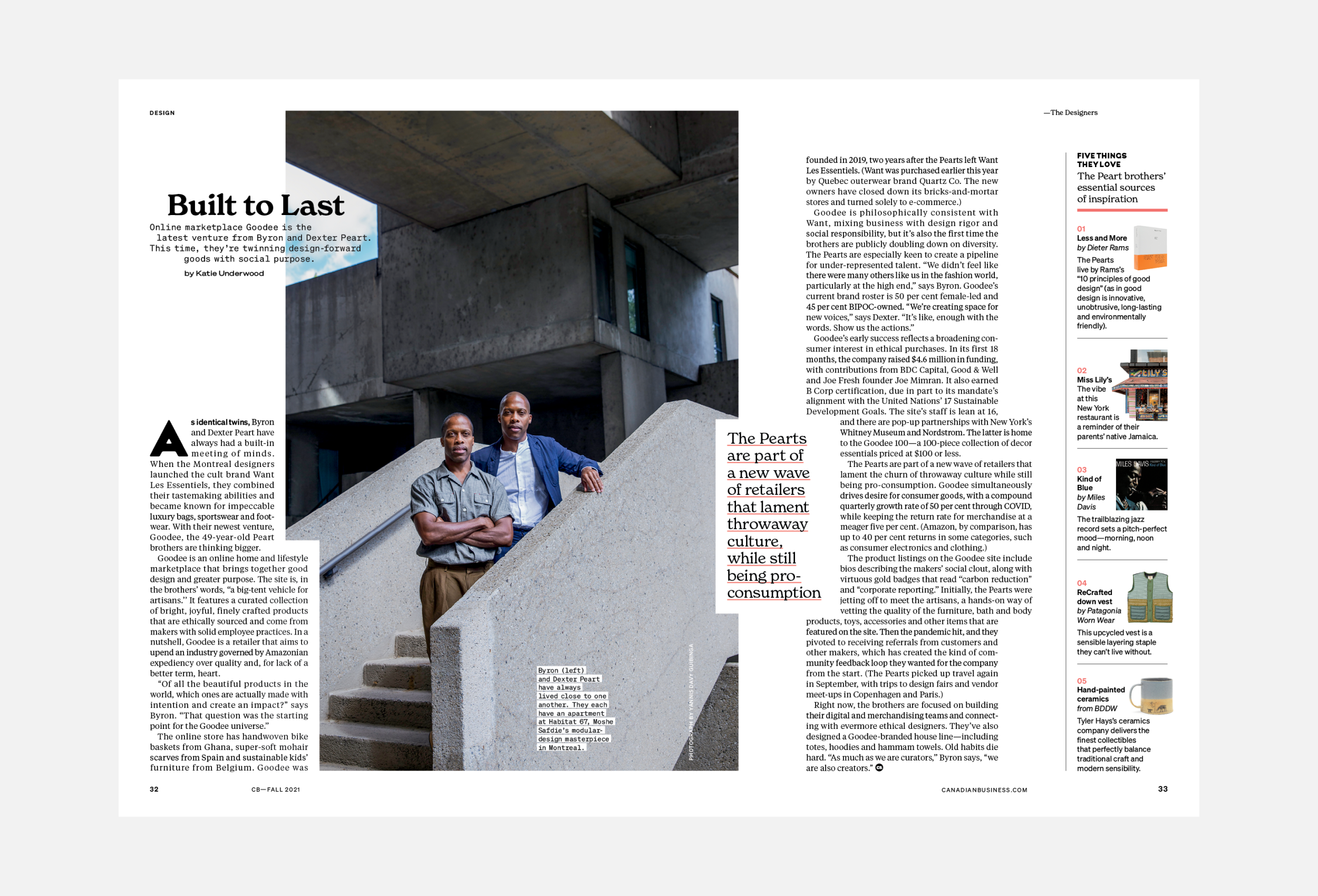
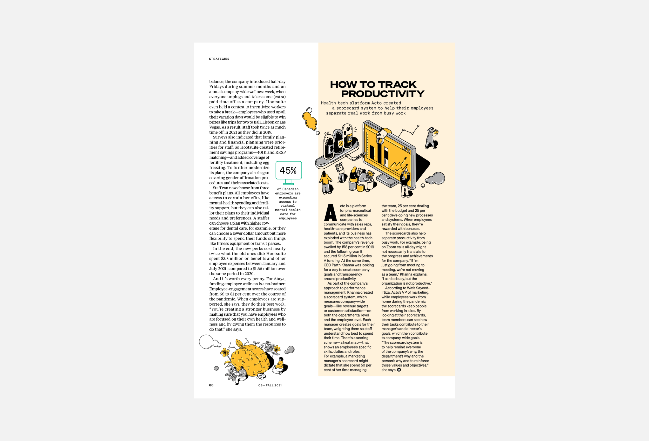
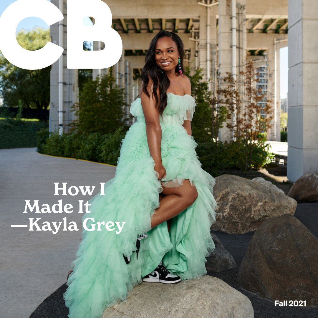
The full print and digital redesign includes a fresh new logo, bold typography and engaging photography and illustrations. Colour is used minimally to allow the visuals to stand out. Text columns shift to create dynamic compositions that flow from one page to the next, creating a cohesive yet surprising package.
The website captures the magazine’s exciting new direction in a modern and user-friendly web experience. The homepage features a bold modular grid of interchangeable cards that capture the innovative energy of the mag. The article pages are structured in a flexible way to accommodate both long reads and shorter stories.
“I’m immensely proud of our success in partnering our editors at Canadian Business with the talent at Studio Wyse. The new CB exceeds my expectations in every way. It’s stunning and draws you in immediately. The cover is bold without being overwrought. There’s a great mix of visual storytelling. The illustrations are lively and the photography is beautiful. Together, we’ve produced just about the best magazine that SJC Media has ever published.”
—Ken Hunt, President and Publisher of SJC Media
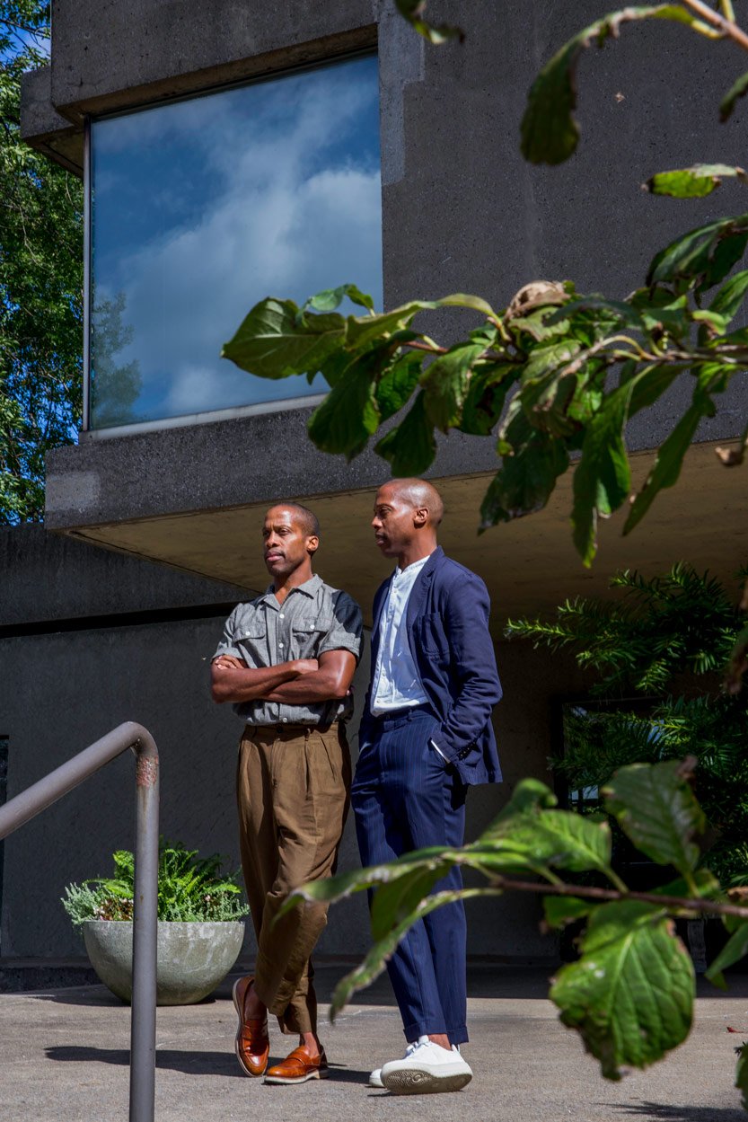
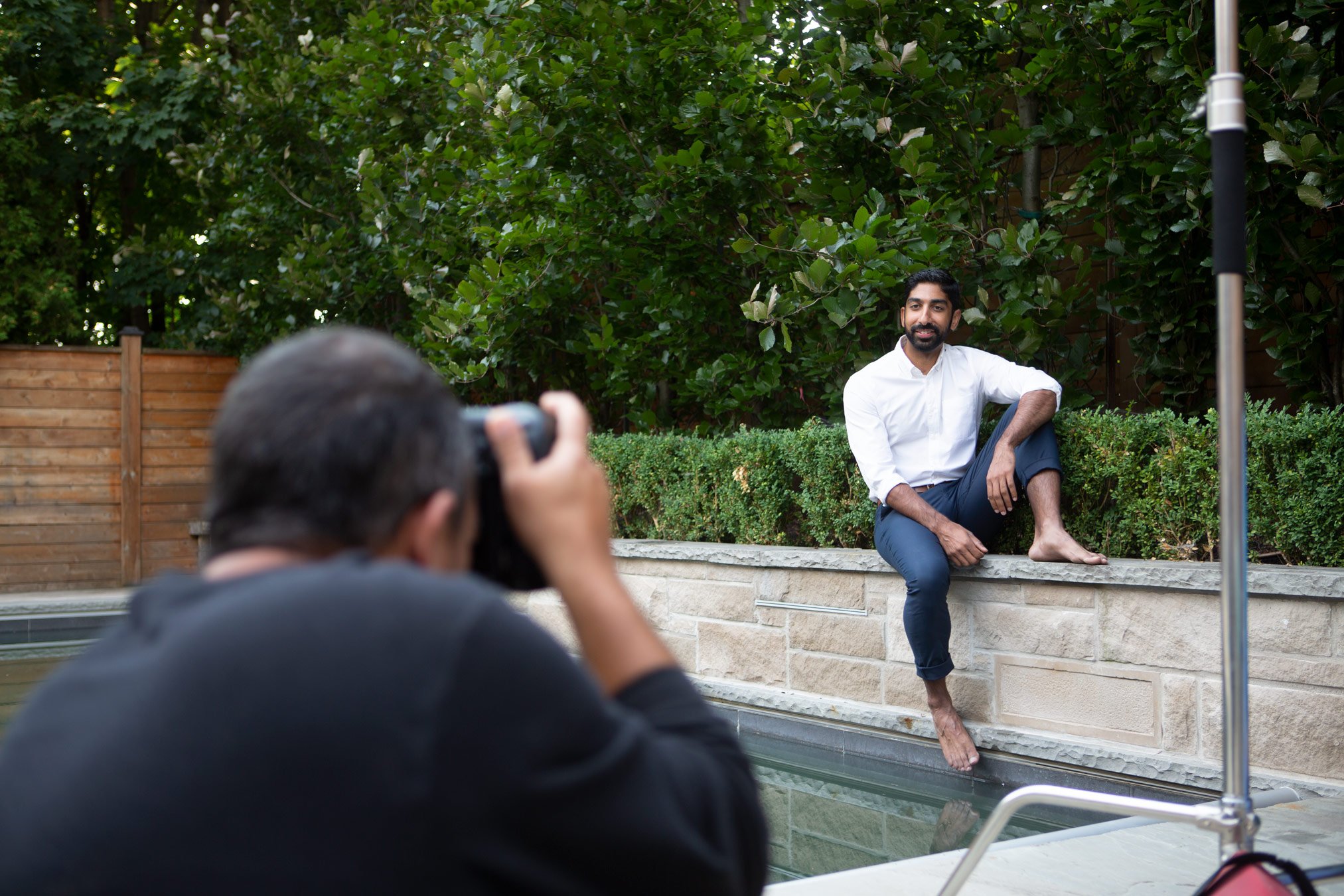
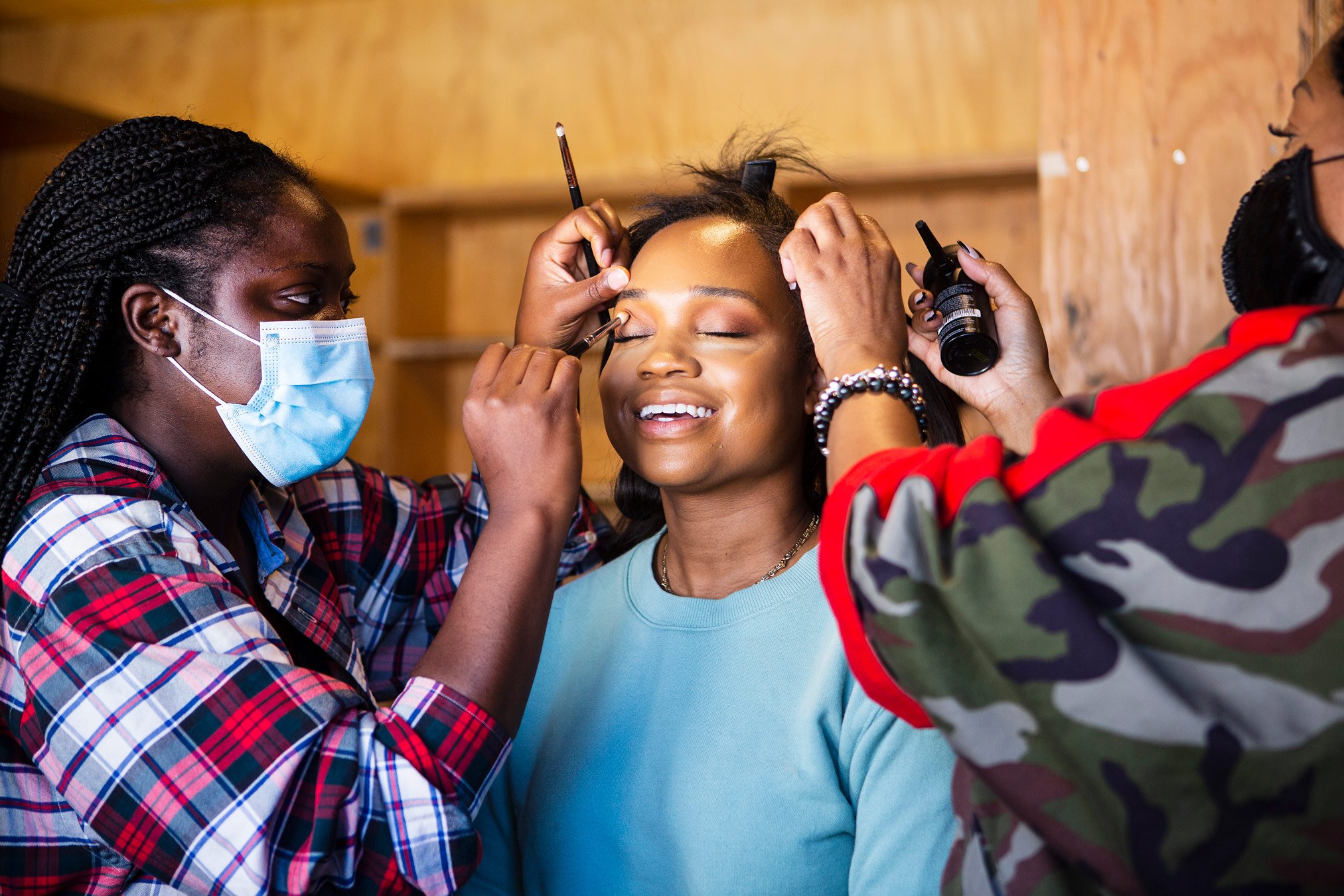
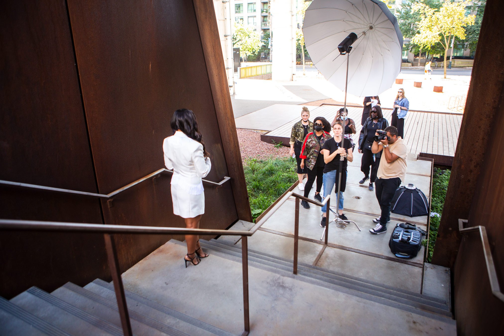
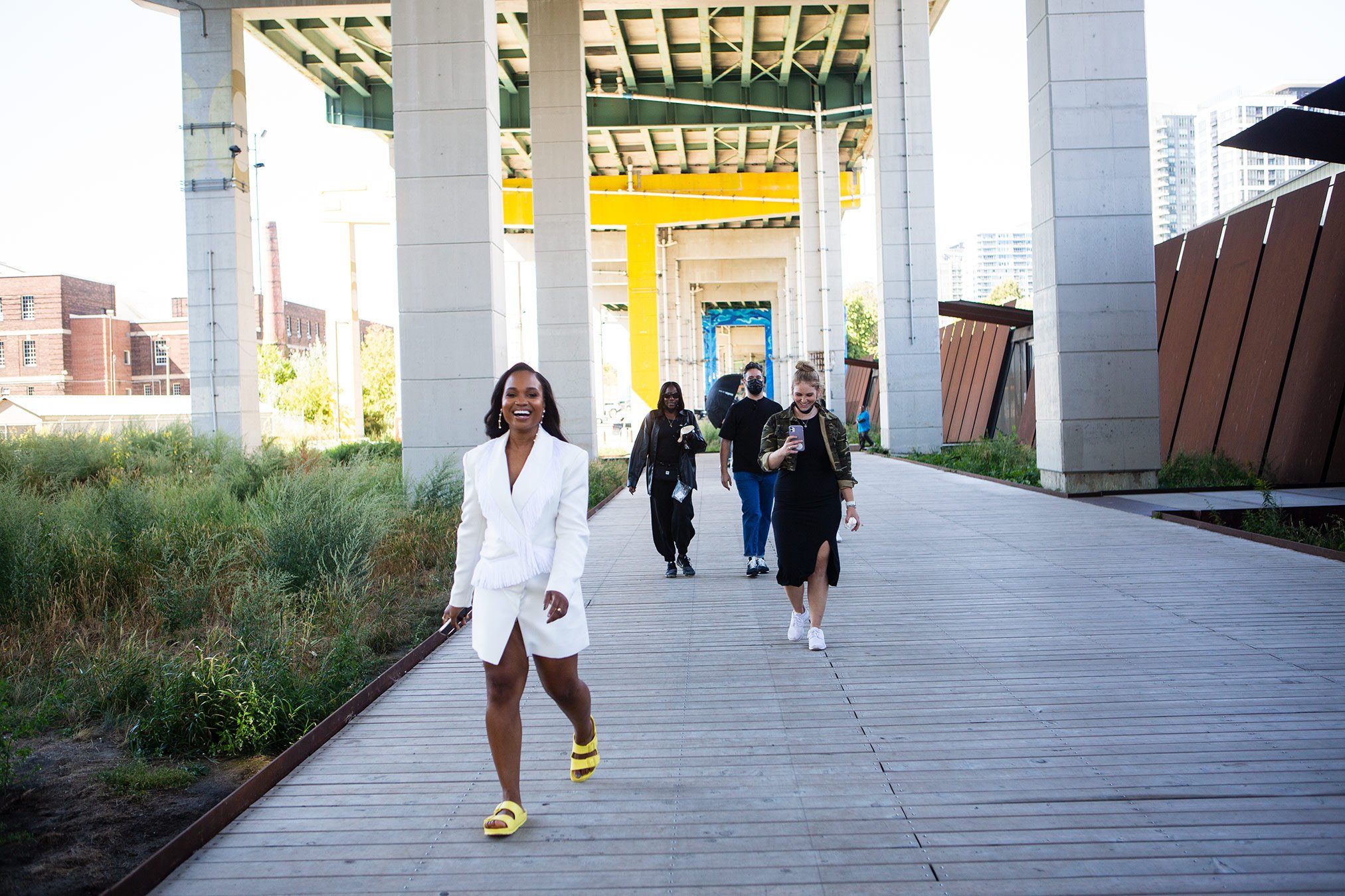
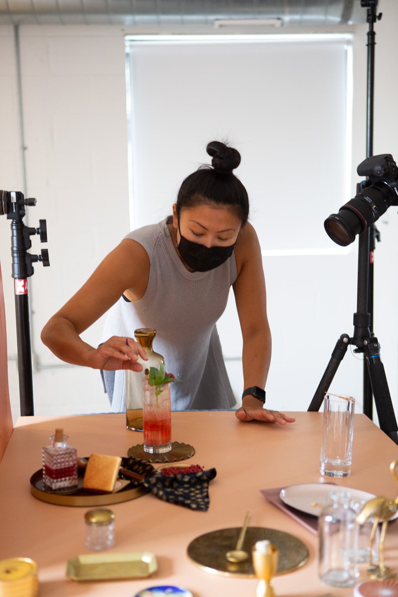
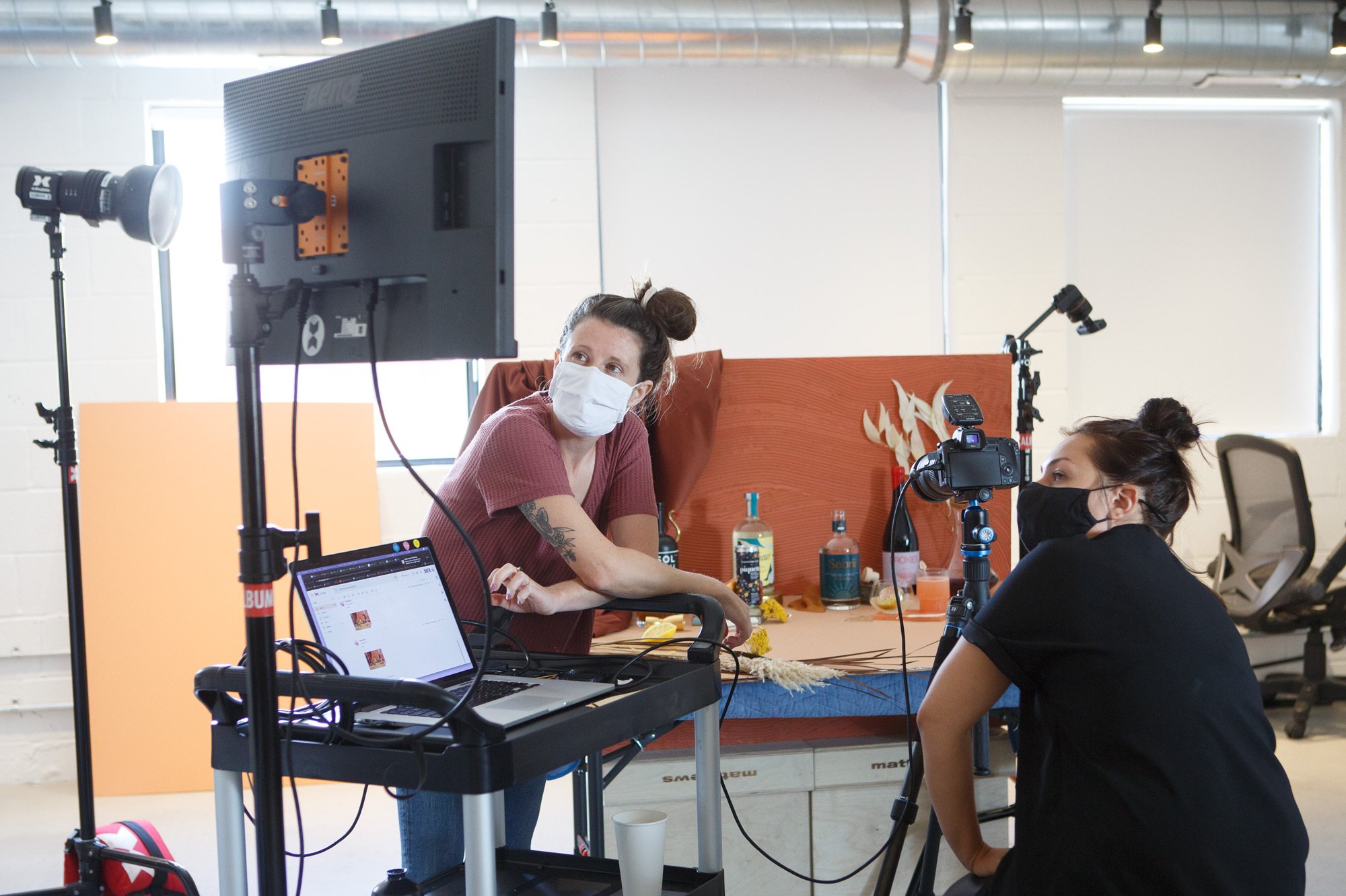
Congratulations, you made it to the bottom! You deserve a prize so here are some fun outtakes and behind-the-scenes.
CLIENT: St joseph’s communications Editor-in-Chief: Charlotte Herrold
Contributors: Miguel Arenillas, Kyle Ellingson, David Sparshott, May truong, Timo Lenzen, Hanna-Katrina Jędrosz, Kate Ince, Nicole Billark, Yannis Davy Guibinga, Ian Patterson, Jordan Andrew Carter, Jessica Chou, Jennifer Roberts, Steph Martyniuk, Jason Franson, Kathleen Fu, Alia Youssef
Website Development: SIX-O-SIX
Communal Lunch Project
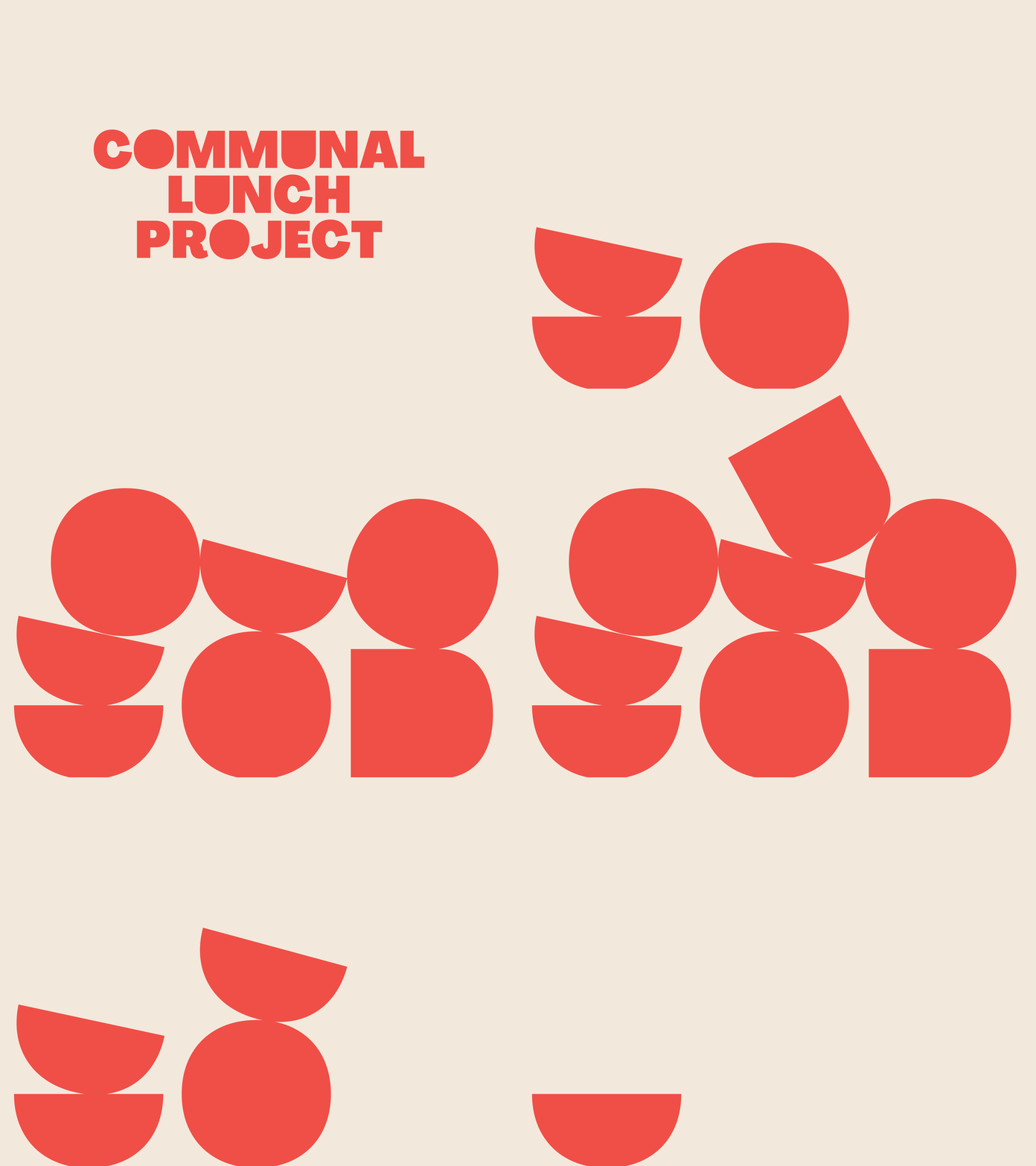
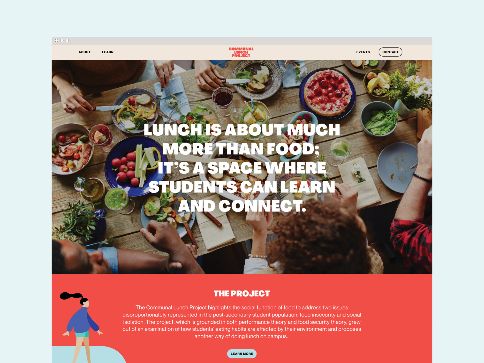
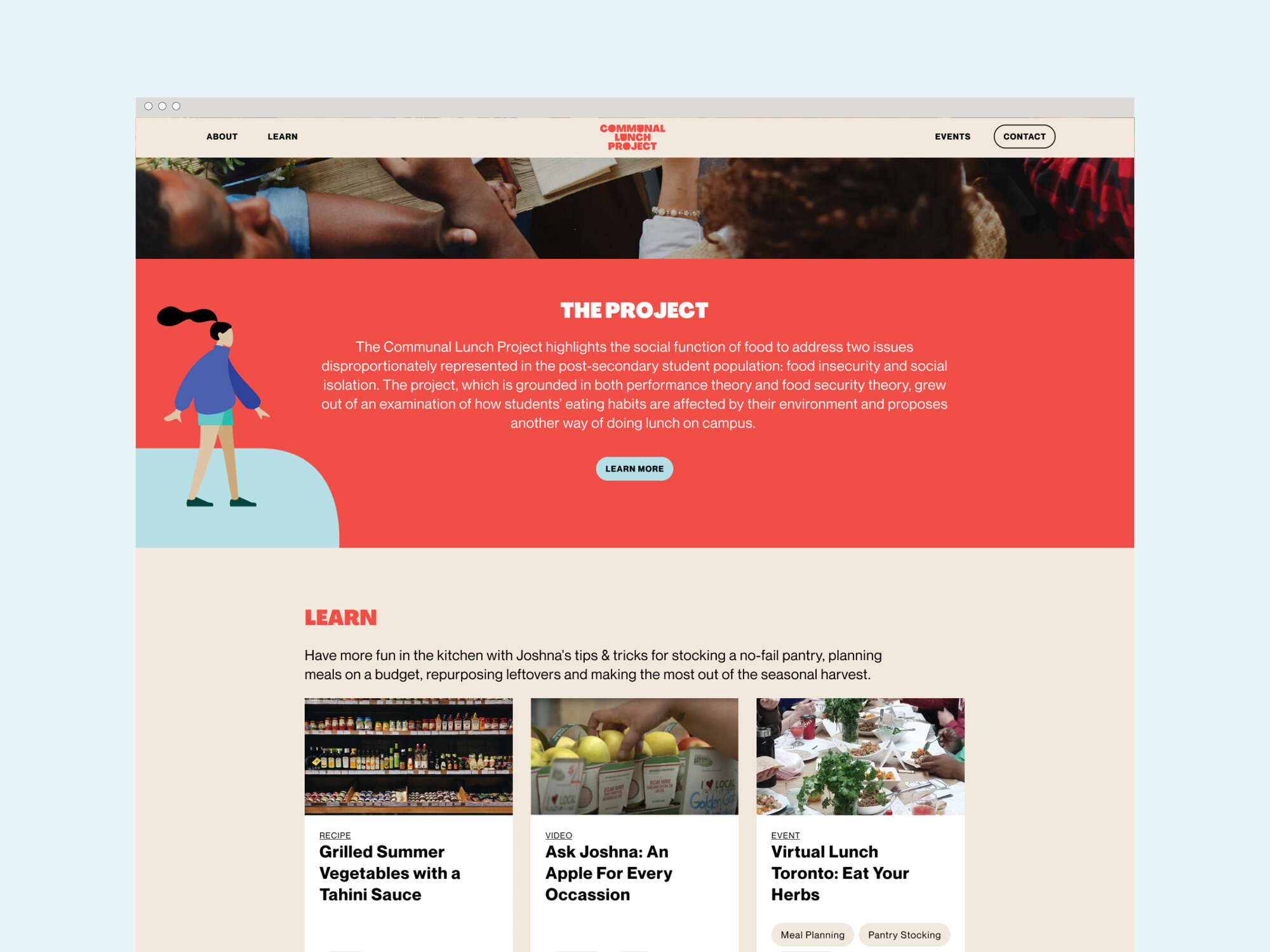
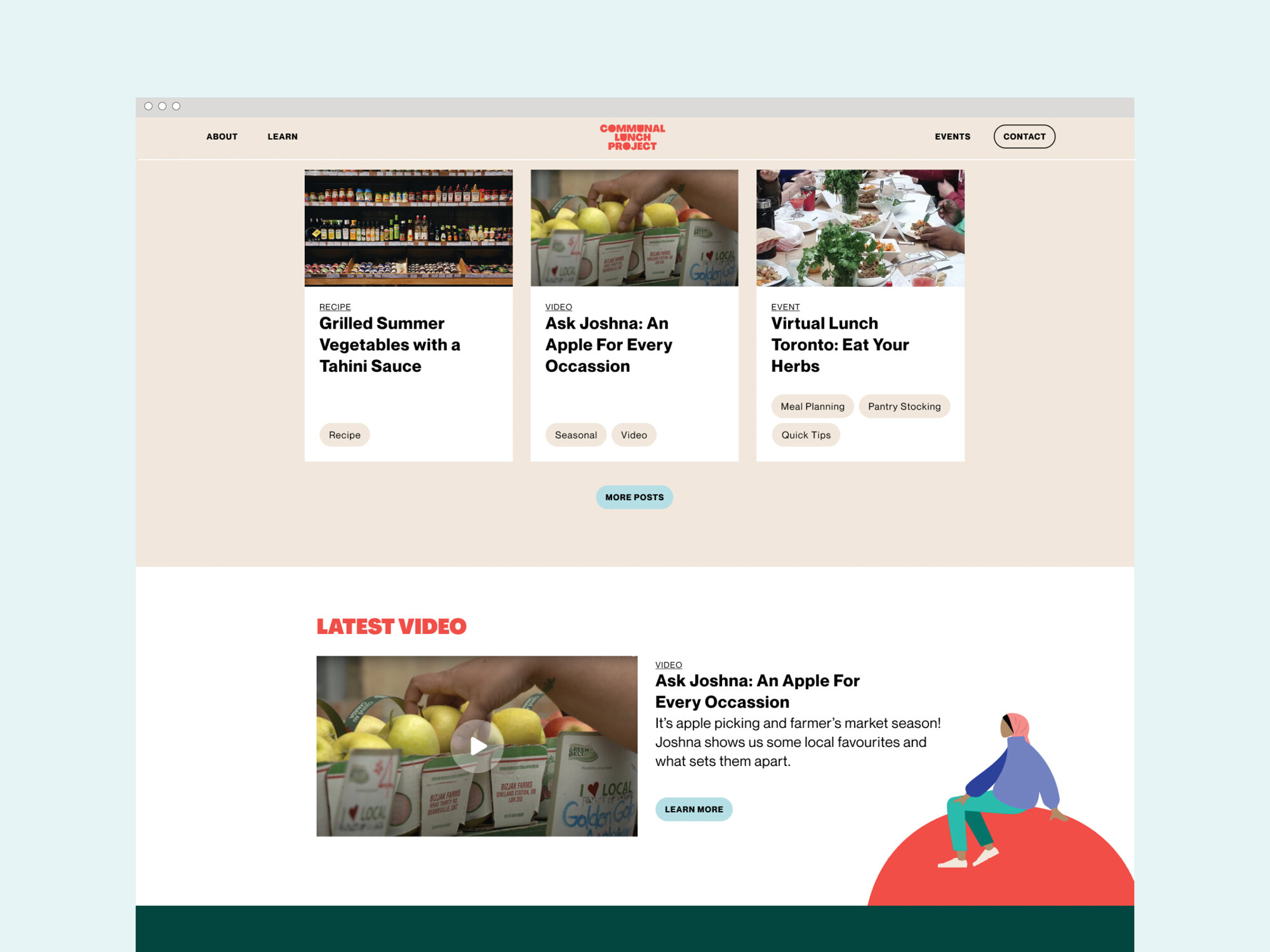
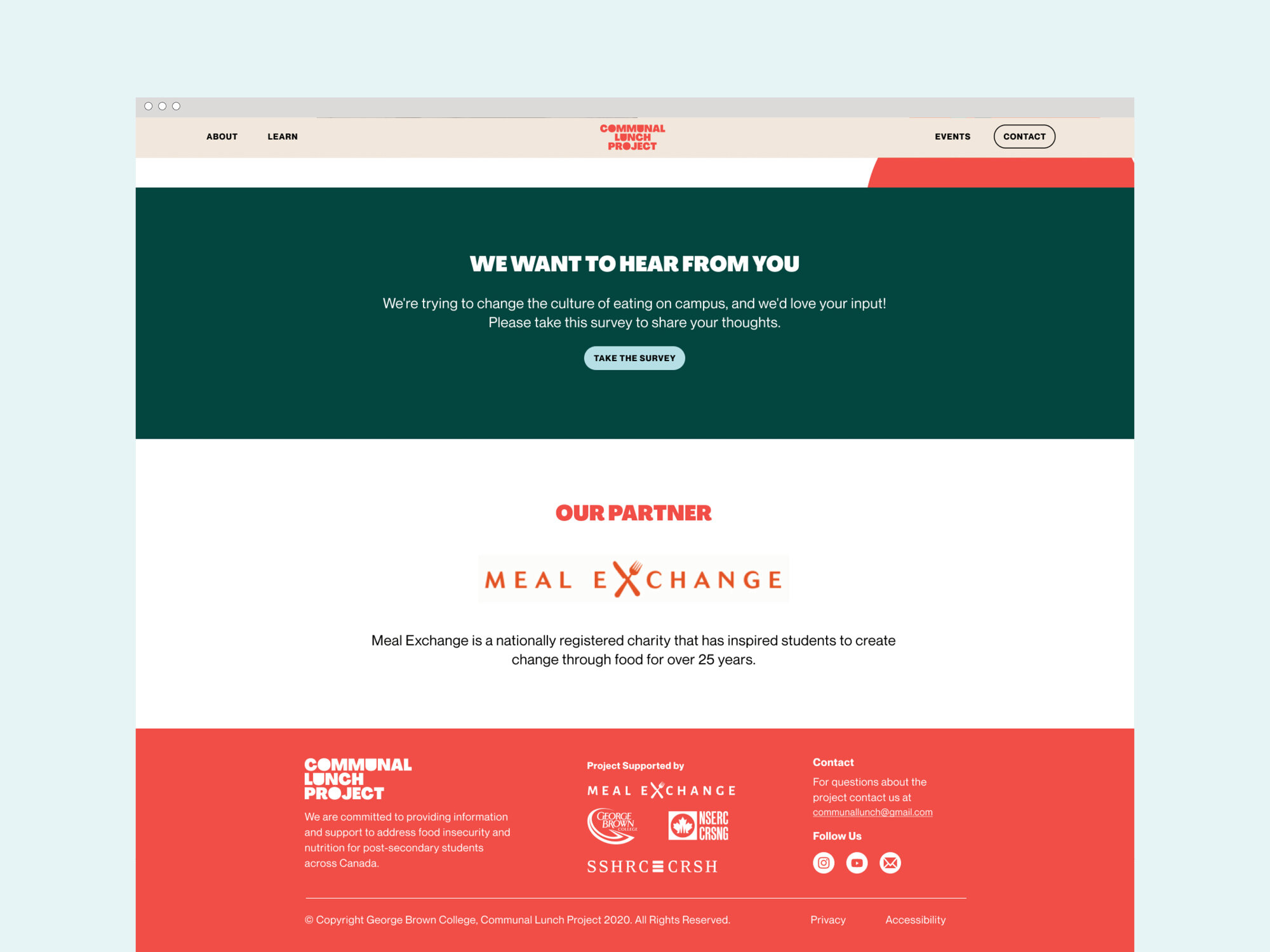
The Communal Lunch Project is a Canada-wide resource that addresses food insecurity and social isolation by bringing post-secondary students together for a meal. We teamed up with George Brown College, Meal Exchange and Chef Joshna Maharaj to establish CLP’s brand and design their website, which offers recipes, videos, quick tips and virtual lunches.
We used bright illustration and a welcoming colour palette to convey the warmth of good food and the fun of gathering around an inviting lunch table. Check out @communallunch to see what they’ve been up to!
“It was a pleasure working with the SW team! They did much more than build a website – they challenged us to articulate the intentions of a website that had to respond to a sudden pivot from an in-person research project to a virtual project. The website they created is now the lifeblood of our project. They made this pivot possible because they ask great questions and listen, they are creative and patient, and they are fun – they made our very steep learning curve enjoyable! We highly recommend them.”
Jennifer Mitsche, Project Director, Communal Lunch Project, Professor, Department of English & Communications, George Brown College, NSERC-funded Researcher
Xtra Magazine
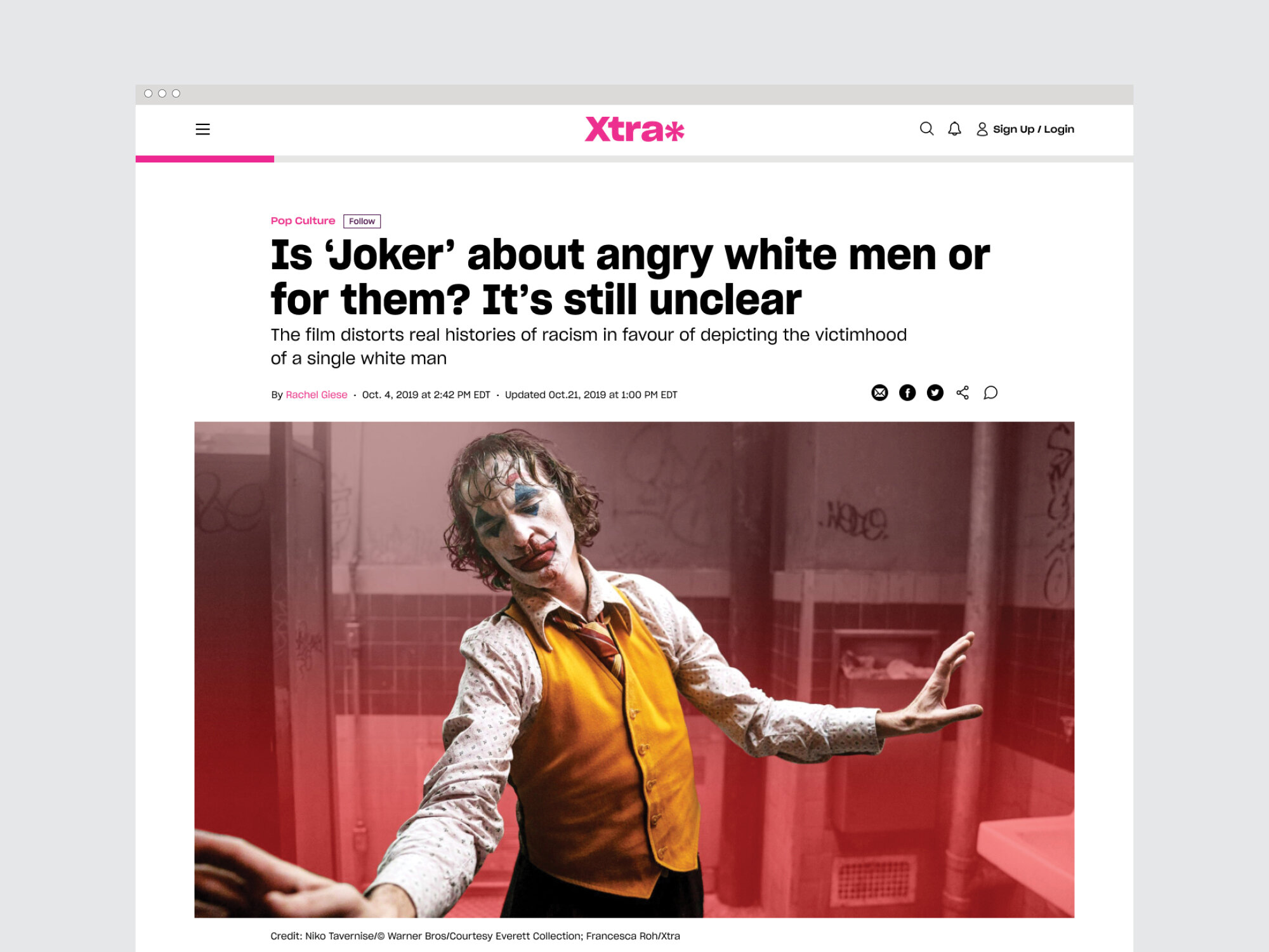
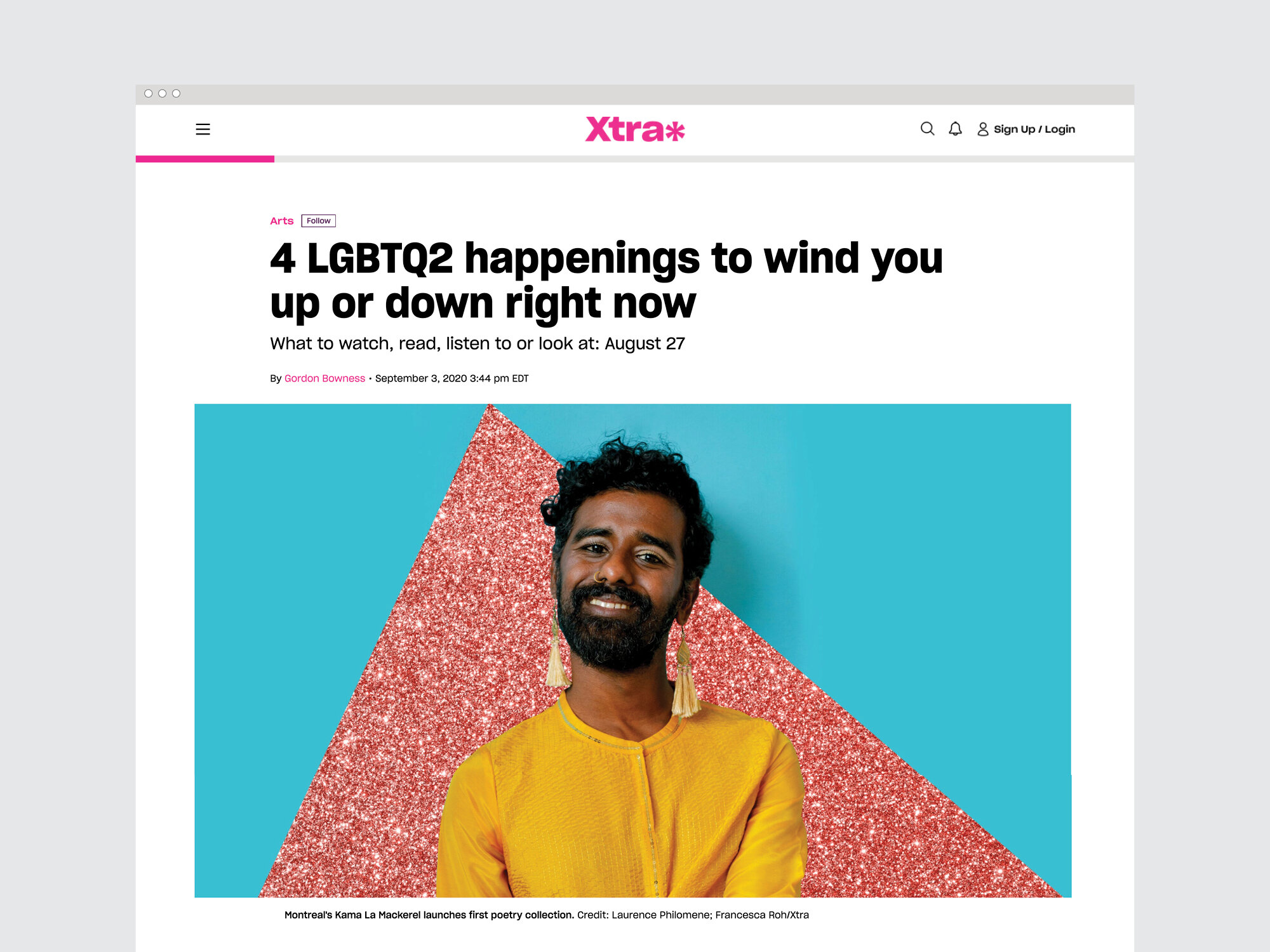
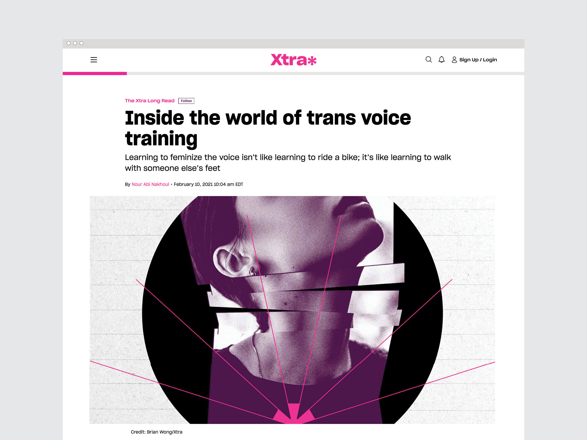
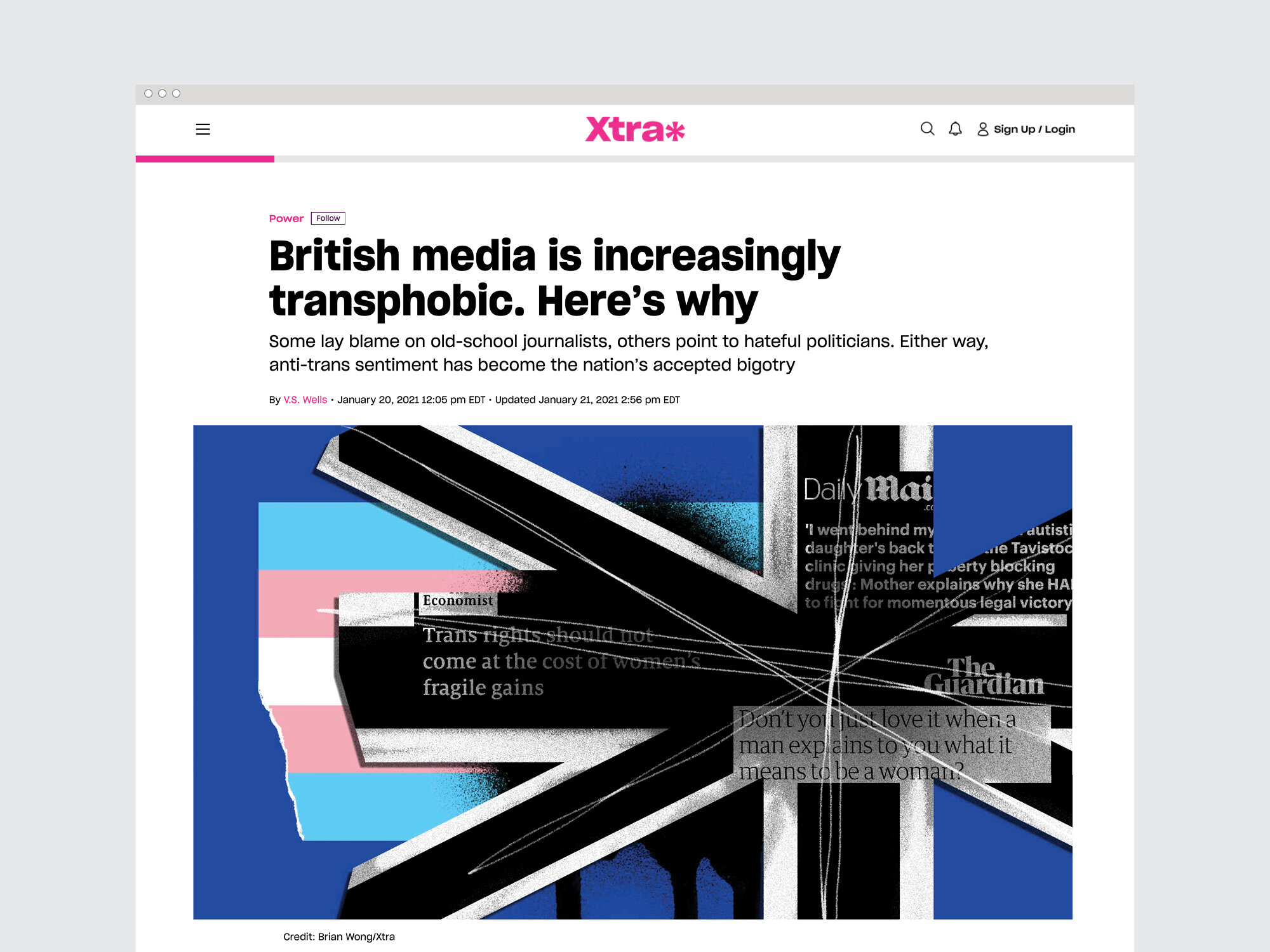
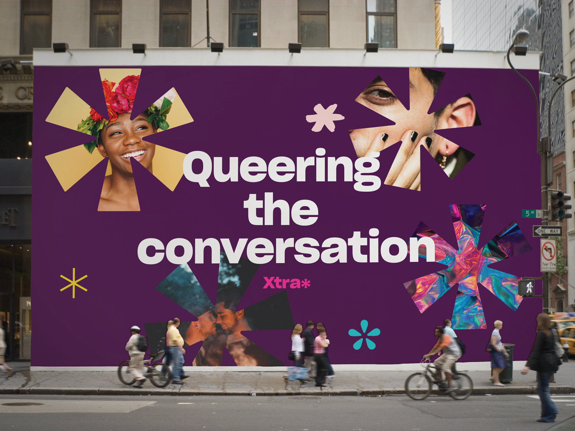
Xtra is an online magazine and community platform covering LGBTQ2S culture, politics and health that launched in 1984 as a local, free lesbian and gay newspaper in Toronto. Inspired by its activist past and back issues of its printed history, we developed a look that was loud & proud and reflective of the communities it represents.
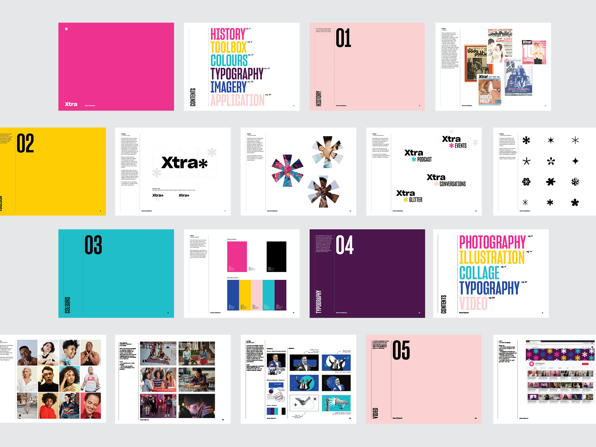
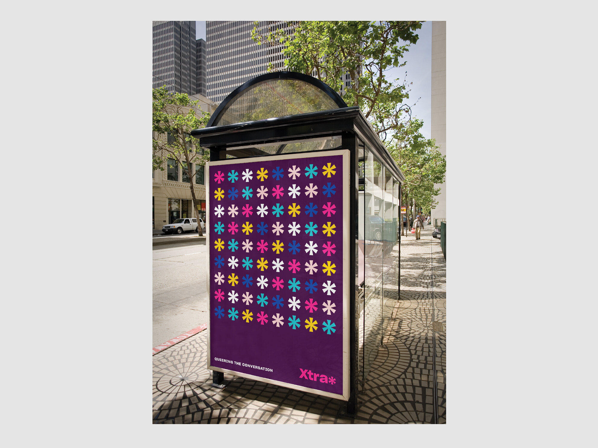
The website and brand redesign is fresh and modern with lots of playful elements. At the core of Xtra’s new look is the asterisk — a symbol normally used to indicate an omission or a footnote. By reclaiming the power of the asterisk, Xtra says, “We will not be left out or pushed to the bottom of the page — our stories matter.”
As part of the editorial strategy moving forward, we developed an extensive visual playbook that provides an overview of how to use the new look. The book illustrates different story types with direction for artwork that pairs with content to strike the right tone, from loud and playful at times to serious and reserved.
Studio Wyse took us down dozens of wonderful rabbit holes in their research—including a fascinating discussion about whether fonts have genders—and dug deeply into our activist, DIY past for design inspiration. They made mood boards of the covers of back issues of The Body Politic and Xtra, pictures of our old hot pink newspaper boxes, 1980s AIDS activism posters and 1990s queer zines. They introduced us to the work of some fabulous LGBTQ2S+ photographers and illustrators, with an emphasis on the work of racialized artists, to support our vision of showcasing more images of members of our communities throughout our site. The resulting look is modern, elegant and easy to navigate, but with lots of playful elements and surprises.
rachel giese, editorial director, xtra magazine
